Around 5 years ago we introduced modals to our former website plugin. One of the defining features of the popup plugin was the facility to serve a popup to a user based on a resolved state - is was very good. When we migrated to a framework that utilised Elementor we essentially ditched our own modal features completely because Elementor provides basic functionality by default. However, the default Elementor modals aren't nearly as clever as our former tools, so we've reintroduced new and improved versions back into Yabber.
Our modals were always better than anything in the market, and with our increasing emphasis on conditional marketing, we were obligated to improve upon the previous features and integrate them into our current framework. In the testing we've done thus far the inclusion of modals has had a seriously positive impact on mid-funnel conversions, and they've improved upon first and second-page conversions in our conditional subscription funnel.
This article introduces the current modals features we've introduced to Yabber. We'll briefly describe the types of modals we've made available, how to create a modal and return it to a page, and how the conditional logic plays a part in returning relevance to a user. Unlike the similar systems you've seen floating around the market, the Yabber module is customised for use by mortgage brokers, modal engagement is fully tracked, and we apply optional triggers to a known user clicking on a modal link.
What Are Modals?
Modals are an overlay returned to a screen that returns content without having to navigate your way to other areas of a website. To demonstrate a simple modal, click on this basic link . Now that you've clicked that link Yabber has incremented your general 'interest' score (this is the score assigned to declared interest actions, such as link clicks or downloads), and we've assessed the interaction for any trigger that might apply (such as an SMS, email message, or modification to a follow-up sequence). The click has also fed our system with usage data that contributes towards our understanding of all traffic. Modals are no longer a website tool - they're a genuine marketing tool.
One of the most valuable website commodities is the attention of your visitor, and relevance is key to serving this funnel objective. A modal shouldn't just be an untracked random resource - it needs to be an engaging asset that actually applies the funnel pressure necessary for a conversion, and this article details how we achieve this.
In this article we'll introduce the primary modals that Yabber supports:
- General Content Modals. General Modal content served on a mouse click.
- Full Screen Modals. Returns full-screen modal content.
- Geographic Modals. Serves content on the basis of geography (First Home Buyers).
- Entry Modals. Shown after a defined number of seconds on your website.
- Exit Intent Modals. Shown to a user when they show intent to leave a page.
- Video Modals and Image Modals. Popup media modals.
We'll also introduce condition elements and modal interaction statistics, and how modals might trigger other events, such as a user email or SMS. As you'll come to understand, our system isn't your standard pedestrian solution. For those investing in any organic or paid campaigns, we'll describe how modals might improve upon conversions.
Creating Modals
Modals are created in Yabber in just a few seconds. Once created they're immediately made available in your WordPress editor via the 'Modal' shortcode button.
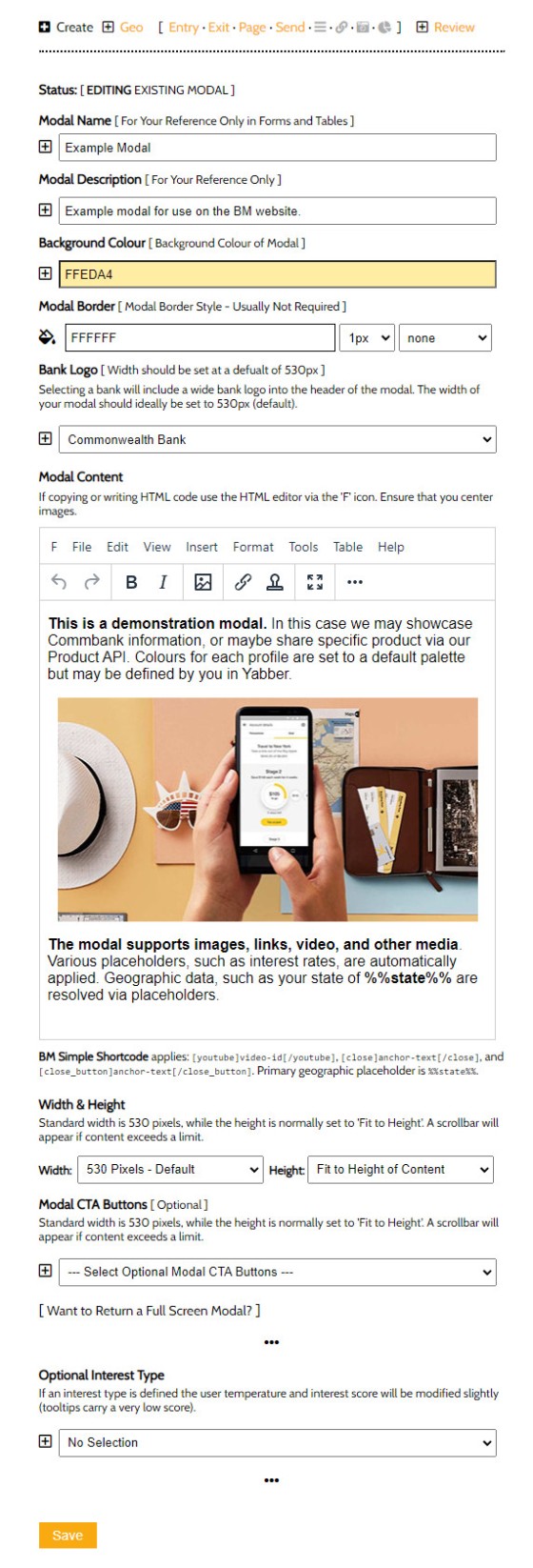
Pictured: Creating a modal in Yabber. All references to the modal are made as soon as the Yabber version is edited in any way. Creation is via a full WYSIWYG editor with all necessary formatting features. Note that the Commonwealth Bank logo was automatically applied via a dropdown, and the background colour was applied via simple tool. The image was dragged into position on the page. The width and height of the modal are customisable meaning virtually any content may be returned (including full page content). Various placeholders apply for assets such as rate data and videos.
Standard placeholders apply for various types of content, such as [youtube]abc123[/youtube] to render a YouTube video, [close]Close[/close] for a close link, and [close_button]Close[/close_button] for a modal close button.
The interest type option in the creation editor, if selected, means that any modal interaction will contribute towards our understanding of a website user, thus making conditional content easier to serve. The conditional aspects of the modal are introduced in more details when we introduce the entry and exit modals.
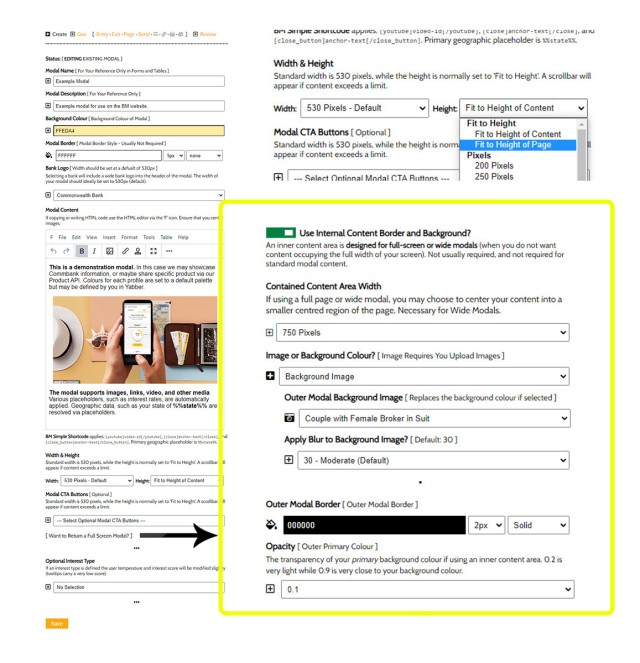
Introduced shortly, full screen modals occupy up to the full width and height of the page. The option "Want to Return a Full Screen Modal?" returns another group of options specific to the outer 'background' section of your modal that content that surrounds your primary content area.
Pictured: Creating a full screen modal. If your primary content modal is selected to full width of 100% width and height, or close to it, you'll want to contain your content to a smaller area in the middle of the page. The options shown above determine how the outer content is shown - this includes an option for a background image.
Once any modal of any type is created it's easily included in a post or page from our content editor menu.
Standard Modals
Standard modals were demonstrated in the introduction. A link is copied into your content from the WP Modal button, and takes shape as [link modal="0a36c5e9fb0a3813091a317d2676430c"]your-text[/link], returning a link that looks like this . An icon is placed alongside the text and a small amount of formatting is applied. As detailed earlier virtually any element of the modal can be customised to your liking.
A full screen modal is available and returns as follows . The full screen feature isn't really designed for a transparent background - instead, it's more suited to an image (optionally selected during creation).
Because we're returning a modal from Yabber, the full-screen modal functionality isn't ideal.
Geographic Modals
Geographic modals serve a valuable funnel purpose because they deliver relevance. Important for FHB borrowers, the modal provides ready access to FHB and other geographically relevant information without the user to have to hunt down information. We reinforced in our introduction that user attention is a primary funnel objective, and attention is best garnished when the information you provide a user delivers the most relevant message.
In our example, created with the shortcode of [link geo="my-modal-id"]Example Geographic Modal[/link], we'll return the following link . In our case, regardless of where you're clicking on the link we'll show the same modal but include your state in the text. The modal is also used to demonstrate how a border might be used (we've created a Westpac-style modal with branding colours sourced from their style guide  ).
).
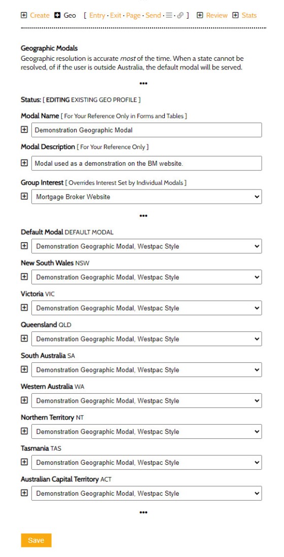
Pictured: The panel shows how geographic modals are assigned to a group. In our link we'll reference the group rather than a specific modal. Geographic placeholder text applies.
The selected modal will show to a user that resolves to the selected state. Like standard modals, geographic modals will apply triggers for the specific modal that was served.
Note that all modals will return geographic data by way of placeholders, but it's only the geographic modal, when specifically referenced on your website, that will show different modals to visitors from different states.
Entry Modals, Exit Modals, Page Modals, and Conditional Modals
An entry modal will show to a user a defined number of seconds after arriving on a page, while an exit modal will display when the user shows intent to leave. Yabber provides a module that makes it super-simple to assign 'global' modals that apply everywhere, and because we're looking at capturing the attention of a user - often defined by what page they're on - we also provide for page-specific modals, or modals that are assigned to a specific page. In all cases we provide for conditional modal content, or content served on the basis of the user's resolved borrowing objective. This is a big deal. Adding further value when compared against the pedestrian options floating around the market, we enhance the influence of our nested funnel pathways by creating various (optional) trigger events if the user is known (usually after a subscription in the 'buy phase').
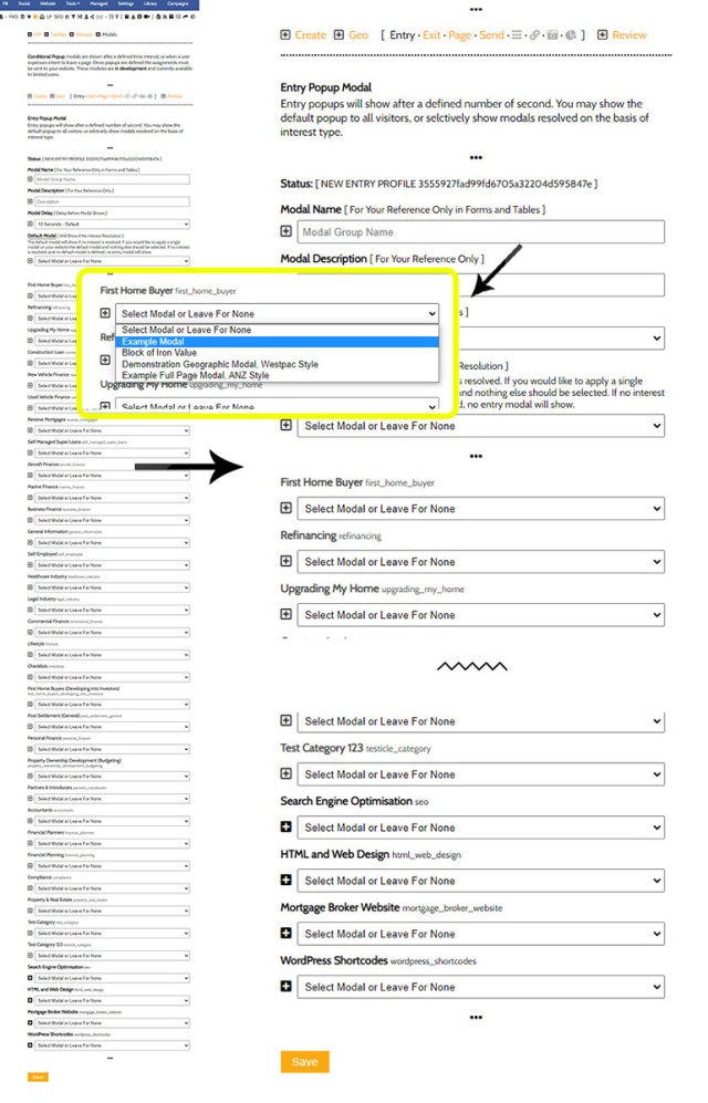
The interest-based assignment is advanced usage in that requires a focus on the conditional aspects of our experience. However, when you choose to invest yourself in higher-level results, the modals are defined to Yabber-manufactured interests as pictured below (we say "Yabber-manufactured" because an interest can be assigned to a simple link, which will register that interest in the system... although we ignore these records in many cases - don't worry about the perceived complexity!).
While there's a large number of options shown below, it's likely you'll simply select a default single modal for entry and exit and worry about the conditional features later on.
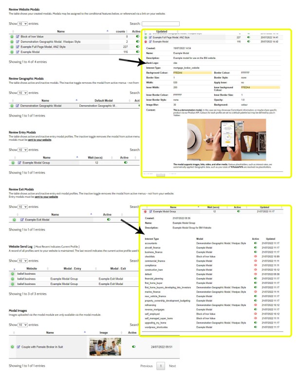
Pictured: The panel to define entry and exit modals is virtually identical. If an interest type of a user is resolved at the website level, the defined modal will be shown (on entry or exit). This kind of functionality is what defines a relevant interest-based funnel excursion.
In most cases you'll simply select a default modal to be shown in all cases. Later on you'll focus on improving upon modal engagement (which is, of course, fully tracked - you simply cannot improve upon a marketing asset if you're not able to measure its performance).
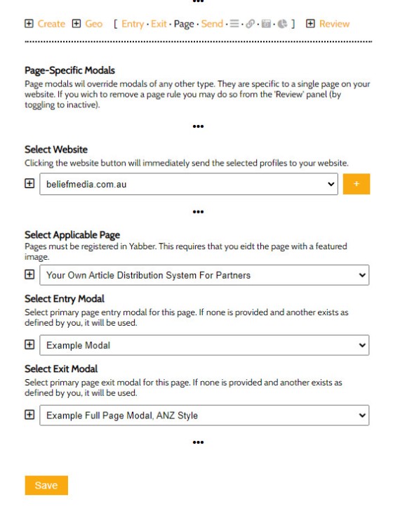
In some cases, and to improve upon specific page conversions, you may define a modal specific to that page. From Yabber, select the website, post or page, and then define your modals.
Pictured: Page modals are used in cases where you want a user to see specific content. Modals of all types may be reviewed then edited from the 'Review' panel.
To be clear, not only does interacting with a modal feed us with an understanding of a client, but the modal returned to a user may also be resolved on the basis of their interest or borrowing objective.
Video Modals
We've always provided video modal tools, obviously, but we've recently built the video functionality into the standard link shortcode. For example, the shortcode of [link v="https://youtu.be/zf1MytwD8dg"]my-anchor-text[/link] returns this link (maybe watch the video - it's relevant!). Note the video icon next to the text - this applies to most modal and tooltip links by default (you may also include videos in a small modal, as we demonstrated with the geographic Westpac example).
A large number of video platforms are supported. While you want to work hard at attracting video subscribers and traction to your channel, it's your website that creates more powerful funnel pathways, so it's on your website where we'd like to render videos - avoid linking off-site.
Modal Usage Tracking and Statistics
A funnel of any type is always forward thinking towards what comes next, and the "what comes next" part is predicated on a bear pooping in the woods if we're unable to resolve what each website user is doing. Any and all interactions must be measured in order for your marketing efforts to return meaningful results, and modals are part of this equation.
We record every modal click and resolve the interaction to the page the specific user is interacting. On the basis of this information we increment the 'interest' count for the user (thus potentially introducing conditional content to the mix), and we optionally apply triggers (detailed below). While we don't dwell on data, the statistical engagement information returned to us provides us with a MCR (Modal Click Rate), MPCR (Modal Page Conversion Ratio), and other data that tells us princely what's working.
Modals feed us with only a small and somewhat limited understanding of of user behaviour, and they're not the fanciest statistics to review, as the insight a modal view provides is limited, but we've come to realise that they're an essential feature in measuring granular on-page interactions alongside links, tooltips, videos, and other page objects.
Modal Triggers
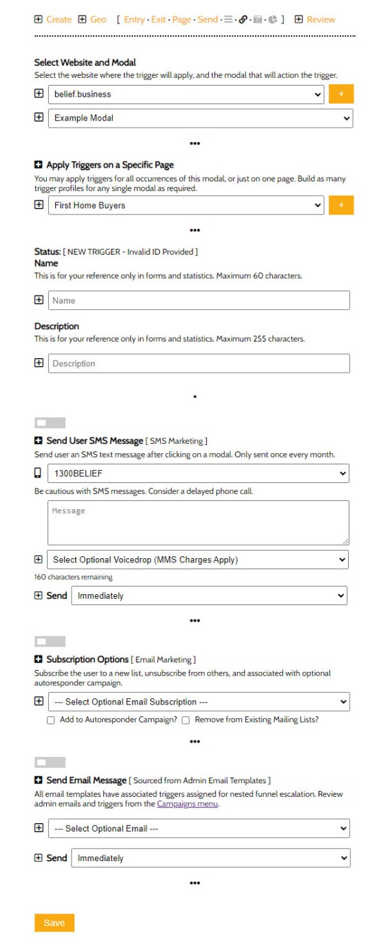
Modal triggers are one of the most powerful features of the Yabber modal module. On the basis of a known user - so, somebody that is actively engaged in a Facebook or subscription-style of funnel - we can send them a message, email, or potentially create other tasks.
Modal triggers are applied globally (so, to all posts), or to a modal on a specific page. The triggers include a client SMS and/or email, and an alteration of the user's email subscriptions. As many rules as required may applied to a single modal.
Pictured: Modal Triggers. You select the website and modal, then an optional page where the triggers will apply, and save. Triggers may be activated and deactivated via the 'Review' panel.
Reviewing and Editing Modals
All models are presented on single panel for easy editing and review. As with all our tables, clicking on the green icon opens up the table with more information (shown below as insets).
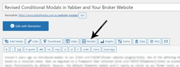
Inclusion of modals in your WordPress posts and pages is made via the 'Modal' button in the BM Shortcode Editor.
Using the feature is simple.
A Note to Clients
Clients should note that this feature will push around the 7th August in Version 0.8.3.11 of the BM Yabber Plugin. We're currently reworking the statistics components (which is why there aren't any screenshots), so if you're on the Beta system you'll be able to watch the feature come alive in real-time.
You will notice an option in the modal creation window that reads as "Modal CTA Buttons". The CTA Button website module is forthcoming and will introduced soon.
The email trigger is one that was crafted via the 'Admin Email' panel - soon to be renamed to just 'Email Blocks'. This negates the need to create a specific email for just this record, and makes nested trigger functionality more easily accessible (nested emails from different sources often converge into a single funnel... eventually).
We'll be adding integrated calendar features, single click forms, and other data into the modals soon.
Conclusion
Your websites, funnels of any type, and other digital assets will only return value to a consumer if they capture attention by delivering relevant information at the right time. In a sense, your funnels are a type of digital concierge that hand-hold your funnel participant through their journey, and only showing what you want them to see.
We have a follow-up article that summarises various conditional aspects of our mortgage broker website experience, and another that introduces the basic conversion funnel, and both (when published) should be referenced for context. Our experience multiples conversions by 300% out of the box by doing in a single page in what others try and do in four pages, so we're able to assign appropriate escalated relevance to the always-important second page. Modals, when used as an exit feature on the second page, or an entry to other selected pages, improves upon this experience yet again, meaning we're able to inject serious relevance into the flow. As stated, we'll discuss the funnel aspects of modals in our article where we pull the typical experience to threads before introducing our own proprietary and extremely high-performing framework.
Used sensibly, modals will objectively improve upon your digital results.


