A couple of years ago we introduced a featured rate panel that'd return formatted rates within a style of textbox. On the back of a recent request from a client, we've created a new style of featured panel that'll return a similar lender rate textbox that is managed entirely from Yabber. While the former rate panel remains, the new panel is simplistic and arguably more persuasive. This article will introduce the basic feature, the WordPress shortcode, and how to use the Elementor block.
The Result
For the first example, we'll look at the typical lowest rate that many brokers rightly or wrongly show on their entry page (and this is where the requesting client required the basic rate text). We've created a profile  in Yabber that includes the type of rate we require and we've defined the applicable style
  . The result of the shortcode
 [bm_featured_rate profile="ef52f9bbf0e5fca721096e2ec7e8d293"] returns the following:
The basic text-only style shown above is the expected usage. For those that insist on using prominent call-to-action rate text on page entry, this is the general style that should be applied.
In the second example we'll use the lowest CommBank owner occupied variable rate  against a plain 'box' background
  . We've also linked the rate to an internal page.
An optional background image  may be applied the container as shown below. In this case we've selected the lowest variable rate made available from Commbank.
The rate may also be 'stacked'. When a stacked rate is selected and a default lender background  image is used (or an image you haven't uploaded yourself), we'll default to the 'square' lender logo rather than the wide version. When stacking rates and applying a background, image it make more sense to create your own 'true' square image and upload it via the image panel
  , as the default image is the same logo we use to render rate data, so it isn't entirely suitable.
Stacked rates might be suitable in a sidebar or similar when making attempts to funnel a user through to the conversion archives (applied to 100% width  rather than a defined pixel width as used in the above example).
For the third example, we'll apply a background image  and restrict lenders to St. George
  (Owner Occupied Variable Rate). The styling looks a little ridiculous because we've exaggerated the branding.
Our examples were fairly ordinary in terms of presentation, but the styling options allow you to create virtually any design. As mentioned earlier, in most cases you'll simply use the naked rate text.
Yabber Profiles and Styles
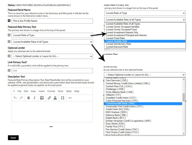
A Yabber pairing consists of a profile (the text and rate type, if any), and the style. When creating a profile, you'll be prompted for a rate type and optional borrowing type. You may also assign a specific lender and create an optional link (in our Commbank examples we've linked to the demo Commbank archive).
Pictured: You may select a 'Lowest Rate of Type' or 'Custom Placeholder Text' in the rate select menu. Using the default of 'Lowest Rate of Type' shows a select menu where a range of product types may be selected. By default, the rate returned will be measured against all lenders, although you may select a specific lender from the 'Lender' select menu.
Because Yabber is a multi-website system, you're required to send the profiles to your website  in order for them to be made available. When sending, we pair each profile to a style, and send.
Rates are cached for up to two days before replaced with fresh data. The data queried via this endpoint ignores data within 5 basis points of the published rate, so the erroneous and deceptive rates returned via lenders such as Gateway and Judo are ignored.
The Elementor Widget
In the case of most of our rate features, the easiest method of inclusion is via the use of a drag-and-drop Elementor block. In the case of the featured rate, the shortcode is easily applied  and doesn't include an array of attributes, so it's probably the preferred method (the linked image shows the 'Review' page which includes the full list of profiles and styles for review and editing).
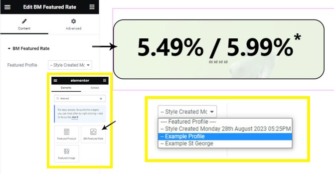
If building a full page, the Elementor block is available. Search for BM Featured Rate, drag into any post or page, and then select the applicable profile as defined in Yabber.
Pictured: Search Elementor for 'Featured', select the 'BM Featured Rate' block, drag onto your page, and select the applicable profile. The results is immediately rendered and will always remain up-to-date.
The widget is made available in Version 0.9.5 of the 'BeliefMedia Elementor' plugin.
Lender API
Your client API Key provides full and complete access to the Lender and Comparison API, and this includes various endpoints that'll serve the data in as described in this article. The applicable API documentation should be consulted for those that are interested and have the appropriate training.
Related Articles
Of all the rate-related features, the Featured Rate may be the least significant. For those that choose to provide their clients with the information they'll actually interested in seeing, there's a large number of Rate tools that serves data in various formats.
If you have a specific need, please let us know.
Conclusion
The request for this specific panel came from a client that wished to include it in the primary front page CTA panel. The front page CTA text has always supported lowest rate placeholders, but the Featured Rate panel is more suitable for the requested purpose.
The featured rate is just one more methods to return lender data to your website. Like it or not (and most brokers don't), the information you share in your consumer-facing marketing material should reference rates because that's what your clients want to see. We're often biased towards a rateless world because of the expectation that the data often implies (despite warnings and links to LVR criteria) and because of our underlying and core 'structure-first' messaging. However, the rate should be used as an information magnet to filter a client into a discussion where the compelling nature of your expertise should be enough to course-correct any malformed understanding. We're compelled to speak in a language that our consumer understands, and in a world driven by rate-related information and news headlines, the rate is a shared language that the consumer understands (in fact, over 93% of consumers form their early understanding based on rate), so using interest rate information will objectively improve conversions. Rates aren't your primary message, but they support your broader expertise.
The panel will be updated based on feedback from those that use it.
The year was 1816, and Australia was divided into different British colonies. The colonies traded with each other and foreign merchants under a barter system. At that time, Australia did not have its own currency, so a lot of foreign currency was circulating within the colonies that would eventually end up abroad. To solve this issue, Governor Macquarie created the Australian dollar, otherwise known as the 'holey dollar.' It was named so because the enterprising Governor cut out a hole in the middle of a foreign coin creating a doughnut-shaped coin unique to Australia. The cut-out centerpiece was called the dump and was worth one-quarter of a 'holey dollar.'However, Australia's monetary problems would not go away so quickly. The country was desperately in need of its own banking system, and so the Bank of New South Wales (BNSW) was established in 1817. It was the first bank to start operating in the outback under the aegis of Governor Lachlan Macquarie and was the predecessor to today’s Westpac Banking Corporation. It was only in 1850 that the bank of New South Wales was officially recognized by an act of the New South Wales parliament. After the passage of this historic act, the bank quickly opened multiple branches in different parts of the colony. The timing could not have been any better. In 1851, one year after the bank was allowed to open more branches, the gold rush struck Australia, and miners needed the bank more than ever to deposit their newfound wealth safely. But the fledgling banking corporation had embarked on an enterprise that was quite often fraught with danger. Transporting gold and cash from one branch to another was risky as bandits, and highway robbers were constantly on the lookout to steal from their next victim. So, in a way, the team at the bank of New South Wales were truly pioneers, bringing banking services to the remotest and wildest corners of the colony. In the following years, the bank established branches in other parts of the country and opened offices in all the major Australian cities. [ View Image ]


