In a previous article we introduced the Simple Panel (a variation of the high-performing Landing Panel). This article introduces a feature in our Yabber digital marketing system that assigns the Simple Panel to various defined locations within the mortgage broker website we provide clients.
The reason Belief's website, digital, Facebook, social, and other programs consistently outperforms others made available to the market is because we build our own in-house technology to support an ideology and philosophy that is often diametrically opposed to the muddied messages promulgated to the industry by the lead-generation charlatans. Our high converting website and landing-originated funnel experience is achieved via multiple methods, but at its core its simply by providing a highly function form and lead magnet everywhere.
Since every page is a landing page, every page requires a subscription or other top-of-funnel entry point. That's every page on your site, almost without exception. The panel or general subscription form provides the conduit for any user to navigate into a carefully crafted and appropriately segmented funnel experience. Of course, using our own in-house tech, each form includes an integrated calendar that links directly to Microsoft Outlook (forms include over 35-points of automation - calendar integration is just one part).
Any page you ever send a user to is a strategic action, and one that always direct a visitor to your website - never an off-site resource. This tight integration knits your experience into a broad conditional funnel fabric that is connected in every conceivable way.
Knowing that every page on your website should emulate the underlying objective of a landing page (i.e a conversion) we obviously include a prominent lead magnet near the fold on every page. This article introduces an easy mechanism to assign various forms to defined locations on your mortgage broker website. The same tool is used at any time to alter the form you might have on a particular page.
Example Location Landing Panel
An example of the simple panel as used on the 'Medico Home Loans' page is as follows:
Pictured: The Simple Panel as shown on the medical home loans page (one of many). The form inherits an escalation cycle, so once a user subscribes to the form another in a sequence will proceed it. Every form should normally include a hidden calendar option. The lead magnet option should obviously be relevant.
Form escalation - or the feature that cycles from one form to another once a user has subscribed to a particular asset - is one of the many defining conditional feature of our system, and the broader conditional ideology is a defining feature of our unique marketing funnel.
The padding above and below the form may be altered as required, and a 'spacer' might be applied for cosmetic purposes.
Example Location Subscription Form
A subscription form is applied in a number of locations. Pictured is the form shown under each blog article.
Pictured: The vertical subscription form is assigned to various locations in the same way as the panel. One of the more important forms is the subscription under each blog post (pictured).
To change the panel (or form) and lead magnet you simply log into Yabber and define a new form for the specific location.
Defining Form Locations
The mortgage broker website we provide clients has a large number of pages. In fact, it includes multiple modules, around 200 primary pages, and several hundred thousand back-end pages (such as those associated with various search features, live bank product data, and bank product archives). On each of these pages we'll show a panel or form with a full subscription form and integrated calendar. Each of the hundreds of thousands of pages directly connects a user to a funnel journey (since each of these pages is a potential website entry page).
Each of the primary pages within your broker website includes a defined position for the subscription form. From within Yabber  we simply assign the selected form we've created to one of the hooked locations.
Pictured: Assigning panels to the various locations define in the mortgage broker website. Once selected the forms are immediately made available. The form selection (single column) work in exactly the same way. The 'Custom Locations' (introduced shortly) are noted by way of a user icon.
The number of primary panel locations (remembering that this form excludes single-column form locations) starts to highlight the scope of the content made available within the broker website. Since every page is a 'type' of landing page, this location-specific form assignment ensures we're always providing the most relevant content to a user.
Note that there is one form missing - arguable the most important subscription panel you include on your website: the front page subscription panel. The front page panel is assigned with other front page resources, and it is introduced in an article titled "Managing Front Page Website Content Within Yabber". The segregation of the front page panel was required since the form shapes itself around the determined interest of a user; if a user is interested in First Home Buyer information we'll show them one offer, and if they're interested in Refinancing we'll show them another, and so on. While the page-specific landing panels don't necessarily shape themselves in the same way they will escalate so no form is shown more than once.
Custom Locations
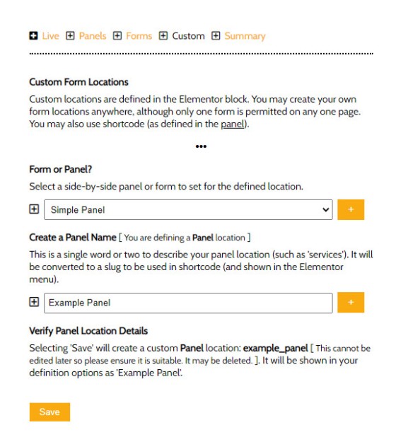
As you create more and more modules or pages on your website you'll have a need for more panel locations that we haven't defined for you by default. To add a new form or panel location we use the 'Custom' panel. First we select the type of subscription ('form' or 'panel'), then select a name, and Save.
Pictured: Creating a custom form or panel location. You select a name that isn't reserved, and then save. You may now assign a form to this location. As we'll describe shortly you may use an Elementor block or shortcode to return your new panel or form to your page.
Elementor Block
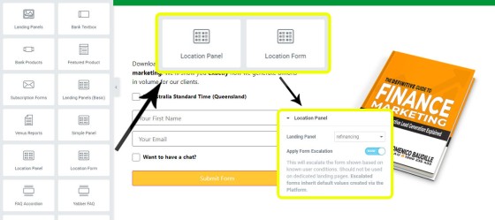
Elementor makes assigning dynamic form elements to your website very easy. You simply drag-and-drop the selected profile into position on your page, and you're done. You may have multiple occurrences of any single form; for example, you might drag your 'finance' form into five or six locations, and whenever the form or panel assignment is altered in Yabber the change takes effect globally - not just for a single form.
Pictured: Location Panel and Form Location Elementor blocks. The primary option is simply the form to be assigned to a particular location, and you may optionally enable or disable escalation for each form (although we recommend that it's always enabled).
The system-generated forms and panels, and those created by you are returned in the select menus in exactly the same format.
An optional shortcode may be used as an alternative to Elementor.
Conclusion
We rant on all the time about how necessary it is to create subscription (and calendar) forms or panels on every page, and the one-click assignments (and drag-and-drop panels) introduced on this page are just one of the methods used to enforce better practice.
For each of the default form types it's expected that in the life-cycle of your marketing program you'll also introduce a funnel off the tail end of each subscription type.
The reason for what we've described is clear: it converts far more business than the pedestrian experience your competitors serve. Used in company with a well-crafted Facebook experience your website becomes a conditional centrepiece of your marketing funnel and literally starts to create funnel pathways and conversions you didn't even know existed.
We understand that our marketing ideologies and our underlying conversion philosophies are often diametrically opposed to what you might be familiar with, but to quote Seth Godin: "Extraordinary is the opposite of what everybody else is doing" (if we were doing the same thing we'd get the same crappy results). We've drawn upon decades of experience to deliver a product we known will return you more business.


