The reason our marketing funnel returns far more leads and business than competing solutions made available to the market is attributed to a large number of factors, with just one of them being the Venus Report. In this article we'll look at the Venus report in more detail than previously introduced, and we'll detail exactly why it has such a significant impact on your general enquires and conversions.
The beautifully formatted Venus PDF 'Mortgage Report' is sent to a client after completing a set of step-by-step questions on your website. The user will answer various compliance-related and borrowing questions and the formatted report is generated on the basis of text responses created by you in Yabber. It's one of a few similar reports we use and it's extremely powerful. Since we first introduced the first version of the report several years back it's now evolved to the point where it plays a role in the conversion of several thousand mortgage clients every single month.
Qualification
There's no such thing as top-of-funnel qualification. Period. The purpose of a marketing funnel is to ingest as many into your funnel excursion as possible, and if qualification is necessary in any respect, you do so once a user is firmly planted into your process.
The client Venus Report is generated on the basis of asking questions that a broker shouldn't normally ask as means of digital qualification. As we'll repeat over and over, the questions and subsequent PDF report are designed to qualify you by having a user engage with an optional post-subscription experience that serves them with a real, relevant, and valuable asset. The fact a broker collects information that is often asked during a (flawed) qualification process is a bonus.
Top of Funnel
In the past we were quite reluctant to expose the specific details of our funnel excursions because our methods are so effective, and we were concerned that the industry charlatans might make an attempt at copying our IP. In the end, many have attempted to copy our Venus Reports but they've done so by way of introducing the ridiculous roadblocking 'quiz' as described above, and the silly 'quiz feature' introduces a business-debilitating bottleneck into the funnel process that is objectively costing brokers massive conversions. Sadly, the quiz-style copycat version of our 'questions' returned to an end user are almost always deceptive and non-compliant, never actually return valid information, and don't contribute in any way to the funnel process. In the end we determined it wasn't necessary to make such attempts as hiding our methods since the typical lead generation crowd simply don't have the expertise, technology, or skills necessary to implement any of our higher-performing solutions.
Once again, the funnel entry points are designed to ingest a user into your funnel, and no roadblock should ever present itself that limits the capacity of your funnel to perform the function it should be designed to perform. Your website, funnel, and development programs are designed to return Opportunities.
The Second Page
We talk quite a lot about the second page in a landing or any other subscription sequence, often called a "thank you" page because it's often wasted with a "thank you for your subscription, please check your email" style of message. By way of our Venus Report (or the alternate Savings Report) we will use the second page as an escalation tool and show other options to a user in order to dig them deeper into our experience. The result of this gamified style of relevance is that you completely leapfrog the competition that your clients are invariably exposed to and you qualify yourself above all others that share your space. Relevance is delivered immediately, escalation and funnel pressure is applied, and the subsequent customer journey starts to craft itself around a user's own borrowing requirements.
Our second page is essentially turbocharged by way of our proprietary Conditional Redirects which directs a user to a second page based on their first 'landing page' (or any other page) interaction. Each user engagement is different and each user will have varying contact objectives, so your funnel needs to cater for this by way of crafting pathways in real time that escalate their interest and commitment to your resources.
Our top-of-funnel subscription mechanism will do in two pages what will take others up to five to achieve, and because of the relevance delivered on the second page, our third-page engagement (conditional on the Venus responses) is up to twenty times higher than the systems you might be familiar with (a generic and extremely powerful subscription funnel is introduced in a scheduled article, and we'll expose the exact methods our clients use to generate over a billion in monthly mortgage volume).
The Venus Report is designed to qualify you - not the client.
The Venus Report Result
The Venus form a user will complete as part of their funnel excursion is shown shortly. On the basis of that form being submitted Yabber will perform a number of tasks.
- The report is generate by Yabber and sent to the user. Links and graphs are specific to the user competing the report.
- An optional text message is sent to the user.
- Optional email subscriptions take effect (if we know the individual is a First Home Buyer, for example, we'll subscribe them to that list).
- We record the submitted details of that user in Yabber so we can serve conditional content.
- A custom (and often conditional) redirect will send a user onto another third page which nests them deeper into the funnel journey (often showing a video).
There are a number of other actions that might be scheduled to take place on the basis of form completion. For example, when a user downloads the booklet we can optionally trigger conditional content, send a voicedrop or SMS, send another email, create a task, or fire off a cannon in your office - there's literally no end to the types of actions that might be programmed when an action takes effect.
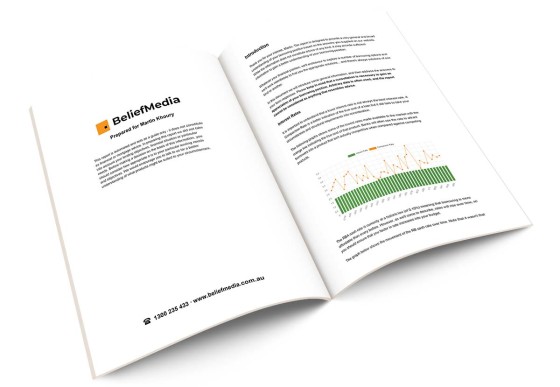
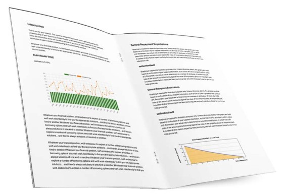
The first two pages of the report sent to the client will look something like this:
Pictured: The first two pages of the report. The report is typically around 15 to 20-pages in length, and includes information relevant to the user (placeholder and graphing information is introduced in a moment). The BM logo shown is obviously replaced with your own and the 'Prepared For' line shows the supplied client name.
The Website Form
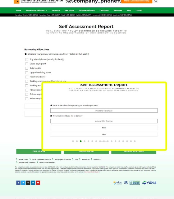
The form may be included anywhere on your website, although we'll often show it to users on the second page of a top-of-funnel conversion sequence (or the second page shown during a Facebook conversion). The form may be introduced to a page by way of shortcode or the drag-and-drop widget in the page builder. The form renders as a basic stepped form.
Pictured: The stepped mobile responsive Venus form shown in a 'naked' style. The page shows the 'Borrowing Objective' responses. The inset shows the property purchase and value questions necessary to construct the LVR and graphing-based responses. Remember, the report is an optional self-assessment (or education) tool; we're not asking these questions at a time when the user isn't prepared to surrender the information because the benefit is returned via the report, and completion is entirely optional. The questions are not in any way similar to the ridiculous quiz-style 'disqualification' questions often used as part of Facebook advertising.
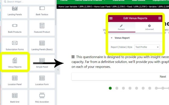
Pictured: The Elementor drag-and-drop Mortgage Report widget makes the process of adding a report to any page a one-second process. A style is selected and the report is saved. It's likely we'll add website-based styles in the next few days (meaning that you don't have to use a style created in Yabber).
Creating Venus Report Responses
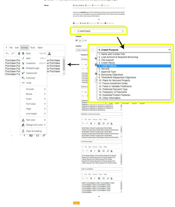
The most common method of creating a report presented to a user on your website, and creating the responses included within the report itself, is by way of the standard creation panel in Yabber. Each question can be altered by you, and the responses created to each answer are those that are rendered into the report.
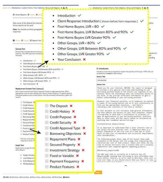
Pictured: Creating question responses to each question asked of a client. A full WYSIWYG editor is provided so the experience isn't dissimilar to Microsoft Word. Images, formatting, tables, and other elements are easily applied. Each text box may be expanded to full screen for easier content creation. As introduced below, the option to create a single generic response is an alternative to answer-specific responses.
In version 2 of the Venus report (the version we've just replaced), there was a requirement that every single client response required a broker response by the broker. However, there are cases where a specific response isn't necessary, and other cases where brokers simply lacked the time to create individual responses, so we introduced an alternate single response that would optionally override the question-specific responses. In fact, we completely removed the LVR-based responses in the standard question panel and migrated that feature into the longer-form text panel because it gave each broker more scope to include more engaging information.
Pictured: Alternate single answers may be provided for any Venus response (applicable in cases such as Fixed versus Variable responses where you may want to include competing arguments). In the case of each text panel we include response text by default. You simply then alter it to your liking and perhaps include a few additional graphs.
Some sections are required to be competed as single responses, such as the Introduction, Conclusion, and now, the LVR response (mainly because of the significant use of graphs relevant to the user and their payment schedule).
Placeholders, Graphs, BM Code, and Shortcodes
Various placeholders can be used at any time anywhere in your responses. The most common placeholders are %%cashrate%%, %%value%%, %%borrow%%, %%lvr%%, %%fn%%, and %%ln%%. We also apply some standard image placeholders that return standard graphs and mathematical formulas for illustrative purposes, such as %%interest_comparison%%, %%cashrate_history%%, and %%daily_interest%% (if you're a Yabber user these placeholders are introduced in Yabber's Venus information panel).
Outside of the WYSIWYG (point-and-click) editor we use BM Code - a type of simple code to return images, links, and apply formatting. The code in these sections are used because of the control you gain over the use of dynamic data, such as the inclusion of powerful user-specific graphing illustrations. For example, an image is returned by way of BM Code resembling [img]https://www.beliefmedia.com.au/test.jpg[/img], a link is created by way of [link=https://www.beliefmedia.com.au/test.jpg]your text[/link], and a standard title is rendered in a textbox with the BM Code of [title]Your Title[/title] (numerous other BM codes apply). It's very easy to use and ensures that the report is presented in a professional format.
Pictured: Graphs should be included everywhere within a mortgage report. Their inclusion is made by way of simple placeholders or shortcode.
An example of the graphing shortcode is as follows: [graph amount="700000" rate="2.5" years="30" frequency="m" type="loan_balance"] returns a fully formatted repayment schedule graph within the report. An advantage of our shortcode is that the user placeholders may be used within the actual shortcode instead of hard-coded values, so the graphs are always based on borrower attributes. Placeholders will always return graphs for the specific user. We provide up to eight standard graphs that can be used anywhere (and the more graphs the better - users love this kind of stuff).
Links and Triggers
Venus triggers are essentially divided into two categories. Early triggers are associated with the user downloading the created document, and the latter triggers are associated with internal report links (the links within a report are created specifically the individual user requesting a report).
Triggers are a defining feature of any high-yield marketing funnel because they create engagement, provide funnel-based course corrections, and manufacture website pathways.
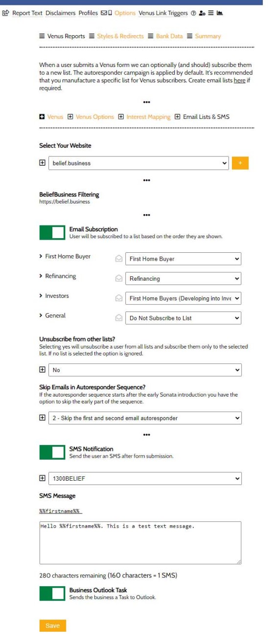
Pictured: Venus Download Triggers. The initial download triggers include a text message and email subscription (which optionally launches a relevant email).
All the links you create within a Venus Report are trackable for the specific user that has received it, so actioning a click within your document can trigger text messages, emails, tasks, or anything else. This kind of digital persuasion has a massive impact on the success of your campaigns but it's largely ignored by many because of the technical hurdles necessary to introduce such a feature. Our report creates this tracking by default but the triggers themselves are defined by you.
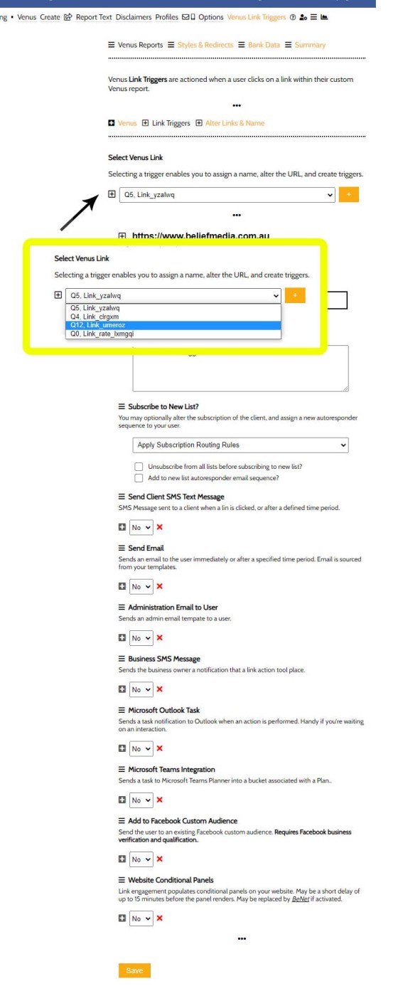
Pictured: You may include as many internal links as you choose, and each of these links may optionally have a set of associated triggers. Triggers are introduced in an article titled "How Triggers Help Craft a True Marketing Funnel Journey".
Our mortgage broker website includes a large number of FAQs that dive deeper into various types of subject matter, and we provide other pages on the periphery that support a funnel journey, such as calculators. It's these pages on your website that should be linked to most often, thus creating a unified and integrated funnel experience where information gained from one resource is passed onto another (your website learns more about your client based on having them land on your site from a report).
Report Styles
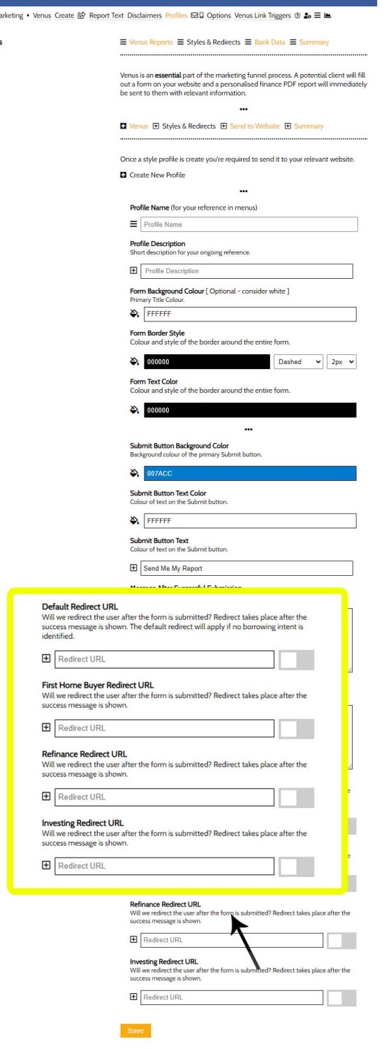
The look and feel of the questions on your website may be styled to your liking. The style profiles are created from a standalone panel, and it's expected that each report will include its own associated profile. The reason for the standalone profile (easily copied if duplicating a style) is because of the associated redirects associated with each report. Based on certain responses in the report we're able to easily determine interest, and this can force a redirection after form completion to a relevant and escalated page (often the third page in an early subscription engagement).
Pictured: Each individual report occurrence inherits its own style with custom form redirects. The redirection page further escalates the user experience and drives the user deeper into our funnel experience. The redirected page is often the third page in a standard report sequence.
Where Should a Venus Report Questionnaire be Shown?
A standard Venus report questionnaire can and should be shown anywhere. Our 'standard' mortgage broker website includes the form within the resources section of the website, but it's feasible you might even show it on your front page (we have another 'Savings Calculator' we're updating and expect it to be relevant and useful as a front page resource).
The typical location for a report is the second page after a subscription. Once the user is subscribed - and not before - we'll offer the report so the client can learn more about their borrowing position. The report itself is designed to create a phone call or other form of contact.
Statistics & Compliance
As a consumer-facing marketing asset all reports and text sent to your website are recorded in an archive. Additionally, all created reports are maintained in a repository and may be reviewed by you at any time.
Marketing is nothing without data... and this is why we record all report statistics, including the number of reports created, downloads, and link clicks. Each report is linked to a user, and all user data is recorded via our website statistics so we're able to identify the specific pathways a user navigated before completing a report, and you're able to review all the engagement associated with a specific user.
Version 3.0
The latest changes introduced to Venus represent the third major change to the report structure. While a number of features were added, the primary motivation was a complete rebuild of the PDF creation engine necessary to generate full and complete property reports (the reporting tool will be made available to Yabber subscribers shortly and we expect that they'll have a massive impact on conversions).
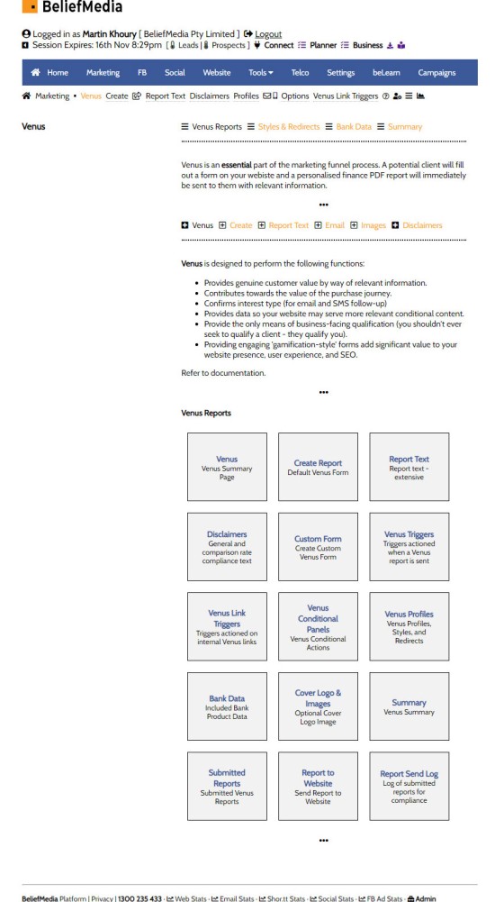
Pictured: The Venus module in Yabber. Existing users will note the addition of various menu items that introduce new features (many are not discussed in this article).
The updated PDF engine permits the creation of version-controlled, fully-trackable, and completely personalised PDF documents of any kind. This method of creating reports is currently in test and will shortly be handed off to Beta testers before a general release.
An extremely funky feature of the newest report includes the capacity to include comparison-based bank products based on the attributes of the user submitting the report. However, we're still navigating the compliance aspects but expect to include the functionality later this year.
There are a number of other features that fit into the 'advanced basket' in that the tools are available when marketing matures to the point where they're required. Most of the features are integrated on the website; for example, when a user submits a form that information is recorded in a cookie and active session, so we're able to use that data in order to shape an experience based on a declared interest. Other features might swap out the front page for another that is relevant, while in other cases we'll update various conditional panels to present more relevant information to a user.
Conclusion
Part of the reason we're able to seriously amplify the effect of organic and paid promotion is because of elements such as the report we've just introduced. A marketing funnel is more than just a transactional name and email, and it's far more than an email sequence. The reason we've multiplied lead generation by nearly 40X for some of those we've inherited from the poor-performing industry programs is simply because of the way in which our three-dimensional funnel makes the simple subscription experience come alive - we create immersive and powerful pathways into your business by way of tools and facilities on the periphery and in the funnel that qualify you as the business of choice. The Venus Report is just one part of this funnel equation... but it's an important part.
In a scheduled article titled "A High Performing Mortgage Broker Facebook Conversion Funnel" we're going to piece together a large amount of the information we've shared on our blog over the last few months, and we'll provide an example of how our subscription-based conversion funnel, and the nested marketing funnel journey, has returned up to 37X more volume than competing experiences (although that's the exception... we normally we see initial improvements of about 500%).
The Venus Report will change your website experience, supercharge your Facebook marketing, and assign serious value to your funnel experience.


