A few days ago we looked at how to build a naked landing page in WordPress for a basic self-hosted experience. The code we shared removed the header, menu, footer, sidebar, and any other unwanted elements from any WordPress child page (associated with a parent page) for a true landing page experience. While the blank canvas was suitable for a linear landing experience, it's not uncommon to build the landing page in columns to negate the need to scroll for a call-to-action when viewed on a desktop computer. For mobile devices, the responsive columns should stack as if the page was built in a top-to-bottom manner.
First, there are plenty of WordPress plugins and page-builders that'll create nicely formatted columns. While we have our own plugin that we make available to our own clients (BeliefMedia Columns), and we have turnkey-style pages that we build based on populating text-fields, video IDs, and so on, sometimes it's simply easier to build the page manually. The purpose of this article is to demonstrate how easy it is to create two equally-spaced columns without the use of shortcodes. While the pages don't solve the problem of garnishing statistical data in the same way as our premium products, this issue can easily be solved with Google analytics, or by way of a simple function to simply track page views in a session or similar.
If you've enlisted the services of digital marketers and they have utilised third-party landing pages, they're demonstrating their ineptitude by doing so (it's a problem we're seeing over and over in the finance space). The simplicity of self-hosted landing pages is intrinsically connected to the browsing and branding experience, and the self-hosted pages translate to far higher conversions than might be seen on third-party services.
The Result
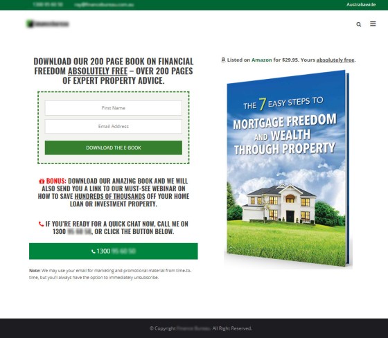
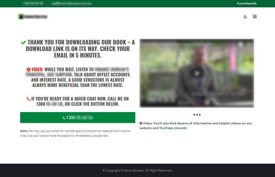
An example page that might be built using our very basic code is as follows. I've included two examples that were built a few days ago (they've been de-identified).
If you're somebody that prefers email options to launch in a modal popup, that functionality is available in our Landing Page plugin (with dozens of other features).
Obviously, as with all web design, all landing pages should be mobile responsive. The above pages stack as follows on a mobile device.
The Code
The following code will work within and outside of WordPress.
Copy the following CSS into your custom function CSS file. If you wanted to conditionally show the CSS only on landing pages you could incorporate it into the PHP function as provided in our article here (under the title of "Hide Distractions From Your Landing Page").
Using the text tab of your content editor, use the following code.
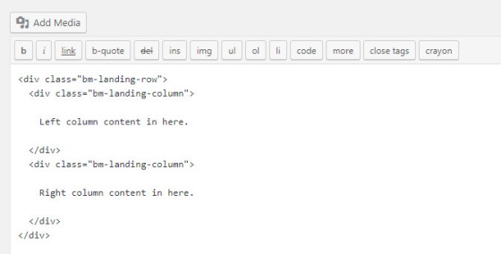
Here's what the simple HTML looks like in the WordPress editor.
Because we're writing code in the text editor, switching to the visual editor will screw up the code.
Considerations
- You can funk up the page however you wish with a page background image and whatever other feature floats your boat.
- If you're using our email plugin, enter the shortcode into either column and it'll scale itself as shown in the above images.
- If you include video as we've shown in the example image, or you include any other content, ensure it'll scale correctly in a responsive manner on mobile devices.
- Despite our code providing only a basic landing page experience, it'll often convert far higher than anything fancy. Every feature you add to a landing page potentially distracts from its main purpose.
- Use Google Fonts
 and Font Awesome
  to jazz up the page a little.


