We're noticing the same flawed 'funnel' experience repeat itself over and over. Given the finance industry in particularly has accepted mediocrity as the new normal we're seeing lackluster landing page (and larger funnel) experiences that are flawed in such a way that they're seriously diminishing the returns that might be achieved from paid or organic traffic. This article showcases some of our proprietary self-hosted technology that provides a high-converting experience that our competition simply cannot provide. While we've titled the article "Making The Second 'Thank You' Landing Page Great Again", it's a somewhat misleading title since we've optimised every touch point in the sales journey; this article simply has an emphasis on that second page shown during a landing page transaction.
 now provides a far more comprehensive suite of tools that'll make the second page even greater.
If you're allocating a budget into paid promotion your Return on Investment (ROI) should be the focus of your efforts. While the Customer Lifetime Value (CLV, or LTV) is a longer-time consideration we work relentlessly to improve upon by way of our unique and proprietary EDGE (and other) systems, your immediate returns are just as important to us. We want to put as little into our marketing efforts in order to return the highest yield (and we return the lowest cost conversions in the industry). So, in this short article we're going to look at what a high-converting two-page landing page experience should look like in the finance space. We're going to show you just one small part of our broad high-performing funnel strategy that details exactly what we do to achieve our industry-leading conversions.
If you're using third-party landing page services this article will start to illustrate why their integration into your own sales experience is a seriously flawed approach. No self-respecting professional will ever advocate their use (the bottom-of-the-barrel and carbon copy worst-practice solutions are usually peddled by the guys calling themselves "Facebook Marketers").
The First Page Experience
The landing page, or the first page that you're redirecting your traffic to from paid promotion, normally provides a lead magnet such as an overwhelmingly irresistible lead magnet (that absolutely delivers on your promised claims) or perhaps one of our high-performing webinar presentations. Your advertising makes a promise, your landing page provides incentive, and the product itself delivers upon the promise. The second page - the focus of this article - is generally (and carelessly) used as a generic 'thank you' with an option to escalate the relationship into a booking... normally resulting in a slow-loading third-party calendar. Generic solutions return generic and poor-performing results.
So, the typical experience (often as how we describe it for the sake of simplicity, and exactly how our competition will implement it) is as follows.
When a user visits your entry landing page for the first time there's a good chance they're genuinely interested in your service and want to make first contact by way of a booking or by proving a return phone number. Does your landing page provide this immediate option? Providing a phone number link might be obvious, but excluding the optional calendar booking option is an almost entirely consistent experience. We can only assume that the limitation is a result of poor knowledge or lack of technical expertise.
Pictured: A Call to Action is a required inclusion on the first page but it's not a mandatory field for the user to complete. We'll always hide the options for a calendar booking in an (optional) expandable blind and never show the unnecessary option as a required field on a cold first page. Any field other than what's absolutely required will compromise your conversions. However, an early conversion presents us with an early means of building upon that early commitment.
Remember, the preferred transaction that takes places on any landing page is that of contact via an immediate phone call or booking; the subsequent email campaign that invariably follows is a secondary means of conversion. Providing an optional calendar option hidden until asked for does not impede upon the funnel flow. In fact, it has the entirely opposite effect; nearly 80% of all the calendar bookings we're seeing are coming from the first page.
Note: Our calendar booking options are simple to use. An intuitive select menu with available dates populates available times in the second dropdown menu. If you have a busy calendar we provide the option of a single select menu with all available dates... and for the sake of it we provide a full calendar (although we generally won't ever advocate use of the latter; a full calendar display for a weeks worth of bookings is a roadblock to conversions). Additionally, we never ask for the user's name and email a second time (another potential roadblock). The booking is sent directly to Outlook.
Funnel Segregation (The "Second Page")
If contact via the first page of our funnel can result in either a basic email subscriber, a phone number, or a calendar booking, it stands to reason that we'll treat that individual with appropriate respect and deliver a second page that is most appropriate.
Our basic two-page landing experience maps out in three ways.
- Redirect the first page to a single page or to a split campaign.
- Redirect the first page to an off-site URL (remembering that all our landing pages are integrated into your website - never use a third-party landing page service).
- Return the user to a page (or split campaign) based on their interactions on the first (our preferred method).
Those that consider themselves our competition generally don't have the expertise to vacate beyond the first option... and while then they may split test advertising they rarely split test landing pages - an essential action if you're serious about your conversions.
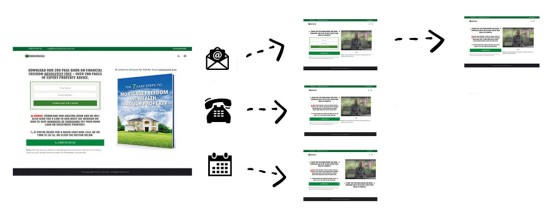
Our preferred means of redirection to the second page is predicated upon conditional first page interactions. This means that basic subscribers, those that provide a telephone number, and those that make a booking, are all treated differently. Coupled with the "First Email" and associated relevance you might easily double your existing conversions using this technique.
So, our conditional landing page redirects might translate to the following:
In the above illustration, it's only the email (subscriber) response that has resulted in the expanded calendar rendering on the second page. The telephone and calendar bookings might return a page with more information, such as information on the "First Email" (perhaps introducing the advantages that might come from completing the fact-find-to-PDF questionnaire). Attracting an organic or paid audience to your page comes at a price, so knowing that conversions organically drop off with every page load we should only show landing content that is entirely relevant and designed to convert in some way; the method described above is the only means in which to achieve this end.
It's important to note that we don't present the conversion-destroying 'qualification' questions (in our funnel workflow) that have becomes somewhat of a staple of the mediocre funnel experiences floating around the market. The funnel experience is not initially intended for you to qualify the lead - it's for them to qualify you. Rather, we introduce the fact-find or more detailed compliance questionnaire in a follow-up email. In the spirit of "qualifying the broker", the second questionnaire builds a PDF report based on programmed responses and immediately sends the high value PDF to the client upon completion (copying in the broker, or course). If you want to qualify your services in the mind of a client this kind of high-level automation is the key to making an impression; remember, some of your competition are asking a bunch of irrelevant and conversion-blocking questions at the time of making a calendar booking (on their off-site third-party calendar tool).
With all landing pages, and all other pages in the lateral funnel journey, we rarely use a single page. Instead, we'll redirect to a pool of options created via our Landing Page module (for "Split Testing"). Based on a large number of interactions we're able to create a sequence that returns more than the others... and then we'll use it as a control group and split test other pages until we see a measured improvement.
Personalisation
First, it should be noted that we've built our own system for returning high-yield landing pages within your own website... and quite frankly, the products we're seeing in the marketplace made available via third-party landing tools are utterly sub-standard... particularly when marketing is not a small expense (you expect quality).
Part of the reason we tirelessly espouse the principle that your website is "Important as Ever" and that "every website entry page is a 'type' of landing page" is because online conversions shouldn't be relegated to what are often 'hidden' or head-to-find landing pages. Your website should be a conversion machine and your (marketing-based) landing pages and your website should be intrinsically connected. Discussed more in this article we look at how the data obtained on any part of your website should be used on other parts of your website. For example, consider the following limited examples:
- If a user subscribes to a mailing list, downloads a lead magnet, or makes any kind of booking, we potentially have their name, email, telephone number, and booking details. This information is recorded in a cookie and is saved to the active browsing session so we're able to target them in other ways within the confines of your own domain by way of serving relevance. If they've subscribe to a particular offer we won't show the same offer again; if they've made a booking we can show a booking link on our website with an optional 'edit booking' link; and we can personalise their ongoing experience by using their name when it's appropriate. Certainly, any form they fill out in the future will be populated with data we've kept on record (conversions increase enormously when all a user has to do is hit "submit"). Those using third-party landing pages are excluding themselves from this extremely high-value opportunity to continue serving relevant information on all areas of their website.
- We resolve a user location (as best we can) and may potentially serve geographically relevant information within our website (say, relating to state-level First Home Buyer information). If our visitor has identified themselves as an investor by way of their interactions (normally on a landing page or any on-page subscription form) we can continue to serve them relevant information that is more likely to assist with their online research. All geographic data is save in a cookie (and page session) and is all available to use anywhere on your website with placeholders.
- Shown here in a scheduled article (and provided to our Mortgage Mailing list subscribers as a free plugin) we provide a menu our users can use to save relevant pages into a bookmark feature without having to log in (details are recorded in a cookie). If the user has subscribed to any list we make the association and call it "John Smith's Bookmarks" or similar (the name of the menu is set via the plugin).
The relevance to the "second page" in the landing flow is that we return a page that is not only relevant to their interaction, but also customise the page with a number of placeholder that allow us to render a name, phone number, booking date, and so on. We also track page interactions and build a profile on the individual seeking counsel.
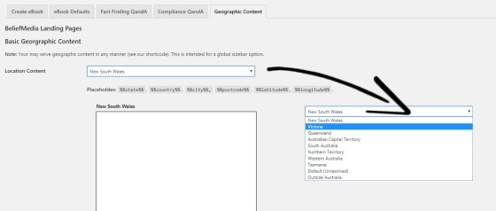
Pictured: We provide an option for geographically relevant content in our plugin but a number of placeholders are available at any time in any content (they add to conversion incentives on that 'second page') Conditional content is also available via shortcodes; for example, we'll only show specific content if we have a booking or first name.
Bottom line: Personalisation is imperative for a high-converting online experience.
Creating The Redirect Condition
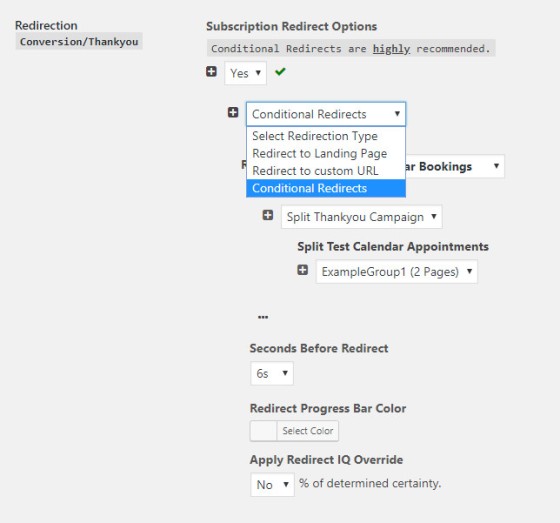
The redirect options are defined at the form level when creating each subscription form.
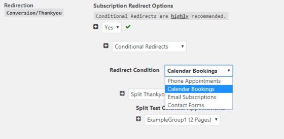
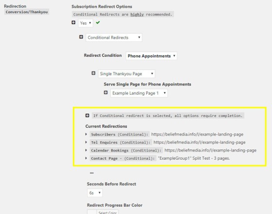
Selecting each parent option requires a selection of the child option. If "Conditional Redirects" is selected you should provide a landing page or landing page split campaign for phone appointments, calendar bookings, email subscriptions, and contact forms.
To select a specific landing page for the redirect we simply select the appropriate page from a select menu. If selecting a group of landing pages for split testing purposes, select a Split Campaign.
Once all the redirections to landing pages or split campaigns are in place, the details will be shown by default in the 'Redirections' panel (as pictured below).
Again, the option to discriminately send visitors to a single page or remote URL is available. There may be times when this option is valid (normally when you don't show a calendar or any other booking option).
Redirect IQ
The "Apply Redirect IQ Override" is a unique tool we've developed over a number of years. While there's a couple of marketing agencies serving the finance market that throw the "Artificial Intelligence" term into their sales pitch for the sake of elevating their product value, they are in fact misleading you. In fact, our algorithm is the closest you'll find to AI in the market (and it's still far from AI). It "learns" behaviours of specific visitors to your website and determines their likely level of commitment to particular product groups. The BM Platform returns a percentage to each page before a redirection takes place and applies an (optional) "corrected redirection" to a landing page most likely to convert. We generally recommend setting to around 70% to achieve best results.
The probability takes individual user actions, other user funnel-flows, aggregated statistical data, and a time-variable object in order to return the most accurate result.
Creating Landing Pages & Split Campaigns
The nature of creating landing pages and groups of pages for split testing is entirely intuitive and will be discussed here (it's the only fully integrated and self-hosted experience in the finance market).
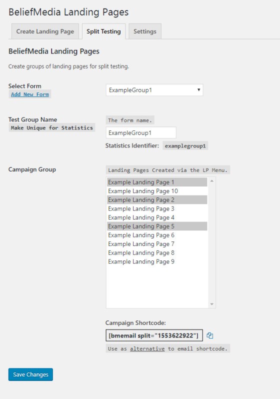
Pictured below is the intuitive manner in which to add pages to a Split Campaign. Tracking is accomplished via our own pixel in addition to other integrated analytics.
The First Email
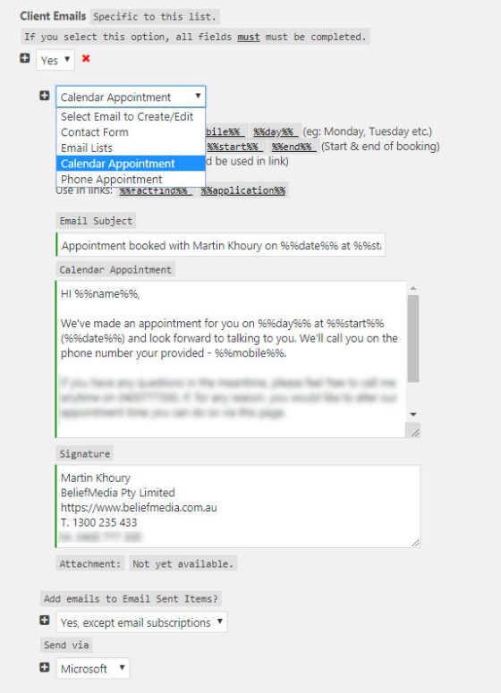
A successful funnel journey is more than a landing page experience. While our Symphony email experience is curated in a manner that quickly establishes you as the business of choice (supported, of course, by the highest value lead magnets or "relationship offers"), it's often the first email experience (the "handshake") that has a significant impact upon conversion success. Not unlike our landing pages, our first email is also based upon page interactions (and it's one of the many conditional features of our "simple" subscription experience.
The marketing funnel experience is made up of a number of moving parts that play together to deliver upon best business and customer outcomes. The "First Email" will be discussed more here.
Conclusion
Landing pages shouldn't follow a standard linear workflow. All users aren't created equal and neither is their funnel journey. Each is curated based on any number of interactions (more than we've discussed here), and each funnel experience needs to be optimised relentlessly in order to maximize upon your organic and paid lead generation.
No technology is effective unless it's supported by high-end promotions, and this is another area where we leave our competition in our wake.
There's no question that our funnel workflows and other lead-generation strategies are industry-leading. If you're interested in learning more please call us on 1300 235 433 (1300 BELIEF) or make a booking with one of our experts here.


