This month we introduced some changes to our Mortgage Broker Website Framework. For many brokers, their priority is owning a website that provides a compelling funnel-based presence that genuinely converts, but they're not necessarily interested paid or promoted lead generation options - the reason for which the early framework was built, so we have recently commitment additional resources on our end to support more robust and powerful website features and modules in the future. This article details what the current mortgage broker website framework looks like.
This article will provide a type of visual sitemap of the pages shipped with the website framework, and we'll details a few of the modules that are forthcoming. The website is now far more of an organic tool in that we have far more capacity to add various pages, or make certain types of content available to you, as a managed resource. The website is owned by you, so some parts of the product are fixed on delivery, although this provides you with the capacity to take ownership of the asset and develop it in creative and unique ways.
The website is supported on the backend by Yabber, our digital marketing and social media system. Yabber contains hundreds of marketing modules that performs a variety of tasks.
Mortgage Broker Website: The website is delivered with around 200 primary pages, and with the search facilities, this explodes to around 120'000 pages of information (with every page a potential organic entry page). The focus of this article is on the consumer-facing pages that guides each user on crafted website funnel journeys, with the primary cornerstone content providing users with the necessary information that'll qualify you as a broker. The integration with Yabber isn't introduced in any detail in this article, and the links at the end of the post should be referenced for a better understanding of Yabber's marketing and website tools.
Lead Package: We have recently added two new tiers of products: the website only package, and the lead package (the latter is a product we prefer you didn't buy).The 'website only' package (what we're calling a 'Bronze' package) has limited access to the resources made available in Yabber.
Pictured: This article is long, and a lot of modules are introduced. At the end of the day, remember that what we're introducing is just a website, and it's easy to use and simple to manage. The website framework is designed to convert organic, social, and promoted funnel traffic of any kind. The website includes a number of modules that are managed by us, such as articles, RBA tools, and real-time notices. Please call us at any time for more information.
Links: A lot of resources are reference in this article, so rather than include links everywhere, we've created panels at the end of the article that reference related articles and content that support the broker website marketing packages.
Bottom line: the framework we're about to describe will return you more organic and promoted website conversions than the typical generic products. Done right, digital has the capacity to fundamentally change your business.
Landing Pages and Promoted Funnels: The landing page system used with paid promotion is detailed at the end of this page. Many of the tools come together in an article where we describe a single promoted funnel option.
Lead Generation
It doesn't matter if you're interested in supporting your business with an organic resource that'll attract traffic via social or SEO, whether you plan is to provide a platform that speaks to your expertise and authoritativeness when dealing with partners or referrers, or whether you intend to launch paid promotion, the framework is designed to support anything you throw at it, and the paid promotion aspects are crafted in a matter of minutes.
No broker should ever buy a lead when it's so easy to do yourself, and we're providing a solution that allows you to attract leads for a fraction of the cost associated with buying blocks of overpriced dud leads (that were attracted via unethical or non-compliant advertising outside your direct control), and the system is scalable, compliant, and fully owned by you.
A scheduled article will demonstrate how to create a conversion funnel (one of many types of funnels), while another article detail how the one-click Solis system operates (it creates in a single click what others charge up to $14k to build), and another article demonstrates the ease of creating dedicated landing pages. These articles showcase some of your website features applied in a promoted setting, and they should be referenced for a better understanding of the facilities that support website lead-generation.
It is truly staggering how many brokers say that their website doesn't return them business. You cannot and will not have an effective website funnel unless it supported by an integrated, conversion-focused, website experience. What was once an entirely cost-prohibitive style of website and marketing solution is now often more affordable than the setup fee for competing products.
If you're engaged with paid promotion on Facebook, YouTube, Google, or elsewhere, we'll show you how you may massively improve on your conversions and deliver leads for cents on the dollar.
Landing Pages and Promoted Funnels: The landing page system used with paid promotion is detailed at the end of this page. Many of the tools come together in an article where we describe a single promoted funnel option.
Your Website is More Important Than Your Shopfront: I ran my own brokerage with significant exposure to vehicular traffic. Our first location was more of a billboard than an open office, despite the fact we operated a cafe for a few years. If your shopfront is a billboard, you should have signage that clearly directs passing motorists or pedestrians to a phone number or web address, with the latter delivering far more business than any other source. My brokerage's second location had far more exposure and was somewhat of an iconic building... but it is and was essentially an expensive billboard. If you do have a shopfront, consider using a street-facing TV screen with Yabber's 'TV Wall' module. Either way, your web address must be prominent.
Requirements & Delivery Time
There are two general requirements that currently apply for using the Yabber website product.
- Microsoft Business 365 Subscription. Microsoft integrates with Yabber and your website by way of email, calendars, tasks, OneDrive, and Tasks (and soon, OneNote). We introduced MS365 as a requirement because it complies with legislated archival requirements, and it allows for a fully future-proofed white-label solution. The email marketing system allows you to send 10k emails per day, easily integrates with calendars negating the use of dreaded off-site resources, and it permits (if enabled) all marking emails to be archived in your 'Sent Items' folder. We've built our email marketing system around the MS365 product, although limited resources are available to Bronze users (you will not be able to create your own email campaign, for example, but you will be able to create autoresponder programs).
- Telstra SMS Application. SMS systems in the mortgage industry have been exposed to an array of fraud over the years, with notable mention going to the 'free' providers scattered over the web. Of course, these services are not 'free' - they are tools run by nefarious actors that provide middle-man attacks on the data shared through those systems. As a means of ensuring complete ownership and unquestionable compliance, we create a Telstra application in your company name. A 10-digit Telstra account number will be provided and all SMS costs will be billed directly to you. This distancing from the charges associated with SMS text messaging gives you complete ownership of the system, and it permits us to keep costs low. After a long period of evaluating various provides, we determined that Telstra was the most compliant facility, and it was one that included functionality that outperformed all others on the market. The system is compliant and satisfies all legislated requirements. The Bronze package is limited in that you cannot send larger-scale 'SMS Campaigns', but you may assign text messaging to website forms and other types of general website interactions.
No fee is applied to the setup of these services, but our terms should be reviewed because if a cancellation is made after contract, a fee will usually apply.
Delivery time is less than 7 days. This may extend if you don't have a MS365 account, and there may be a delay if we encounter (unlikely) issues with your MS365 subscription. If you have an existing MS365 account, delivery can often be arranged on the same day (workload permitting). The website is delivered as 'Under Construction', and you simply flick a switch to make it live after you have carefully reviewed the product in full (making a website live will always be tasked back to you). Delivery time over holiday periods will usually be longer.
Advanced Features
Your website framework is more than just a website. Comprehensive statistics are maintained, triggers may be applied to page views and links, and there are literally hundreds of features on the periphery that amplify the effectiveness of your organic and promoted funnels (some of these features are introduced at the end of this article).
One of the more significant broker website features that is rarely introduced to businesses because of the perceived complexity is conditional content, or content that changes shape based on the resolved borrowing objective of a single user. One of the most valuable funnel commodities is the attention of your user, and this is delivered via relevance, and relevance is obviously a core attributes necessary for a conversion, and conditional content serves this objective.
Website Framework
The website framework is dynamic in that it may change shape over time. If you're participating in certain programs you will see pages and tools added regularly, and all subscribers will now see FAQ and other pages added almost weekly (the continued addition of FAQs now applies to all subscribers).
The pages listed in this article should be considered out-of-date (with the exception of FAQs, which are updated daily). We're currently adding pages at least weekly.
A demonstration website is provided at BrokerGrowth.com.au, although this product should also be considered out-of-date (and we take it down every few days to replace it with an updated version, so if it's not there now, check back tomorrow). The demo doesn't show the large number of pages that are hidden from typical navigating, and many of the features aren't enabled. This article provides further insight into the framework's purpose, and why our unique methodology will return you more business.
Standard Pages
The standard pages are those such as your home page, blog, team page, and about us page - all required for users and search engines.
Home Page
The home page is comprised of a number of converting elements. Each primary block on the front page is determined by content settings applied in Yabber - this allows you to change the front page CTA text, primary subscription panel, primary CTA button (video or link), primary text above lender icons, and the video panel (a panel of three videos at the bottom of the page).
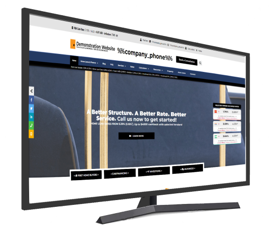
Pictured: Mortgage Broker Website Framework. The top of the page includes the call-to-action text and buttons, and the top of the primary subscription offer. You'll note that the page includes a number of converting elements: primary CTA, Simple Panel, lender panels, primary video and video panel, testimonials, linked lender icons, and more. Most panels may be updated in Yabber making it very easy to alter font page content. There's a number of pages linked from the header menu, and a number of pages linked via the footer. Other page assets are options, such as header messages, footer banners, modals etc. Every front page asset is designed to convert, and every option was specifically crafted as the starting point for a website funnel. The page is entirely customisable - in terms of branding and images - via a single click panel. It is extremely easy to use.
For advanced front page usage, optional conditional escalation applies, so various values may be applied to each front-page block, and if we're able to resolve the borrowing objective of the user that content will be shown instead. This conditional feature is advanced so we recommend you ignore it initially. Another module we call 'Switch' will completely swap out your front page for another based on the resolved understanding, niche, or profession, or your visitor. The front page includes a large amount of up-to-date lender data based on your defined accredited lenders in Yabber, with each lender - including lender icons at the bottom of the page - linking to other resources that craft our performing funnels.
Blog
Your blog is the epicenter of your creative universe, and continued engagement with your audience by way of content and video will have a tremendous impact on your organic success. Yabber subscribers will see automated article content submitted to their website, although we do actively discourage our article service, and instead make various tools available so brokers are able to more easily able to create their own original content.
Contact and Appointment Page
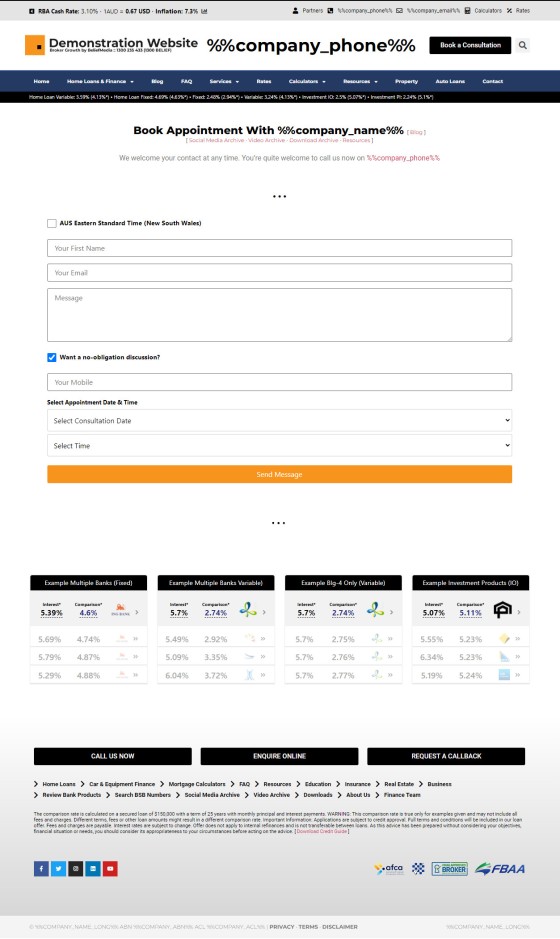
Both a contact and appointment page are required by legislation, and various search engines require 'one or the other' in order to provide full-featured search listing. The difference between the two forms is that the contact form provides a checkbox that reveals the optional calendar booking, while the appointment form shows all fields by default. We obviously integrate with Microsoft, so all submitted calendar bookings are sent to Outlook.
Pictured: The difference between the Appointment page and the Contact page is the former will show the Calendar options by default (usually without the checkbox). Both are require for different purposes. You won't use an orange button - this is because our own forms were 'dumped' into the demo.
The only time the phone number is enforced in a form is when a calendar booking is made. Again, the calendar is linked to Outlook and shows available slots based on your current availability. Different forms may be set up for different users.
About Us, Team Profiles, and Core Values
The About Page may be manufactured in Yabber (we'll simply apply some text in two columns and a primary headline), or you may add your own block using the Elementor integration.
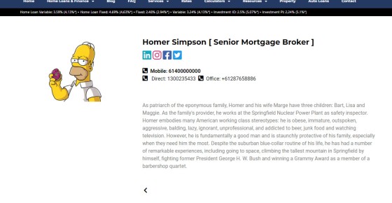
Staff member profiles are created in Yabber and then sent to your website. The primary teams archive page will show each of the active team members with a link to their primary bio page. Various options apply, such as a feature to add social links, phone number links, and so on.
Pictured: The Teams page recently underwent some updates and now provides options that make the system a little more usable and scalable. Each team member profile may be styled to your liking, and various presentation options apply. The article on teams should be reference for more information.
Pictured: Team profiles are created and managed on your website in Yabber, as are the profile images. Each widget links to a profile page with a full-featured bio. A large number of customisable options apply.
Core company values are created in Yabber and sent to your website. They're shown on a standalone page that you may style in any manner of your choosing.
Other Top-Level Pages
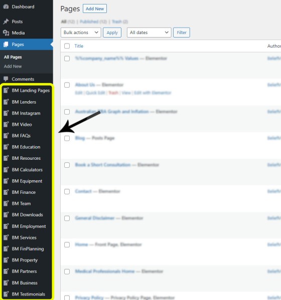
Your website is divided into a large number of 'modular' post types, so only page-style content is shown within the 'Page' archive. Additional pages are detailed below.
Pictured: A standard WordPress installation includes just Posts and Pages which seriously compromises on your ability to effectively scale your digital presence. Multiple post types are included and are all handled differently by the Yabber API.
Privacy, Terms, and Disclaimer Pages
Privacy Policies, Terms and Conditions pages, and Disclaimers, are all created in Yabber and simply sent to your website (we provide an initial template when creating new policies). Older policies, when updated, will be archived in full for compliance purposes. An always up-to-date link to your credit guide references Yabber's version-controlled document manager.
Australian RBA, Inflation, and Exchange Graphs
The RBA Cash Rate and Inflation graphs are shown in a standalone page within the page archive to ensure it attracts top-tier importance. It is linked via the header of your website (when viewed on a desktop) and the page provide a cash rate graph, comparison graph, and inflation graph.
Graph: Various graphs are included everywhere - some JavaScript and others via our Image 'LoanCalc' Graphing API. Graphs illustrate a point, so it's only prudent to include them everywhere. Numerous graphs are shown by default, and other up-to-date information may be returned anywhere with shortcode, such as the current cash rate of 4.10% (returned with the shortcode of [bm_cashrate]). Other up-to-date information types include inflation, product rates, and currency exchange rates.
Other styles of graphing, such as the exchange graphs, are shown when required:
Pictured: Exchange graphs are shown on standalone currency pages. Graphs are retuned in JavaScript or Image formats.
Medical Professionals Home
All websites are shipped with a single page for Medical Professionals for the purpose of applying the page to the Switch module (so incoming medicos will see your front page as a medical website). Additional professions are lilted in the 'Finance' module. We've seen some brokers create more than 100 pages for different professions in order to support various Switch and Conditional modules, although it's an effort that has to be justified (each of these 'dormant' pages are SEO-optimised, so they're ignored unless applied, but they'll always be found despite the fact this and other similar pages are not linked from any menu).
Finance & Mortgage Cornerstone Content
The following pages are currently listed in the 'Finance' module. This is your cornerstone website content and provides an initial entry point for those looking for specific type of finance. If you do not have these pages you will not rank with authority in search engines, even at the local level. As shown shortly, additional finance options, such as auto and equipment, are all listed in the 'Equipment' archive, while business finance is listed in the 'Business' archive.
The following pages are linked from the primary 'Home Loans & Finance' menu.
- Mortgage Product Archive (top-level resource)
- First Home Buyers
- Construction Loans
- Investors & Refinancing Investment Property
- Refinancing
- Renovating Your Home
- Second Home Buyer
- Self Managed Super Fund Borrowing
- Self-Employed Home Loans
Each page includes relevant content, FAQs, and applicable lender widgets.
Pictured: Example First Home Buyer page. Note that Simple Panel (the form and lead magnet) will show a First Home Buyer Guide (assigned via Yabber in about 2 seconds. The large number of FAQs are rendered in a customisable panel, with each FAQ linking to more information. The video is assigned in Yabber as a 'default' (optional) video - you simple select 'First Home Buyers', select a video, and save. Most pages take on a similar format. What we avoid on these style of pages is the typical "Why do you need a broker?" style of fluff - the user is on your website and already finds value in a broker, so it's here where we start to funnel their journey. SEO Fact: In our archive of over 32'0000 pages (we crawl every broker website in the country for analytical purpose), no website without a dedicated FHB page has ever ranked on the first page of Google or Bing for cornerstone keywords. While generally a rare occurrence not to have these pages, the websites in question will almost always be relegated to the second or third page for even local listings - usually behind larger franchises. You can easily alter this by delivering the information a user is actually searching. You don't satisfy Google's hunger for Expertise and Authoritativeness unless you demonstrate those attributes by way of your website content.
The following pages are not linked from the primary 'Home Loans & Finance' menu. In some cases they're not linked from anywhere, and certain industry pages exist for the purpose of supporting the Switch module, designed to support SEO, or they'll simply provide a page when included within a primary campaign.
- Personal Loans
- Margin Finance
- Home Loans for Lawyers & Legal Professionals
- Medical Industry and Doctor Home Loans
- Police Home Loans
These pages typically all take on the same shape with their differentiation determined by the assigned subscription offer, call-to-action text, general content, lender data, and FAQs.
Lender Data
Lender data is the single most powerful feature you should include everywhere on your website. We include lender data everywhere because it creates the engagement necessary for our experience to showcase our expertise and authoritativeness, and it starts to add a measure of trust to the relationship.
We often hear that brokers are reluctant to include the data because they "want the client to call us rather than the bank". This thought process is objectively flawed, and years worth or statistics support what we believe is a fairly obvious statement. If a user wants comparison data they'll find themselves a comparison website. You're provide access to educational resources as a means to generate traffic... and you're not doing so for the purpose of online loan applications (at least not yet).
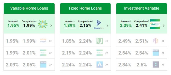
Pictured: Three example widgets styled in green (the screenshot was clearly taken in happier times). You define your accreditations in Yabber by simply checking a list of available lenders. The widgets may be styled in Yabber or Elementor, and the data shown is also defined in Elementor or defined in Yabber.
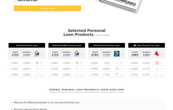
Pictured: Personal loan products listed on the 'Personal Loan' page. Not unlike primary mortgage products, the widgets link to a product page detailing the specifics of the product. In a sense, personal loans are 'gateway borrowing' and provide for other borrowing options in the future. Widgets are available for primary mortgage products of all types, auto finance, equipment finance, green products, personal loans, margin loans, and transactional accounts.
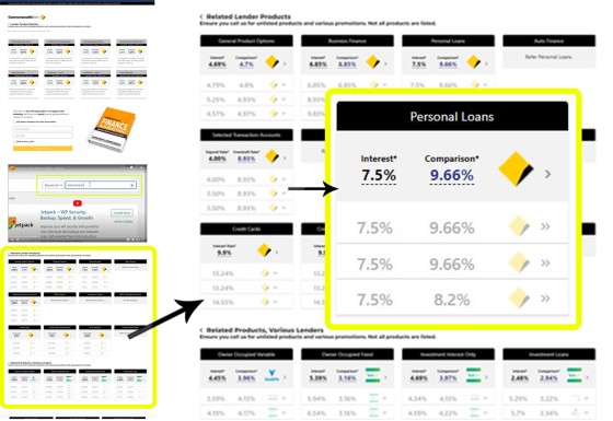
Pictured: A single page is provided for all lenders. On each page all product types are shown, and each product links to a single product page. An optional video and subscription panel should normally be assigned to every page (a one-click process in Yabber).
Pictured: The lender icons shown on the front page of most websites are a static resource that serve no navigation objective. Our lender panels provide links for each icon to the applicable lender product page. This improves SEO, improves navigation, and provides valuable funnel pathways.
Lender data is provided by way of widgets, banners, ribbons, content blocks, and standard posts (via find and replace functionality). Data is updated daily on our end and cached on your website for (usually) no more than 48 hours.
Shown are two of many ways of including lender data in styled containers.
Find and Replace Blocks: Shown above is the Bankbox and BM Box. Both containers may be styled to your liking, with the Bankbox styled by way of assigning a lender to the container. All fields are evaluated for 'lowest of type' placeholders, and the rates are returned. Optional links to product pages may be applied in both examples. The same 'find and repalce' feature is applied to a shortcode that doesn't apply styling, thus enabling rate text anywhere - including post titles.
A full-featured comparison engine is forthcoming.
Equipment Finance
Many of the pages in the equipment finance module aren't linked to, necessarily, but they do form part of your architecture and may be linked from other pages. Motorcycle Finance, for example, exists primarily for SEO purposes and is only linked to in one location. A number of 'lesser-important' pages are presented in this manner.
- Equipment Finance (Auto)
- Business Equipment Finance
- Commercial Kitchen Equipment Finance
- Aircraft Finance
- Boat, Jetski, and Maritime Finance
- Caravan Finance
- Motorcycle Finance
Some further pages are provided for general guidance.
- Chattel Mortgage
- Commercial Higher Purchase
- Dealer Purchase Loans
- Finance Lease
- Novated Lease
- Self-Employed Finance
Pictured: Example auto finance page. The equipment, business, and asset pages are rather extensive, and they're categorised by parent borrowing type. The jetski, aircraft, margin, motorcycle, caravan, and other finance pages all take on the shape of the primary auto page, albeit with a different focus. Some of these pages aren't made available via any menu of link, but they're essentially hidden for SEO purposes. Outside the scope of this article, auto finance takes an hour to process and provides gateway finance into 'something' else. The same applies for personal loans; you can process a personal loan within a couple of days, and refinance later. No finance product should be beneath you.
We'll continue to add these pages when required.
Business Finance
There is significant overlap between Equipment Finance and Business Finance, but the standalone business archive was necessary for what is often something over than general equipment finance. Some of the primary pages includes the following:
- Business Finance
Secondary content (non-FAQ page) include the following:
- Business Self-Managed Super Fund
- Debtor or Invoice Finance
- Commercial Real Estate Finance
- Equipment and Vehicle Finance
- Franchisee Loans
- Inventory Finance
- Term Loans
- Unsecured Short Term Business Finance
- Working Capital Finance
Like all modules, this resource will grow over time.
Resource, Fact Find, and Search Tools
A number of facilities are provided in the Resources archive to enhance SEO, provide user engagement, and create nested funnel tools. They are listed as primary and secondary tools. They are as follows:
Fact Find Report
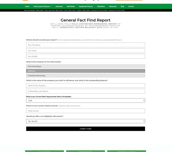
The fact find report is similar to those ridiculous '30-second' quizzes you see floating around the market. Our form is designed to enhance the user journey by providing a PDF report to them upon completion. The experience is usually part of an escalated experience, so if a user does not make a booking we'll generally try and edge them further into our funnel.
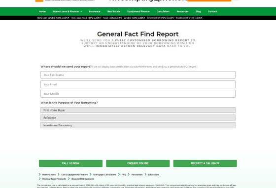
Pictured: The Fact Find report (shown empty) can be rendered on any page with shortcode or an Elementor Widget. The form is provided in step-by-step format rather than the typical paginated manner because it returns better results. Each panel shown is based on the previous selection. Unlike other similar reports, our report is designed for the user; it'll send them a PDF report upon completion based on the responses provided in Yabber. It's a basic report but is designed for escalation. Remember, the purpose of a funnel of any kind is to quality you - not the client... and if you're going to use a form it has to provide value at the end of the journey.
Pictured: Shown is an expanded fact find report. Unlike others, our Fact find includes an integrated calendar subscription form (integrated with Outlook and only showing your listed available times). You will improve conversions if you reduce page views, and sending somebody to another page (especially an off-site resource) is futile methodology.
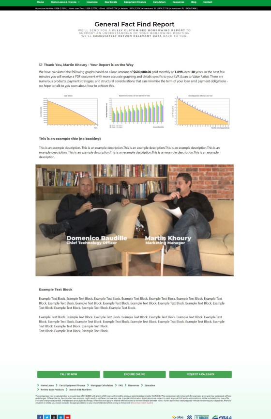
Pictured: When a report is submitted, and not unlike every other experience we should use on our website, we're redirected to another page based on escalation. If a user simply completes the form we should show one response, and if they didn't we should show another; in both cases the response should be relevant to the type of borrowing. This feature is made available in Yabber and simply provides for a better customer experience.
Note that when a user submits the report, basic and relevant data is returned to the screen by way of graphing and video elements. The fact find is suitable for use at 'some point' in the funnel journey.
Venus Report
Not unlike the Fact Find, the Venus Report is designed to make you stand out from the mediocrity and uncertainty delivered to mortgage clients in the market. The tool provides a large number of questions about the borrowing intent of the individual, but the purpose is to send them a PDF report addressing their responses upon completion.
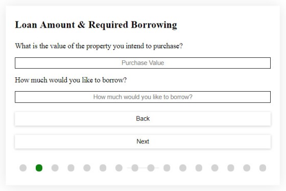
Pictured: The Venus Report is similar to the Fact Find in that it asks a number of questions. The 17 questions are focused on allowing the user to gain a better understanding of their own borrowing objectives. Like the Fact Find, a PDF report is sent to the user with responses based on their responses.
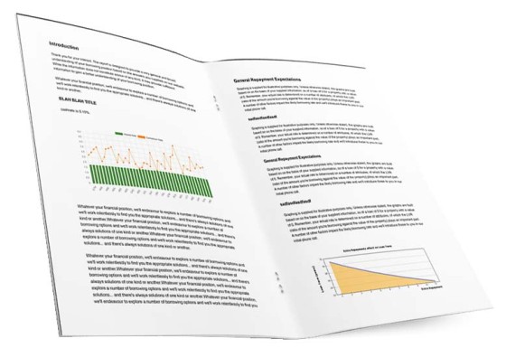
Pictured: Website interactions of any kind are focused on educating the borrower and qualifying the broker. For this reason, we'll always send the user a report based on their website interactions (you should never, ever say something generic and rely on a phone call).
Remember, the entire digital experience is used to quality you - not the client. Actually delivering upon your forms with engaging assets is something your competitors do not do.
Note: The Venus Report (and Fact Find) responses are completed by you. We provide generic templates for responses, so in most cases you simply have to save the template. The Venus report provides options for broad topic-based responses and responses for individual questions.
Mortgage Glossary
The Mortgage Glossary is a standalone page with, as you would expect, glossary terms. The Yabber glossary works differently to most in that you may easily created, edit, and manage all glossary definitions, and update them easily at any time. Further, glossary definitions may be applied as a tooltip to the first occurrence of every term on articles that include a matching term. Only selected terms are applied to the page-level,glossary tooltips (as defined by you).
Search & General Facilities
Search facilities are deigned to give your website authority, and assign appropriate expertise and authoritativeness to your business. General search tools are as follows:
- BSB Numbers. The idea with a BSB number search engine is simple; we want a user to use our website as a resource instead of another. The facility adds thousands of pages to your website.
- School Search. When a home is purchased, one the attributes of a local area that tends to shape decision making are the facilities in the area. The school search engine helps borrowers understand education options in the area in which they intend to purchase.
- Child Care Services. Not unlike the school search engine, the childcare facility provides borrowers with an understanding of the care options in the area they would like to purchase.
- Australian Localities. The locality search engine provides details on care facilities, schools, childcare, hospitals, and points of interest within a certain distance of a postal area.
- General Finance Quotes. The finance quotes page are real quotes from humans relating to money, finance, and wealth. The page isn't link anywhere on the website.
- Currency Exchange Rate Graph. Currency and exchange data is a module that we'll likely build upon given the frequency the page is visited by expats and foreign investors. As the page suggests, we simply return a graph of conversions against the Australian dollar.
These pages - via sitemaps registered with search engines - provides your website with over 200'000 pages of additional content. As with every single page on your website, each page will include a subscription form and offer or video (as defined by you in Yabber). Remember, the purpose of every page is to actually convert traffic. A marketing funnel of any kind, even a website funnel, is predicated on the notion that 'something' comes next (just not a bounce).
Some features are in development, while others still haven't been migrated into the standard website experience (a former Platinum product included a number of features that we're progressively migrating over to the standard website).
- Bitcoin Price Graphs. The Bitcoin pricing graphs are something we were reluctant to include because of the spammy nature crypto in general. However, based on feedback we'll likely include those pages as property can often be transacted using Bitcoin and other unregulated currencies (even if they're converted to real dollars first).
- Saturn Local Businesses . Saturn is one of our most powerful programs we've ever introduced to the mortgage industry. The Saturn pages are in a process of being updated. Those clients that currently use the system are relying on a legacy system that will soon be replaced. It is unlikely the Saturn module will make its way into the Bronze package.
- Secure Document Upload. BM's FileInviter module was retired a few years back because of the adoption of similar tools by many aggregation groups and CRM systems. It is likely we will include the feature back into the standard website.
- Online Applications. A future website inclusion will be the online application module. The system will be platform-agnostic in that the applications are submitted to Yabber before they are modified for any supported aggregator CRM.
Note that much of the Resources module will undergo a facelift in January of 2023. Results from BSB searches, schools etc. will be returned in an accordion style format rather than in styled boxes.
Mortgage Calculators
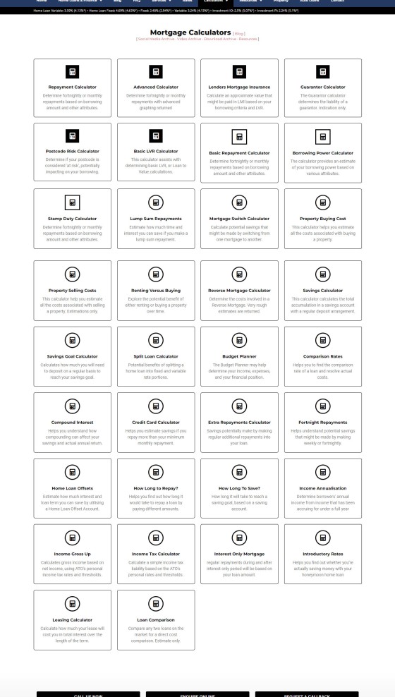
The 'Calculator' archive includes access to the 34 calculators, of which 7 are created by BM, with the remainder manufactured by a supplier to the MFAA and FBAA. To use the latter calculators you will require licencing, although access is provided to FBAA members as part of their membership.
Pictured: Calculators are listed on their own archive page. Each page includes a right sidebar with links to all other calculators. As with many resources, calculators may also be linked via in-post modals via a trackable link (we track every link, so you know exactly who is clicking on any resource).
Pictured: The Mortgage Calculator Archive shows all calculators created in the dedicated Calculator post archive. Listed in order of 'importance', each block links to the single calculator page.
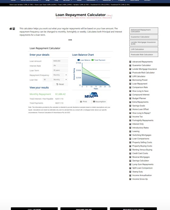
Pictured: A single MFAA calculator. Once on a single calculator page a menu to the right hand side makes other calculators available.
Calculators may be used on any page with shortcode, or by dragging and dropping the Calculator widget onto any page.
Calculators are one of most searched terms in Google and Bing, although it is highly unlikely you'll rank on the basis of calculators alone unless you apply effort to other areas of your website. That said, they mortgage calculators are a useful user-experience tool, and they're required for that purpose (an engaged user will have an impact on your organic SERP). If you don't provide calculators - and despite the fact they'll often return erroneous, generic, and unhelpful data - you're in for a world of UX hurt.
Partners
The Yabber system itself includes a number of Partner tools, such as the extremely powerful Article System made available via the Partner Plugin. If you're going to engage partners, your digital presence must be compelling and persuasive, and you should provide a funneled experience for this group of users. The Partner page is one that should be modified to promote your own structured partner program.
Partner Plugin: The Partner Plugin is provided for those broker that wish to seriously grow their business. Partners are looking for value in their relationships, and you must be able to stand out with products that add direct value to their operation. The Partner Plugin permits you to own and operate your own article system by sending articles to select partner websites. This is juts one of a number of programs that is available to full subscribers. Talk to us for more information.
Frequently Asked Questions
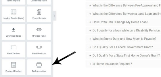
There's little doubt you've searched for information before and landed on a comparison or competitors website to find necessary information. These websites assign the appropriate resources to their content creation program in order to dominate organic search, and they usually capitalise on this traffic by way of website funnels that convert that traffic. These standalone information pages are similar to our FAQs, with the exception that your website FAQs are siloed within their own archive, and the information is made available via drag-and-drop panels that render accordion FAQ-style responses to questions relating to a specific subject.
Your website provides two styles of FAQs: website FAQs and Yabber FAQs. Website FAQs are created on your website by you (or sent to your website by us), and inclusion of the accordion FAQ panels are made based on a single category, or a group of categories. Yabber FAQs are a series of question and answer responses created in Yabber, and the content for each page does not link to any standalone FAQ page.
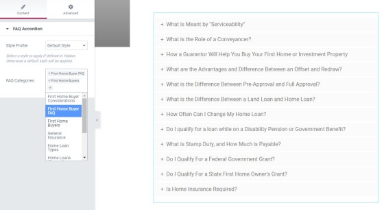
Pictured: FAQs are created in Yabber as 'general' question and answer responses, or they're listed based on FAQs in the FAQ post category archive.
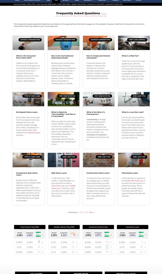
Pictured: The FAQ archive shows all created FAQs. The link in the FAQ accordions (pictured above) link to the relevant FAQ page. The FAQ methodology allows for enormous amounts of information to be applied to any single page. As you create more FAQs, you simply assign them to an applicable FAQ category, and that FAQ will list wherever that block of FAQs is shown. The style applied is defined in Yabber (or, if you prefer, in Elementor).
FAQ pages are the bedrock of your consumer-facing 'information' content. As you come across various borrowing scenarios, or after you're asked a question with an answer that might be of benefit to others, you simply create a new short FAQ and assign it to the appropriate categories. When a new FAQ is created it will automatically be shown with all occurrences of that FAQ accordion block.
All standalone FAQs are listed in their own archive that is similar to your blog (so each of the FAQs below include a full article, often including an inline calculator).
Again, when new FAQs are updated, we'll send them to your website as a 'draft'. You should then review the content and publish (or delete) when ready.
Pictured: The FAQ archive shows all created FAQs. The link in the FAQ accordions (pictured above) link to the relevant FAQ page. The FAQ methodology allows for enormous amounts of information to be applied to any single page. As you create more FAQs, you simply assign them to an applicable FAQ category, and that FAQ will list wherever that block of FAQs is shown. The style applied is defined in Yabber (or, if you prefer, in Elementor).
Pictured: An example of a single LMI FAQ page. There are two ways to assign videos to FAQ pages. The first is by assigning a video directly to the applicable FAQ in Yabber, and the second (pictured), involves a generic video applied for a certain time period. Note the inclusion of an inline calculator. Where possible, calculators should be shown in context, not unlike an image, so that the calculator contributes towards the article content without forcing a user to a new page.
It's customary to rewrite the FAQs in your own voice, but this process shouldn't prohibit you from making your website live. If required, you may edit them over time.
Education
The Education page was provided as an incentive for brokers to build engaging 'course' content for First Home Buyers, Investors, and other groups. The problem? Nobody ever did. We're recently migrated the system into our 'Managed' module with an expectation that we'll create courses ourselves, and simply push learning modules directly to client websites. A soon-to-be-released system that provides for quick and easy education/FAQ material called Contentus will make manufacturing this type of content a breeze.
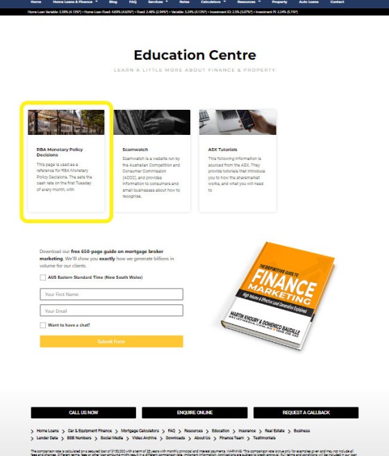
Pictured: The 'Education' module will look a little empty when your website is created. The entry page shows available courses and education material. In the above example we're linking to a module that provides easy access to RBA Monetary Policy Statements.
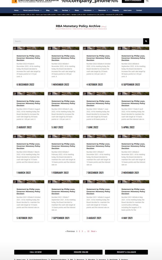
Pictured: The RBA Monetary Policy statements are a good example of the module used for information purposes rather than education reasons. In some cases - and entirely appropriate for the monetary policy inclusions - an archive may be created that shows all child pages associated with a parent topic. An RBA archive, Scamwatch archive, and others will be shipped with your website by default.
Keep an eye on the education module as it'll become a high-value focus in the new year.
Property & Real Estate
Property is intrinsically connected to the mortgage market, and property professionals are essential relationships for a sound referral-based (or any other type of) business. For around a year we've provided former Platinum clients with a tool to list properties on their website, and that tool will soon be made available on your website as a default module. The page and most of the code is in place, so when the system becomes live the facility will be made available to you immediately.
Unlike other property tools, this module is designed for brokers to more effectively promote their partners. That said, the module is more robust that most of the property tools floating around the market, If you're a broker that dabbles in property, this tool will provide you with a massive advantage.
Video and Social Archives
There's a certain absurdity in sending content to social media, YouTube, or elsewhere, and losing 'control' of that content. Any content you create or share should be sent back to your website so you have an ongoing archive of your own social content. This gives you more ownership and provides additional (and unique) SEO traction.
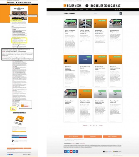
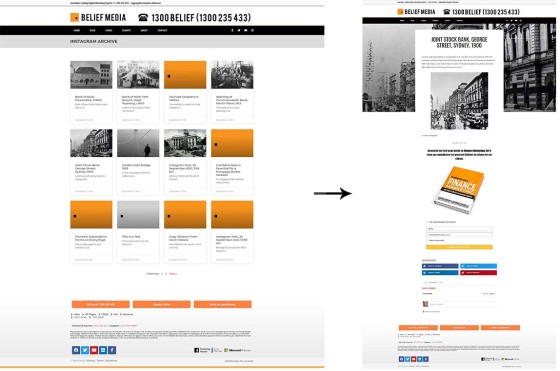
Two primary archive pages were created to showcase your video and social content. A facility in Yabber permits you to send a video post to your website, and the social archive is automatically populated based on social posts shared via our social tools. The examples on our demo website will likely be empty so it's worth reviewing BM's own video and social archive for a better understanding of the powerful features the module provides. Screenshots below are from our website.
Pictured: Videos were once automatically posted to your video archive. We now have you review your videos and apply appropriate call-to-action details for each page. You need to own your video content! If you have created chapters for your videos (in Yabber, via the YouTube module), the chapters may be rendered under each video.
Pictured: Social media content is automatically posted to your website (assuming of course, a filtering rule was set up in Yabber). The filtering applies to any content shared by our Instagratify or Vista (Outlook calendar-based) social media scheduling tools. Sharing content to social media without taking complete ownership of it is kind of ridiculous. The social archive assigns ownership and SEO-value back to you.
Note: The social media modules are not available to website-only packages. In these cases we recommend you simply delete the social archive and possibly post to the video archive manually. Options are introduced to you in our early discussion.
Download Archive
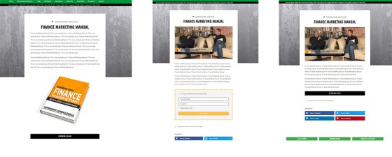
Not unlike the video and social archive, a download archive is made available as a standalone blog-style page with links to various download assets. The archive is a browsable resource, while it's more common to provide links to resources on those pages where those downloads are required.
Pictured: The download archive itself shows your selected downloads in a format similar to the video and social archive pictured above. The pages returned for individual downloads will differ based on the type of download you make available. For example, it may be a free download or subscription download, and a video may be applied to each page.
All downloads are tracked with optional triggers applied. Our own download archive serves as a very basic example (since we don't really use it much ourselves).
Reviews & Testimonials
Yabber will query Google and Facebook for reviews (other services are pending). While all reviews were once sent to your Review archive as drafts, they are now dormant in Yabber until reviewed, crafted, and sent. Various tools are made available to show the testimonials (a post-style archive or masonry-style grid is usually used).
Pictured: A basic reviews panel. The panel slides between those reviews that are specifically defined, or all reviews. The number of reviews shown, colours, timing, and other elements are all customised to your liking..
The Review module includes an archive of all reviews, and a single page that showcases individual reviews (with optional inclusion of video testimonials).
Employment
The employment archive presents a list of available roles in your organisation in an accordion-style panel. Selecting any role returns the user to a page with a job description.
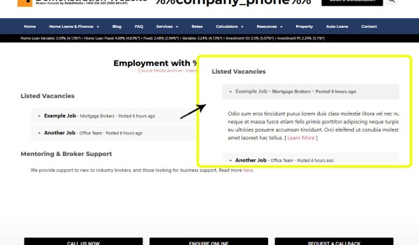
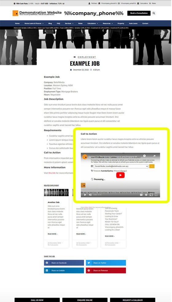
Pictured: The employment archive page shows all available active listings. Clicking the accordion returns the 'description' as created in Yabber. A link will direct the user to a full-featured page with more information on the position. The accordion panels are full-width, and the default text includes the position title, the employment category, and when the job was posted.
Pictured: Pictured is the accordion-style archive page that lists all advertised positions. Each panel shows basic data and opens to reveal a description. A link in the description links to a full-featured page with a job description. The record is created in Yabber's employment module, with each section created via a WYSIWYG Word-style editor.
The Employment module includes a single 'boilerplate' page that should be utilised to attract new industry brokers into your organisation. Others have employed many of our programs and have seen significant growth, and these brokers have built the page in a manner that attracts talent into their organisation.
Financial Planning
The Financial Planning page was designed for two reasons: satisfy best-interest obligations by providing access to various resources, and to provide a mechanism for you to support your high value partnerships. The page when delivered only includes very basic information on Life insurance, Income Protection, Total and Permanent Disability (TPD) insurance, and Trauma Recovery insurance. Like a few pages, it presents as a placeholder so you're able to build upon the available content. Given that the module is housed within its own archive, there's enormous amount of scope to build on this resource.
We've made a 'stock price' plugin available for a few years, and there's an expectation that we'll include this module into websites (as an option) early in the new year.
Landing Pages
A landing page is a dedicated page usually used off the tail end of paid (or other promotion) and its purpose is focused on converting the escalated warmer traffic. The page is free from distraction and should only ever serve elements that are necessary to convert the client. The primary purpose of a landing page is a phone call, so this type of contact option should be a focus, and the secondary experience is predicated on education.
First, every single page on your website is a type of landing page. Therefore, every single page of your website is required to provide the necessary assets to actually convert organic or mid-funnel traffic. For this reason, you provide subscription forms with an offer on every page, and you should assign a video to every page.
High Level, Click Funnels, Lead Pages, and other third-party services to host or supply a 'landing page' should never be used. The experience objectively diminishes your capacity to convert clients. Supported by ASIC documentation, the option dimities trust and is often non-compliant. A landing page is just a page, albeit designed with a specific purpose. These third-party services aren't integrated with conditional methods in any respect. If supplied by a digital agency, they're showcasing their inept understanding of digital.
Your landing pages are created in seconds, and usually require you simply assign a lead magnet and a subscription form. Click 'Send' and you're done. On the backend, you'll have email autoresponders established, possible voicedrops or SMS campaigns, and you'll continue to develop that individual into a conversion.
What we described in the previous two-line paragraph is what a lead-generation will sell you as a 'system' that generates 'high-quality' leads. It's a lie. The $120 or more that you're paying others can be delivered for cents on the dollar.
Pictured: A very simple landing page created via the automated system. The optional conditional redirects are shown (you may choose to simply show a message, or redirect to a single page).
The Solis Module, if assigned to you, will create full-featured campaigns in seconds (it'll create landing pages, forms, email follow-up, conditional redirects, and other supporting funnel assets.... all automatically). This module will soon be released to all subscribers, regardless of their access level.
Form Creation: Form creation takes a few seconds, and is fully accessible on your website via standard shortcode and Elementor Widgets. Forms, once created, are assigned to every single page of your website in Yabber. Every single page of your website is a type of landing page and requires an offer (and subscription form) of some kind.
Services Archive
The 'Services' archive is a single page that shows your primary services in a visual manner. You may create pages in the archive as you would any other, but this is largely redundant for mortgage brokers because primary services are normally listed in the 'Finance', 'Equipment', and 'Business' archives.
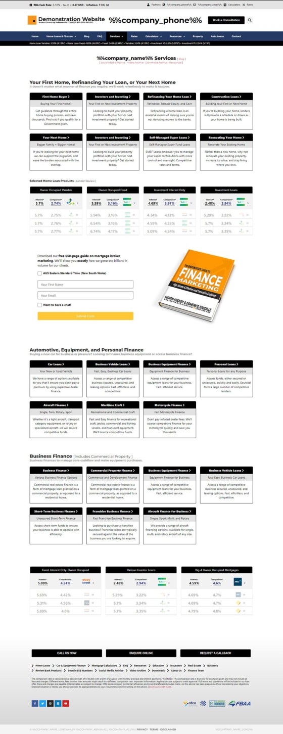
Pictured: Mortgage Broker Website 'Services' page. The box is simply designed to emulate the stylistic presentation of the lender widgets. The style allows more consistency to be applied to content when it's required. In the pictured example, each of the widgets includes a linked title as white text on a black background, a basic subtitle, and description text. Each widget includes a small black border (utilising a feature we call the BM Box').
The Services archive should normally include a video and subscription panel (since every page on your website should include a calendar-integrated subscription panel, and video should be everywhere).
Website Features & Tools
Your website is packed with hundreds of optional features and shortcodes that may be used when required (many listed below in what we call a 'Related Posts' panel). The modal system is one module that deserves exploration since it provides for link modals, geographic modals, lender modals, conditional modals, page modals, and more - all funnel imperatives. The modal system is the most scalable in the industry, and when used in company with paid promotion, or organic funnels, it objectively improves conversions.
An example of a shortcode is shown below:
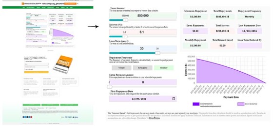
Shortcode of [loancalc gt="clblg" a="970000" i="2.5" y="30" f="m" ca="900000" ci="2.0" cy="30"] returns:
Shortcode of [loancalc gt="csivt" a="970000" i="2.5" y="30" f="m" ca="970000" ci="1.8"] returns:
Pictured: Two of the numerous graphs made available via the loancalc shortcode. The Loancalc feature is built into our complimentary mortgage broker plugin, and every broker in the industry should be using it. Clients enjoy vastly enhanced features. Graphing is one of several hundred shortcodes packed into your website.
Again, the article on shortcodes should be referenced for some of the behind-the-scenes features that you'll use on a daily basis.
The Marketing Funnel
It's easy to think of the product we provide as just a website. It is not. Your website is a purpose build funnel-focused lead -generating machine. That said, and while the website is SEO optimised, if you don't have a content creation program in place, or you don't promote your experience in any way, your website won't be able to perform the function it is designed to perform. SEO will only work when your experience is supported by the content necessary to feed search engines with evidence of your expertise and authoritativeness. However, it will objectively convert more clients that land on your website when compared against competing experience. The small block of articles below introduces a few posts that'll feed you with a better understanding o the Marketing Funnel.
Lender Data Features
The following list of articles introduces primary lender data options. This panel will grow as we start to introduce the comparison features.
Modals
Modals are provided by way of links, or may be served as entry or exit modal. The modals(s) served are actioned on the basis of a static modal, geographic modal, page modals, or conditional modal (an advanced feature that serves a modal on the basis of the resolved borrowing objective of a user). Modals are used in a number of ways to support various applications, so usage as part of a 'popup' are just a small part of their usage.
General Website Features
Only a small number of website features are published on our website since most of them simply don't warrant dedicated glory. A scheduled article introducing broad shortcode features introduces a number of unpublished shortcode tools. The list of features below are all used to enhance the user experience and support funnel escalation. We use a tool called Elementor to support your website since it provides drag-and-drop features that turns any broker into a professional web designer in a matter of minutes.
Conditional Content
Conditional Content is one the most powerful features you may introduce to a marketing funnel. We say over and over again that the attention of your user one of the most valuable funnel resources, and the key to attention is relevance, and conditional content is designed to improve on the relevance of your experience by serving content that is resolved on the basis of the borrowing objective of your user. It is advanced feature that tends to take a little time, but as your marketing matures you'll start to apply effort into incremental funnel improvements.
A summary of the most important conditional website features is scheduled in an article to be published shortly. The article seeks to rationalise the concepts in an easy-to-understand manner.
Conditional content may be applied in a seriously simplistic manner. For example, forms may be set up to provide conditional redirections, and the same forms may be set up to support vertical escalation (meaning that the same form isn't shown twice to the same user, very handy if you're feeding traffic to your website off landing pages).
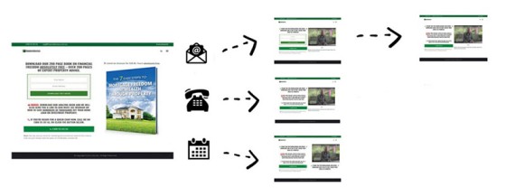
Pictured: Conditional Redirections redirect the user on subscription based on their type of interaction. A user may simply subscribe to your offer, supply a phone number, or make a booking, and each of these interactions have to be handled differently. Escalation of commitment is the core focus of your marketing funnel ("what comes next") so we're obligated to provide relevance in order to retain the attention and engagement of our user. At the same time (based on what we now know about a user, we're able to potentially start showing conditional website content, and form escalation will apply if defined.
Most brokers won't necessarily use conditional features to their potential because it requires a commitment to the process, but the data gained from the interactions will always be available to you; you will know exactly what type of website pathways and engagement results in a conversion.
Broker Website SEO
We've mentioned a few times that content creation and video is the foundation that improves your SEO. That said, the website itself is the only example of automated SEO in the industry. On the backend, Yabber tracks statistics, link data, and other information that feeds us with an understanding of page structure, and it 'tells us' how our content is positioned to capture the attention of search engines in order to expose our expertise and authoritativeness. There's a large amount of SEO data on our website but the following posts tend to provide a good introduction.
In terms of SEO, your website is now analysed as if it were a real human browsing the web (in many cases, there are real 'Raters', or real people sitting behind read computers) that will evaluate your website to compare against search results), so your obligation is now one of creating information and engaging education. You'll note that we use the terms 'expertise' and 'authoritativeness' over and over, and you'll also hear us talk about 'know, like, trust'. It's the former two attributes that Google uses (along with 'Trust') to effectively measure the value of your website experience. If you don't provide rich, ever-changing, and dynamic content, your website will be penalised as a result.
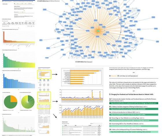
Mortgage Broker SEO: Yabber is packed with hundreds of graphing tools that relate to your general website usage. The pictured graphs are from the SEO module and it shows the site matrix at the top-right, and various other linking graphs.
The evergreen-style cornerstone pages we include on your website, the always-updating FAQs, and other dynamic blocks are designed for the user, ergo, they'll be recognised by Search. Note also that we provide full website sitemap support managed via Yabber.
We've found that businesses using our framework tend to rank locally very quickly - this particularly applies when their former website presence was 'limited'. We've seen clients with a 5-page website move from page 6 on Google to page 1 in a matter of days, but each experience is different, and when seeking to improve your local visibility you're in direct competition with others that may be assigning more effort.
SEO Authority: We were recently quoted as having said that, in part, our systems "tweaked the Google algorithm". To address that issue we had to search for the 134 references on our blog, in guides, in email, and elsewhere, that said this wasn't possible. The single action required to rank with authority in search engines is content, and the framework provides for this. One thing is certain: if you don't have a blog, don't actively create marketing material, or don't have extensive resources on various types of subject matter, you will never rank with authority.
Elementor
We use the Elementor website builder because it permits brokers, with little to no training, to create rich and engaging pages themselves. We've built around 50 Elementor widgets that provide finance drag-and-drop related features, and we'll obviously continue to build these blocks into the future.
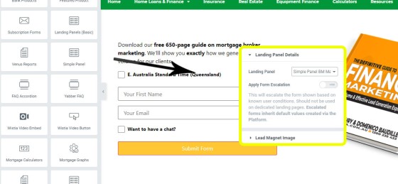
Pictured: Shown is the 'Simple Panel' widget. You simply drag and drop the Simple Panel Elementor widget into a page, select your form, and the form will render (meaning that Yabber automation will immediately apply). The primary means of assigning forms to pages is via what we call 'Location Forms' and 'Location Panels'. You simply assign a form to a specific location on your website and the form will be shown. A form, calendar boking option, and offer of some kind, must be present on every single page of your website, since every page of your website is a type of landing page by virtue of the fact organic/other traffic can come from anywhere. Note that it is impossible for your website to be created within default forms, but custom forms should be created by you in Yabber when required. We were recently quoted as saying that setting up forms may take an hour. First, assigning forms takes a few seconds... but creating new custom forms with appropriate automation applied will take longer - sometimes up to an hour if guidance is provided (or if you're tech-challenged). Once a form is submitted there's around 30 points of (yabber) automation that optionally applies.
Your website doesn't have to look like the others sharing the same framework, and changes can be made extremely quickly - particularly to the front page. The early changes made to your own framework requires we assign your primary brand colours to the Global font colours in Elementor. From there, we apply some basic changes so your experience is unique. All primary website content is generally pushed via Yabber.
Pending Features
There's three big-ticket items that we've held off releasing for some time; they are the property module (to support partners), mortgage comparison engine, and online applications (supported by our own FileInviter module). The comparison engine is one we couldn't release because it was a former Platinum product, and as long as we still have Platinum clients it's difficult to dilute their positioning in the market. The property module is one that we're looking forward to releasing; the module includes drag-and-drop functionality from within Elementor (similar to that of lender widgets) that sources stock from Yabber, with Yabber fed data via various feeds, and in one case (a trial system) via a listing dashboard.
Remember, everything we build is done so to support lead generation - paid and organic.
Conclusion
The website is priced in such a way that makes it affordable to any broker (in fact, the basic website without the Yabber subscription is priced lower than the setup fee for Finsure's very poor website, and lower than the setup for other commercial alternatives). The difference with our framework and what you'll find anywhere else is that the Yabber framework is designed to support scalability, and actually convert clients. There's little question that is provides far more value than alternatives, and with integrated marketing tools, and features that enable the quick creation of advanced funnels, you can generally embark on paid promotion within just a couple of hours (maybe a little longer for your first campaign).
The framework is extremely powerful. However, as introduced earlier, your website will only attract organic traffic commensurate with the effort applied to your own content creation, partner, relationship, and other programs. That said, if you're looking to convert existing traffic, you're more likely to do that with our website when compared against what you're using now.
It's not reasonable or feasible to detail every feature we've packed into our website framework. Needless to say, used effectively it'll provide your business with an amazing platform to promote yourself in any manner that floats your boat. It'll fundamentally change your business.
Note to Clients: Clients should schedule a framework update. While a nuisance, the pain is worth the gain. It'll be difficult if you've made significant modification to your website, but we should at least have the discussion. A large number of changes were introduced in the last 6 months.
Note to Aggregators, Franchises, and Larger Businesses: Our website and marketing solutions are more effective than what you're using now, and it costs your brokers less for a superior product. Unlike other similar systems, we deliver a fully-owned product that brokers may update and personalise themselves for a very unique experience. Contact us for details.


