This article introduces the 'entry-level' website we provide mortgage brokers. As we'll come to explain, and despite calling it an 'entry-level' website, it's not only the most affordable and powerful website made available to small and medium businesses, it's also the only website in the industry that is driven by automation and AI, and we believe that it is the only broker website made available to the market that is designed to convert clients. It is also the only mortgage broker website manufactured to support paid promotion such as Facebook advertising, and it is the only website architecture in the finance industry that supports a real marketing funnel designed to nurture, educate, and support clients into your business.
This article should be read in company with our introduction to the broad marketing features that support our program. You can read what is essentially 'Part 1' of this introduction in an article titled "Next Generation Marketing with Yabber and an Integrated Website", and an article introducing Content Management touches on some of the managed website features.
As the industry's leading lead generation and marketing company representing the finance space, we can categorically state that very few brokers operate a website or funnel experience that provides an integrated experience, and even fewer provided an experience that crafted the necessary funnel pathways required to create conversions. It's for this reason that we've made an enterprise-level website available to brokers of any size that provides an industry-leading experience. Whether you already have a website, or you have already engaged Facebook advertising in some respect, the experience delivered via our framework will legitimise your business, undo the funnel-contempt introduced by the ubiquitous industry mediocrity, and deliver you far more digital returns.
If you don't read any further, please understand that the website we now provide brokers supports the highest-volume Facebook and organic marketing programs in the industry. The website is supported by a one-click marketing system that provides facilities to create fully immersive campaigns in a matter of minutes.
■ ■ ■
Introduction
Our mortgage broker website is the only website in the industry that is designed to convert clients. Supported by the Yabber digital marketing and social media system, our broker website is the only website that is fully integrated with landing pages and your Facebook and other advertising experiences.
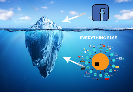
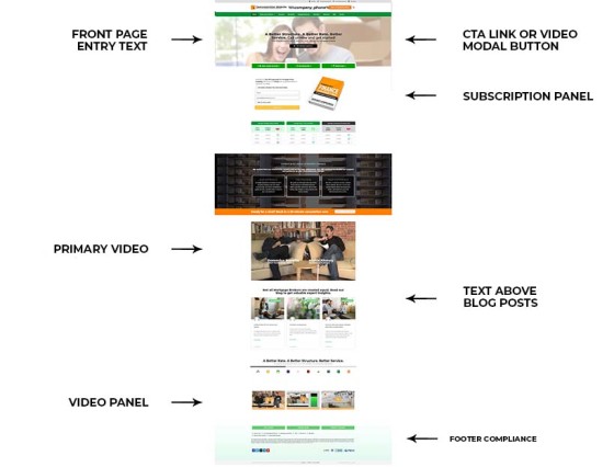
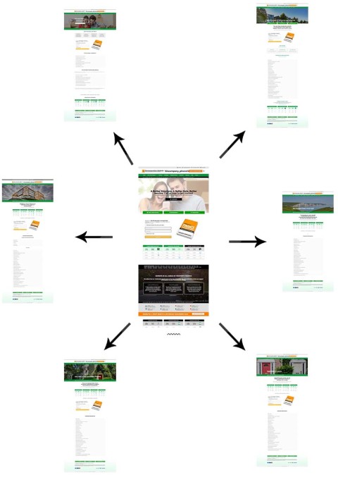
Pictured: We we'll come to explain, most brokers are driven towards Facebook advertising (because it works), but very few (if any) are business are provided with an integrated marketing funnel, and even fewer are served with a digital experience that provides a true customer journey. While we provide what is unquestionably the leading Facebook program in the industry, we also don't ignore the essential digital touchpoints necessary for a business to achieve funnel traction. In this article we touch on what a real marketing solution and website integration looks like.
The scope of automation and managed content is extremely extensive. We know you don't have time to manage your various marketing assets, so your website, social media, and other tools may all be automated with libraries of content that are supplemented by our own real-time material.
First, the following points have to be made:
- The website might look simple, and it is, but it's completely scalable and more powerful than anything your competitors are using. It'll support the most sophisticated marketing campaigns and/or SEO organic efforts.
- The website contains over a hundred consumer-facing pages all packed with information and funnel entry-points, but the site is also supported on the back-end by over 100'000 pages that provide easy entry into your marketing funnel experience.
- Your website forms, calendars, SMS features, landing pages, CRM integration (limited for now), and other resources, are all fully compliant and fully integrated - a first for the industry (although we've done it this way for over 20 years).
- The website includes live bank product data - all introduced shortly. We return bank data to a user wherever we can use it. Bank data is one of the most fundamental and necessary components of a broker website, and its inclusion creates an environment that supports multiple funnel pathways and increased engagement.
- Modifications to the website are easily performed by you with various financial-related drag-and-drop tools we've built ourselves to support our large and growing features.
- The website is supported by set-and-forget automation elements, including SEO.
- The website features are updated weekly.
- Your website is supported by various content programs. The content program isn't limited to just our article distribution system. We update your FAQs, in-post content, footer banners, and other content based on consumer trends. Your website content and appearance needs to remain relevant, so our content programs inject constant changes into your experience. Unlike other content programs, images are sent to your website, articles are SEO-optimised, and internal linking will link to FAQs and other resources on your website.
- Stylistic and features are easy to add. The website can take shape in any way that floats your boat. The colours, branding, and features may all be updated with ease to reflect your brand, culture, positioning, and personality.
We'll touch on some of the above features below, but since there a lot to cover we're trying to keep it brief. We'll link to supporting articles to avoid including explanations and background information on every feature. It should becomes very clear why our marketing experience outperforms other products made available to the market (and priced lower than virtually all of them).
General Information
The Cost
First, the cost. At the time of writing we have a special on the website (since it's new and we're still pushing feature updates). You pay only $2980 + GST for the full website with all features. You will also receive 12-months of complimentary hosting, valued at $360 per year) and a 12-month subscription to our proprietary Yabber platform, the most powerful digital lead generation system made available to the finance industry. You also receive access to our education programs and expert telephone support.
Contact us for details on this very time-limited offer. Pricing will increase in early November and then again to our final product price. The Yabber subscription and website will soon be sold separately.
Unlike competing products in the market that limit the number of forms, landing pages, and other features, and then assign an escalation cost based on the number of features you choose to include, our mortgage broker website includes 'unlimited everything'.
The Requirements
Given the product we provide is designed to be fully integrated, and since it is one that provides a raft of features necessary to deliver a leading experience, we do require that you have access to a Microsoft 365 subscription and Telstra account.
Microsoft.
Telstra.
Having your own applications makes the functionality available to you forever. This means that if you ever disconnect from the Yabber system the applications may still be used to power and support general features.
Better Digital Results
We have people ask us all the time how our returns are higher than others in the market, and while the supplied mortgage broker website plays an important organic role, the website resources are intrinsically linked to your marketing funnel journey... thus expanding your funnel into a realm largely ignored by others (and one that can multiple your returns by triple-digits). If you're participant in any Facebook program and you've ever heard the message that your website isn't important, or you "don't need a website" (a message used by charlatans trying to assign value to their mediocrity), then your representation has objectively failed you.
First, we've mentioned maybe a few hundred times throughout our website that third-party management tools are largely inappropriate for the mortgage industry, and their use is seriously limiting your digital success. As we've said over and over, the notion that you'll host your landing pages on third-party websites - such as Click Funnels, Lead Pages, Kartra, and at the bottom of the barrel, High Level - is patently absurd. The messaging that tends to plague the lower-end of the marketing industry suggesting your website isn't an essential component of your marketing experience isn't just wrong - it's professional negligence.
A Conversion-Based Escalating Architecture
Did you know that Belief is the only company representing brokers that provides the necessary digital architecture to build a real marketing funnel? Unlike others that tend to provide a very low-yield experience via third-party products, we offer the the only integrated and fully-immersive marketing funnel experience in the industry. As salesy as that sounds, the statement is required to make our positioning clear: we have no competition. So, despite providing the leading Facebook experience in the industry (this tends to be the go-to 'system' these days) we don't ignore the powerful digital touch-points on the periphery that provide a powerful, magnetic, and completely immersive digital and funnel experience.
Belief are the only company in the Australian mortgage space that provides a turnkey digital product that was built by mortgage experts for Australian mortgage experts, and we're the only company to have made available a purpose-built suite of tools specifically designed for the mortgage industry. This needs to be stated because there are charlatans that tend to undermine our position by making similar claims when they're doing nothing other than reselling a completely inappropriate and often non-compliant High Level product. Sadly, we remain the only company in the industry that provides a fully-integrated, fully-owned-by-you, full-stack, and fully-compliant digital product.
Our Blog Includes More Information
We've made an attempt to provide around 70-or-so articles prior to this one that gradually introduce you to the features of Yabber, and they were necessary before sharing our demonstration website since our marketing product isn't just a website. For the first time ever we're publicly disclosing the specifics of the system our clients have used to elevate themselves to leaders in the industry. The tools and programs we've used to power some of the biggest brands since 1997 are now available at a price that makes it a no-brainer.
If you're looking for a very general introduction to website and marketing integration you should start with an article detailing how Yabber and your website communicate to provide an industry-leading experience.
The website is designed to do one thing: convert business.
Delivery Time
The full website we're describing is made available to you in less than two-weeks, and can often come with a same-day service (we're working towards a 48-hour turnaround for general brokers, although aggregation groups will almost always see faster delivery). The website includes a massive number of features, FAQ resources, tools, and generally includes well over 100 pages. It is designed to support all your marketing endeavours in every conceivable way, and it is designed to provide a far more powerful experience than even large franchise-style websites. The mortgage broker website is simple to customise, it's easy to add other resources, and it takes no time at all to further develop resources that reflect your own business, positioning, culture, and brand.
Customised experiences that require significant modifications and customisations incur an additional fee and will take a little longer to deliver.
Integrated and Dynamic Features
Over the course of a number of articles we've provided an 'explainer' for the features you'll find on our mortgage broker website. There are literally dozens of features we cannot introduce in this article, so other articles have to be reference for a full understanding of how the website works.
Keep in mind that the website is super-simple to use - it is "just" a website, after all. All the functionality that resides on the digital periphery is largely optional; the point is that the site provide the framework necessary to do whatever you want... and we never, ever recklessly and negligent send your previous paid traffic onto a third-party website, and we never ever dare sacrifice our valuable data to a system such as High Level. The extremely poor-performing mechanism relied upon by the technically-illiterate marketing charlatans in the industry really has to be understood to value the nature of a fully integrated product.
Please keep in mind that we integrate all our website tools (in fact, we've given some of them away for free). For example, calculators such as the LMI or Limited Guarantee Calculator (two of many) shouldn't be another page-view, and there's no reason why these pages shouldn't be read inline (so, included within articles).
All our pages include a subscription and calendar booking form: every page on your website is a potential organic entry point, therefore a type of landing page, and therefore needs to include a conversion opportunity. Every single page on your website should provide a conversion and/or booking mechanism. This single change alone has taken some of our guys from seeing one or zero website leads a month to over 30 - just that change. Of course, on the tail end of this we don't introduce non-compliant Mail Chimp or similar systems, such as Calendly - our tools are fully integrated with Microsoft.
Live Bank & Comparison Data
The notion that a mortgage broker won't have product data or information on their website is a little odd, and one that has become a standard exclusion based on the accessibility of the information. Previously a Platinum-only product, the Bank Data of every kind (including the forthcoming Comparison features and comparison search) are now a default inclusion on our broker website. Various plugins are available as a standalone subscription if you're not interested in our marketing services.
Following is a list of 'basic' ways in which we integrate bank data into your website. We maintain our own database of current and historical rates, and plan on the addition of a large number of features to supplement existing functionality.
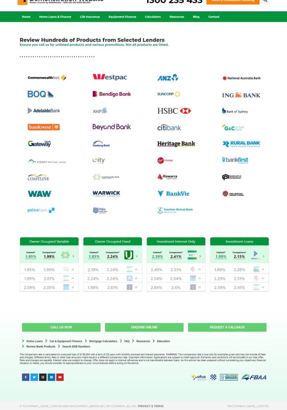
Pictured: The bank archive includes all the bank logos as they appear on the front page of your website (they can be included anywhere via a drag-and-drop option, with accredited banks defined in Yabber). Clicking on any bank logo returns the parent products associated with the bank.
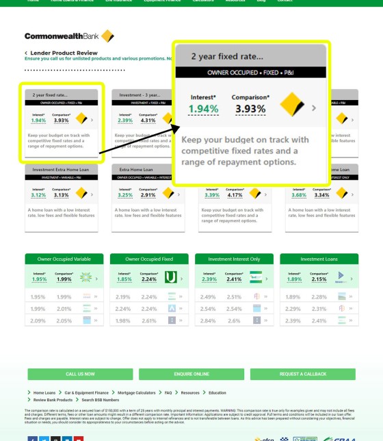
Pictured: Shown is the second-tier after clicking on a logo - in this case, the Commonwealth Bank. Parent products are listed. Clicking on any product returns the conditions and attributes that apply to that specific product (as shown in the next image).
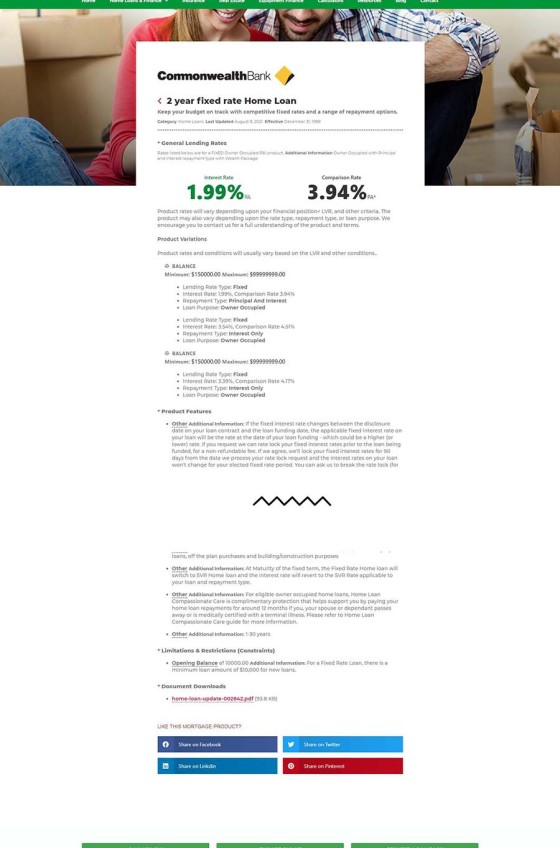
Pictured: The site includes hundreds of bank product pages. Each product page shows the applicable interest rate, comparison rate, required LVR, LMI criteria, and borrowing conditions associated with each parent bank product. All of the interest panels that are shown will link to these pages. The page is snipped for size.
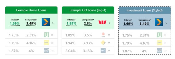
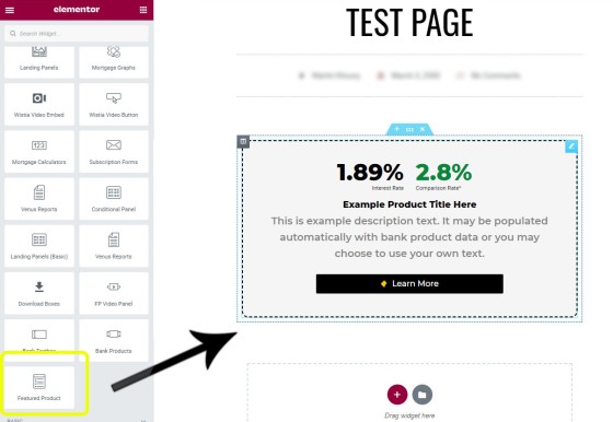
Pictured: A featured product panel with a number of custom fields. We've obviously used a fairly generic style but you may create the panel to look and feel in any manner that floats your boat. In this case we've opted to keep only the interest and comparison rate data up-to-date - all other fields will remain as we have defined them.
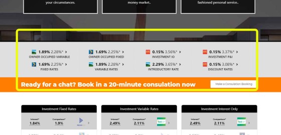
Pictured: Interest Rate Bar. The bar is optionally placed under the navigation bar of your website. The colour and text is obviously customised to your website. The text is reasonably small and is really only intended to provide a website visitor with an immediately appreciation of your expertise. Other product widgets are more usable from a user point-of-view. Note the interest rate published within the call-to-action text.
Pictured: The lowest rate panel shows the lowest available rate for various product types. The responsive container will show two columns on tablets, and one single column on mobiles. The bank data is obviously always up-to-date, and each record provides two website funnel pathways (product or archive). The small chevron image to the right of the rates link to the product page associated with the rate, and the bank icon links to the product archive page for the applicable bank. The banks returned by the tool will default to those that are defined in Yabber  (those that are on your panel), although you may specifically return rates for only a group of banks if required (say, the big-4). You can also filter on the lowest published rate or comparison rate. The rate panel may be dragged-and-dropped into any position on your website by way of Belief's Elementor plugin.
Even those website visitors that aren't rate-driven will explore various product options on your website. You'll find Live Bank Data everywhere (always kept up-to-date via the BM API). We include widgets in FAQ pages, product pages, and just about anywhere else we can squeeze it in. You want to demonstrate your expertise and authoritativeness? Actual and real-world product data is how you'll do it. We'll be introducing a comparison feature shortly.
How the Website is Structured
Introduction
The website is structured very differently to what you're likely familiar with. Despite providing extremely high-performing and integrated websites in the past, our new 'framework' is based on carefully assessing and scrutinising a few-million page views and over 100'000 real conversions to settled client (we traced all the funnel paths backwards in order to identify commonality and pathways). With the support of participant brokers - most of which see triple-digit organic leads from their website every month - we were able to take a snapshot of the current browsing psyche and consumer consumption psychology in order to apply a website structure that not only worked from an SEO point-of-view, but one that returned a pixel-perfect mechanism that we now know converts better than other methods.
The structure is different in that we've vacated the 'typical' hierarchical mashup of pages that generally provides a single page for information - we've found this is ridiculously difficult for brokers to maintain, and difficult for users to browse or consume. Understanding that your consumers are interested in consuming information that is relevant to them, we've designed a system of FAQ pages that are added by you whenever necessary and render on the appropriate page in an accordion-style menu. For example, if you encounter a new First Home Buyer FAQ you simply create the page and assign it to the FHB category (or multiple categories, if desired); the item is then added to the appropriate page.
Loaded up with over 60 FAQ pages upon delivery (that we expect you to modify), the FAQ section becomes a usable and powerful resource in and of itself (new FAQ pages are part of our content program and are submitted to your website when necessary).
Understanding that many mortgage brokers are also financial advisers and/or real-estate agents, we've added sections of the website to cater for these audiences.
The Front Page
The front page is the typical entry point for most website visitors, so we've removed the clutter and rendered only those elements that are designed to convert. Navigation options provide website funnel pathways to appropriate resources.
The website takes on a 'chameleon-style' effect and can change shape based on consumer browsing patterns, and this is more evident on the front page than anywhere else. The simple method of updating front-page options are described in an article title "Managing Front Page Website Content Within Yabber", while the conditional features of the front page are introduced in another article titled "Showing Conditional Front Page Website Content to Identified Website Visitors". These brilliant features are supplemented by a system called 'Switch' that allows you to completely alter the front page for another for certain visitors, or resolved audiences. Our BeNet AI engine can often change these front-page assets on your behalf if consumer interest is determined and if an alternate page exists for that market.
Post Types
The current structure of the site is broker up into the following resources. As you can tell it's quite extensive.
- Standard Posts and Pages. The standard posts and pages don't differ from your current website, with your blog (or "Posts" section) remaining the single module of your website that is usually most active - your blog remains the easiest mechanism to attract search engine traffic and demonstrate your expertise and authoritativeness. Pages are limited to post types such as your 'Home' page, 'About Page', 'Booking Page' (despite booking forms on virtually every page), 'Privacy Policy', and so on. Pages are not used for your information pages which is typical; instead, we use a Custom Post Type for each primary area of your website, making it extremely pleasurable to manage. Pages are also used for alternate entry pages (part of the Switch system which changes your front page).
- Finance. The 'Finance' category is the 'Home Page' for your mortgage related pages. In the finance category you'll include all those sub-pages necessary for any broker website - such as First Home Buyers, Refinancing, Construction Loans, SMSF borrowing, and Investors - and each page include necessary big-ticket blocks of information with the FAQs rendered for that category (the demo website should be reference to understand how this works).
Pictured: Standard product pages include those for 'First Home Buyers', 'Investors', 'Refinancing', 'Self-Managed Super Fund Borrowing', 'Your Next Home', and 'Construction Loans'. New pages are added in just a few minutes.
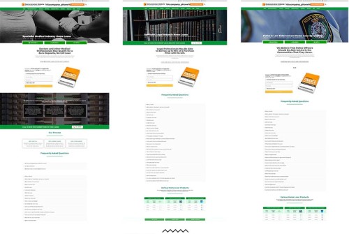
Pictured: Various industry pages (snipped for length). Industry pages for law enforcement, the legal industry, and the medical profession are included as unlinked industry pages. Their purpose is introduced in an article titled "How Industry Specific Pages on Your Mortgage Broker Website Improves Conversions". When you employ the 'Switch' feature (swapping out the front page for another) it's expected those alternate front pages will be included as pages within the 'pages' post type (although you may link to any page in any location).
- FAQ. The FAQ pages, as described above, are the centerpiece of your general information pages. When a FAQ page is created it can be assigned to any other page (information on Guarantors, for example, might be assigned to a First Home Buyer and Investor category). Information is no longer replicated or difficult to maintain; update it once and the changes are reflected everywhere.
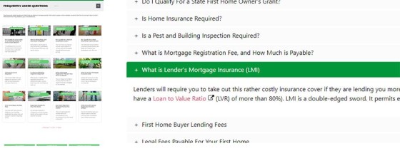
Pictured: FAQ sections are created so we can neatly render large amounts of information to a page without a user getting lost in text. FAQ come in two flavours: a version based on linking to internal posts, and Yabber-generated FAQ blocks. The FAQs may be inserted anywhere on your website and are normally used on your various 'information' pages (First Home Buyers, Investors etc.).
- Landing Pages. As we've repeatedly said, hosting landing pages on a third-party service is just ridiculous, and professional negligence if introduced by a marketing company. Our landing pages are created via a one-click mechanism within Yabber, optionally created via a drag-and-drop tool, or, if you like, built from scratch (they take 1-minute). The landing pages on your website are automatically integrated with your Microsoft email, Telstra SMS, triggers, and integrated conversions statistics. In summary, it can take as little as 5-seconds to create a landing page that is far more powerful than those used by your competitors that were carelessly drawn towards third-party tools. Landing Page creation is discussed in an article titled "Powerful One-Click Landing Page Creation".
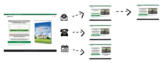
Pictured: One of the highest-converting features we ever introduced to our form subscriptions is a methodology made available by way of 'Conditional Redirects'. Based on our understanding of users' commitment, we're able to serve a user a second page with purpose based on their first page interaction. The conditional ideology is a defining feature of our service, and it's one that has the potential to explode the effectiveness of your marketing funnel. Landing pages are touched on shortly, and they're introduced in an article titled "Powerful One-Click Landing Page Creation".
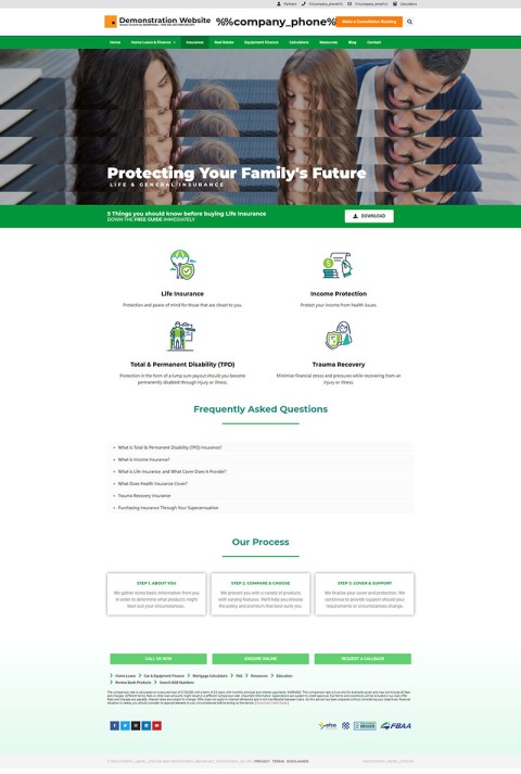
- Financial Planning. One of the smaller sections of the site thus far, the Financial Planning section is intended to introduce topics such as life Insurance, Income Insurance, and Total & Permanent Disability (TPD). If you don't provide these services yourself, you should use this resource to promote one of your partners (as detailed next).
Pictured: Financial Planning Pages. The planning module is important from a BID perspective, but they also support relationships. Read "Why our Mortgage Broker Website Includes Property and Financial Planning Modules".
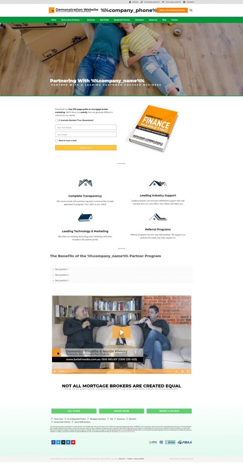
- Partners. A partner funnel is more than just an email experience (typical of the 'marketing trade'). First, your partners will expect a seriously high-value website. When they check you out they'll be overwhelmed by your digital presence and drawn towards your promise of your customer-first service. The partner section is used to showcase your leading technology, marketing, post-settlement service, customer-first service, and quality assurance. The page introduces our Partner Dashboard, if applicable, and provides various resources. Of course, there's a subscription-based funnel entry point for those looking for more information. To be clear, we essentially provide a full website backend experience for potential partner and introducers - an essential feature if you're looking to demonstrate your claim of value.
Pictured: The partner module is intended to support your partner program as a standalone product. Read "The Mortgage Broker Website Partner Module Supports the Partner Funnel". The partner systems are supported by Yabber in a number of ways.
- Equipment. Equipment finance is a big topic, and a super-simple way of generating some business volume. As we'll say over and over, much of the time your equipment service is usually a heightened funnel into your longer-term and more profitable mortgage funnel. Not unlike other service pages, each equipment page includes various FAQs. At the time of writing we're developing a new mechanism for online applications.
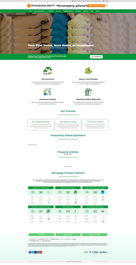
- Property. Historically, we've worked primarily with the finance and property industry, and there is massive overlap between the two professions. If you don't have a referral partner in the real-estate space you're potentially letting 150-million a year slip through your fingers (we did an interview with a broker recently that attracted around 100 ready-to-go buyer leads each month). To facilitate this property relationship, or to draw attention to that part of your business, the Property page is vital. At the time of writing we're in the process of building a 'Property Listing' tool within Yabber that'll deliver property to your website.
Pictured: The property module. The pictured example is missing FAQs and 'latest articles' (as sourced via the Property category in your blog). The module is designed to support partners, but also provide the foundation for your own property efforts if you're involved with sales or similar. The module is expected to support property listings soon. Read "Why our Mortgage Broker Website Includes Property and Financial Planning Modules" Yabber supports property in a number of other ways, such as Property Notification SMS subscription forms, and soon, SMS Property Estimate tools.
- Business. The business finance module is an interesting one. We don't see brokers apply much attention to this market, but each business owner potentially represents a high-value client in your residential funnel. In order to make the business transactions easy (assuming you do not want to manage the feature yourself), we optionally send inquires off to one of two large specialists in the area (this feature is in Beta and is expected to be released in December). Business clientele are often qualified in order to filter the inquiry to the appropriate organisation (based on high or low risk). Qualification is something we'd never normally do for a residential customer.
- Education. Every broker should have a 'First Home Buyer' course, 'Getting Ready to Buy' course, and a Budgeting program - all educational and subscription-based resources. We've included the 'Education' module so these programs will have a place later on, and we fully expect to build these resources for brokers on their behalf (when ready they'll just be submitted to your website in draft). At the time of writing the 'Education' module is very limited - we've included information on just a few more complex topics. Read: "Why our Mortgage Broker Website Includes an Education Module (Useless Until Proven Otherwise)".
- Calculators. Calculators are often created in standard pages. We've created a standalone post type for calculators since we expect to build a full suite to supplement our existing resources. This turns your calculators - one of the most searched terms on Google when researching finance - into a resource of its own.
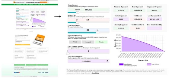
Pictured: The standard repayment calculator as shown on the front page of the Calculator archive. Standard repayment conditions apply, such as payment frequency, loan term, and extra repayments. Extra repayments adds another chart element to the graph. The pictured calculator, or any other calculator, can be dropped into any page with our Elementor website plugin, or rendered with standard WordPress shortcode. Read: "Powerful Suite of Mortgage Broker Website Calculators".
- Resources. The resources section is intended for various resources made available from within your website, or included within the resources module. For example, we provide details on the Venus report, a Mortgage Glossary, various Property Checklists and Buyer Guides, and links to calculators. The section also includes a link to a BSB number search engine, locality search feature, school and childcare search engine.
- Video. Yabber provides a facility to automatically send videos to your website after you've uploaded them, and the video section provides a facility to manage this library. Of course, you may add your own video resources here yourself.
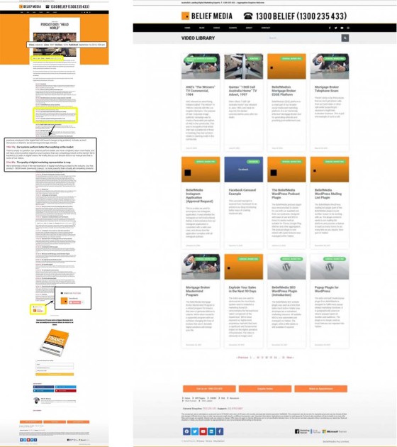
Pictured: The video post page and archive. Videos are sent to your website after they're ingested by Yabber. Read "Send YouTube and Wistia Videos to WordPress Automatically". Sending videos to your website is normally completely manually to ensure content is appropriately crafted.
- Instagram. The Instagratify tools provides an option to have your Instagram posts send to your website. If a rule is defined, the Instagram post will send to this post category. Each image or video is uploaded to your website and linked internally. The Instagratify tool is part of a much broader and feature-rich Social Media system.
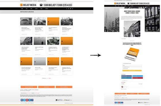
Pictured: The Instagram archive (left) and the Instagram image post (right). Each page may be formatted to your liking in virtually every respect. As with almost every page on our mortgage broker website each page includes an escalation-based calendar subscription form. The form used is determined by the Yabber form assignment panel. Instagram content is normally created via Yabber's Instagratify tool. While Instagram images are sent to the Instagram archive by default, you may filter them through into your standard posts archive (i.e. your blog) by using the hashtag of #ispost in your Instagram description. This might be suitable for those occasions where you're compelled to provide information quickly, and when time or circumstances prevents you writing a quick article.
- Bank Products. Bank product information was introduced in brief earlier in this article. The features are extensive and they're added to on a weekly basis. On the basis of the information resolved from client interaction with the data we're currently feeding the BeNet AI engine with data that'll power some more sophisticated tools, including the website comparison search engine that is due for imminent release.
- Testimonials. Testimonials are collected from Facebook, Google, and other similar websites from Yabber, and then they're sent to your website 'Testimonial Post Type' section as drafts. If suitable, they can be published to your Testimonial archive, or made available on other areas of your website in various ways. At the time of writing we've disabled this system for a massive update which includes the automation of testimonial images for use on social media. This module is back in development as a result of various changes to Google My Business and will be ready (again) soon.
- Your Team. Managed in Yabber, the teams archive displays all your team members with a short bio, and it displays various social links and contact details. Clicking on any team member page returns a longer story for those wanting to learn more. Details on the Teams section may be found in an article titled "Managing Website Team Bios in Yabber".
- Conditional Pages. As a hidden post type the conditional pages are not actually available from within WordPress... but they are there. Managed via Yabber, all your conditional content is made available on these pages and then served to your user in specific areas when required.
Other posts types are expected soon, such as an Employment page.
Conditional Content
As described in an article titled "Escalation of Commitment and Conditional Content in WordPress", with the specifics of how conditional pages are created is detailed in an article titled "Add Escalating and Conditional Landing Panels to Your Website", Belief's websites support escalating and conditional content designed as a persuasive digital salesperson that shows each website user what they're looking for. limited components of the conditional features are introduced into the Bronze website although there is far more there than any mortgage broker will likely ever use.
Subscription forms (as shown on every page) and Page Landing Panels (the difference being the former is a single column while the latter is a two-column panel inherited from a landing page) also introduce an escalating feature. As a user engages with one product (a funnel escalation point) we encourage them to further escalate their commitment by way of another download (they won't have to enter their name or email again, or course - we already know that).
Pictured: As mentioned earlier when we briefly introduced Landing Pages integration, one of the highest-converting features we ever introduced to our form subscriptions is a methodology made available by way of 'Conditional Redirects'. Based on our understanding of users' commitment, we're able to serve a user a second page with purpose based on their first page interaction. The purpose of the top-of-funnel experience - normally served by way of a subscription or lead magnet - should never ever introduce a roadblock. If you're going to 'qualify' a client online, the method of doing so is once that use is part of your funnel experience. The typical experience that many brokers rely introduces a what many erroneously call a fact-find quiz into the top-of-funnel that does little other than disqualify the candidates that are least willing to provide the information you're asking. Our landing flow converts higher than others in the market, and our follow-up email autoresponder and outreach programs are fully integrated, so they provide infinitely better results. The conditional redirect allows for a second page that provides an option for a user to complete a 'self-qualification' questionnaire; unlike the silly quizzes that have become quite popular, the tool returns a PDF to the user via email. The Venus report is used to qualify the broker - not the client. In fact, the funnel's primary purpose is to qualify the broker.
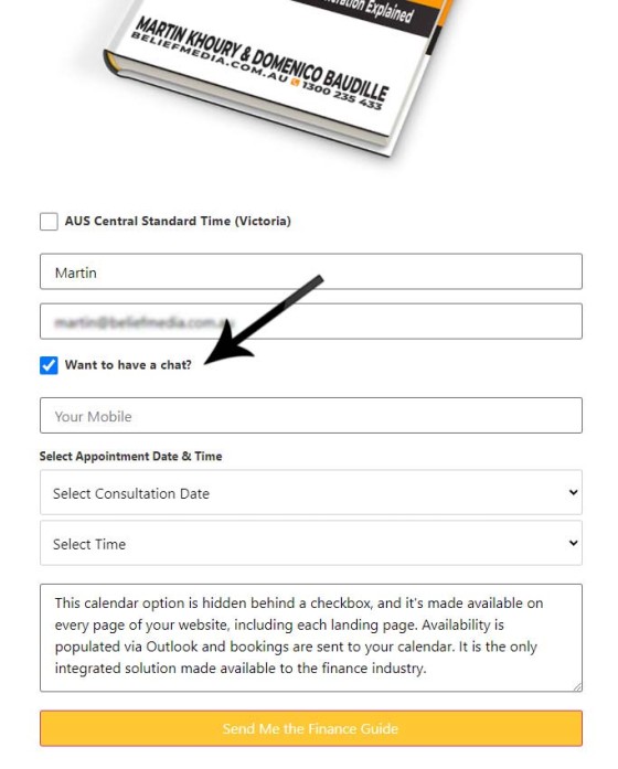
Pictured: The integrated calendar makes the conditional redirect possible (the calendar is hidden behind a checkbox on the first landing page). Of course, every single page on your website is a potential organic entry point, therefore a type of landing page, so every single page on your website includes a lead-magnet subscription form (with optional redirects applied to each). Up to 35-points of automation are applied to each subscription form - more than any other option in the marketplace. The most popular option in the calendar field? The "Earliest Convenience" option.
Once again, the basis of any funnel experience is an escalation of commitment, and your website and broader marketing efforts need to craft various pathways through your funnels based on the interests of a user and their interactions, and the Yabber experience provides this (in fact, it's the only such existence in the industry). The conditional ideology is a defining feature of our service, and it's one that has the potential to explode the effectiveness of your marketing funnel.
SEO, Links, Triggers, and Statistics
SEO is a big topic largely ignored by the industry in favour of paid promotion. However, our typical 'Facebook client' will often employ some of our early relationship programs, manage their website content strategy a little more efficiently, and then not dare advertise for additional clients. The number of clients returned by others in the market via paid promotion is fewer than what you should normally organically attract (and we say this despite providing the highest-yield Facebook program in the industry). The mortgage broker website is fully SEO-optimised by various automated mechanisms that you may optionally alter to your liking.
When's the last time you encountered a website that'll send a client an SMS message because they clicked a link? Your mortgage broker website will do far more, including sending optional emails, creation of business tasks, and so on. This kind of funnel-based course correction (such as subscribing a user to a new list) is vital to a high-performing experience, but one that was typically cost-prohibitive or simply not understood to be essential. Triggers are introduced in an article titled "How Triggers Help Craft a True Marketing Funnel Journey".
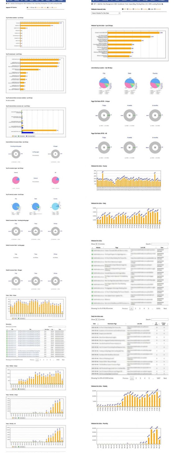
Pictured: Basic website statistics. The statistical engine is extensive and records enormous amounts of information. Unless you know how you're website is performing, or how Facebook pages or landing pages are converting, then you aren't able to improve upon the results. We record each page view (on a user level), link click, interaction, and up to 40 additional data anchors.
The statistical data returned to Yabber are very extensive, with statistics and data returned in a manner and format that is consistent with marketing objectives. We segregate landing pages from general statistics because they're normally associated with paid promotion so the engagement must be understood in isolation of general website 'browsing' behaviour.
Other Website Features
There's a ton of website features we haven't mentioned... some of which are more relevant than others. The most notable relevance might be best demonstrated by way of tools such as RBA Data, Exchange Rate information, CPI graphs, and so on.
Graph: The Cash Rate Graph returns a historical record of cash rate movements, CPI data, Inflation Data, and 'average' Interest Rates as reported to APRA. The graph is typical of the information made available to you to support your content program.
Graph: The graph shows a number of products from a range of banks (they won't be bank that you necessarily have on your panel). The purpose of the graph is simply to illustrate how the lowest published rates don't necessarily equate to the lower or more appropriate comparison rate. To be fair we've sourced all the products with the lowest and current interest rates made available to the market. It's simply nice to be able to include an array of graphs into your content, and we provide a large number of similar graphs for inclusion in your articles.
Other shortcodes are available (most of which you'll never have to use) that returns data such as the current cash rate. For example, the shortcode of [bm_cashrate] will return 4.10% (bolding is ours), while [bm_exchange_value to="usd" value="3.25"]%%exchange%%[/bm_exchange_value] returns $2.16. There's also a backend to support those that dabble in Bitcoin values and share prices (the latter useful for financial advisers).
We've made the website ridiculously easy to modify yourself in amazing ways via the use of the Elementor page builder. We've created a large number of drag-and-drop features that adds various types of functionality to your website (including a number of bank data widgets).
Aggregator Advantage Website
Available as part of a managed package, or as a standalone product, the website is made available to aggregation and franchise groups (modified, or course) to provide an amazing online experience. To be clear, while the Advantage product includes a large number of options, we provide a standalone Advantage product that provides just the website, support, and training components.
We tend to attract a lot of brokers from aggregation groups that were provided with a 'limited' experience by way of their website and marketing tools. The websites themselves aren't necessarily very good, and none we've encountered thus far are optimised for SEO in any significant way (if at all), and none provide the Facebook-style back end experience that brokers require to support their Facebook marketing (and we've found that virtually all lead generation services provide a non-compliant product). Additionally, allowing brokers to make changes to their website is often difficult and normally attracts a significant fee. In all cases of aggregator websites we've inherited there's usually no live bank product data or integrated calendar/booking forms. In fact, in all the examples we've looked at there's not even a centralised manner to assess aggregated statistical data, and there's no mechanism to compare the performance of one broker website against another.
Our Advantage website changes this.
Not only is our Advantage website installed as a standalone self-hosted resource, brokers maintain full control over content while enjoying the information that you choose to provide them via integrated blocks of dynamic 'standard' or 'controlled' content. Belief's website architecture is the very first product made available to aggregation groups that actually converts... and we absolutely guarantee that it'll convert far more business than generic products.
For brokers that aren't using your 'standard' Advantage product, we provide them with an optional website plugin so they can enjoy the dynamic and ever-changing resources you choose to provide them. This enables you to quickly promote single products across hundreds of websites in seconds.
Since our standard website includes a Financial Adviser and Property module by default - and assuming you have an aggregator-level relationship with a financial-related partner, or Real Estate partner - you can make these sections of participating sites available to your partners, thus massively increasing their exposure. On your end it obviously elevates your business and provides additional revenue opportunities.
If and when your brokers choose to engage with paid promotion the website is Facebook-ready and provides an experience that far exceeds any of the lower-performing 'Facebook Advertising' programs that are made available to the market.
Each aggregation group is supported by a dedicated support channel (emails and phone numbers), and the website program includes webinars to help your brokers explode their business with leading digital marketing technology.
The Advantage subscription is made available for far less than all known similar programs in the market.
Conclusion
Yabber supports holistic marketing. Fed up with industry options that use third-party landing pages, and frustrated with the marketing industry's failure to build real website and broader marketing funnels, Yabber supports your marketing in a six-digit fashion for less than a single commission payout. While we've just touched on the website features, the system itself manages relationship marketing, post-settlement, complete SMS and email marketing, and your social media. Yabber supports white-label marketing material, automated RBA campaigns, telecommunications (including call recordings), and more.
The most important takeaway from this introduction to our broker website, apart from the vast array of growing features, is that the system is managed on your behalf. This isn't just articles submitted to your website. Our AI back-end, and general automated features, will update in-post content, change header messages, add footer banners, and inject conditional content into your experience.
If you're interested in learning more, please contact us on 1300 235 433 for a no-obligation discussion.


