In previous articles we've introduced a number of ways in which we return live and always up-to-date bank related data into your mortgage broker website. The most notable, or at least the most popular feature, is the drag-and-drop live bank data widget that renders defined product types into a tidy and fully customisable container. Also quite popular is the feature to include the 'lowest available rate' into your primary front page call-to-action text (used with placeholders, and introduced in an article titled "Managing Front Page Website Content Within Yabber"). This article introduces the newest addition to the suite of website bank product features: the 'Lowest Rates Panel'.
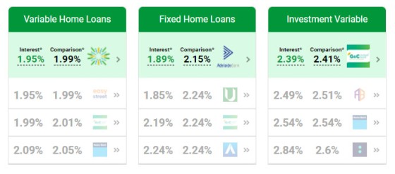
Pictured: The bank product widgets are a brilliant drag-and-drop feature that renders bank types of your choosing into styled containers. Banks are determined based on your accredited banks, or those specifically defined. All colours, features, and tooltip features can be fully customised.
Bank data on your website should be everywhere. Brokers are in the business of selling bank products so it stands to reason that you'll include available product options on virtually every page of your website. The bank product data provides a means for your users to genuinely engage with your online experience, they provide website and marketing funnel pathways, and they create a passage into your real-world conversion funnel.
A few days ago a broker showed us a website that he'd put together before he found our services. The website he built was essentially as a "Satellite" site that was used to sensibly experiment with various website features (his primary website was aggregator-supplied). It was the 'premium' WordPress theme he used that caught our attention; the theme provided a facility to return a single row of interest options across the page (manually inputted, of course), but it got us thinking about how we'd include a similar feature on the site we provide brokers. In response we've built three new interest rate features - all very simple in nature.
Navigation Bar Lowest Rates
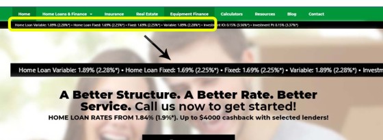
The first panel is super-simple in nature. In an effort to spill more interest rate content into your website we've simply created a small banner under the navigation bar that lists the lowest interest rate for various product types.
Pictured: Interest Rate Bar. The bar is optionally placed under the navigation bar of your website. The colour and text is obviously customised to your website. The text is reasonably small and is really only intended to provide a website visitor with an immediately appreciation of your expertise. Other product widgets are more usable from a user point-of-view. Note the interest rate published within the call-to-action text (CTA interest rate placeholders are introduced here).
The bar is created via a 'find and replace' shortcode. In fact, any block of text can returns the same results as the 'interest bar' by the simple use of text placeholders. The colour and size of the text may be altered.
Lowest Rate Panel
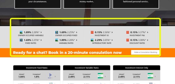
The lowest rate panel is simply a block of eight rate types, each of which is the lowest available rate associated with each product type (fixed rates, variable rates, interest only rates etc.). The panel is pictured below and highlighted with the yellow border.
Pictured: The lowest rate panel shows the lowest available rate for various product types. The responsive container will show two columns on tablets, and one single column on mobiles. The bank data is obviously always up-to-date, and each record provides two website funnel pathways (product or archive).
The small chevron image to the right of the rates link to the product page associated with the rate, and the bank icon links to the product archive page for the applicable bank.
The banks returned by the tool will default to those that are defined in Yabber  (those that are on your panel), although you may specifically return rates for only a group of banks if required (say, the big-4). You can also filter on the lowest published rate or comparison rate. The rate panel may be dragged-and-dropped into any position on your website by way of Belief's Elementor plugin.
Lowest Rate Shortcode
A non-Elementor option at this stage, there's a single shortcode option that'll simply find and replace various interest rate placeholders with a 'lowest rate' and comparison rate. Available placeholders are as follows: %%owner_occupied_v%%, %%owner_occupied_f%%, %%investment_io%%, %%investment_pi%%, %%fixed%%, %%variable%%, %%introductory%%, and %%discount%%. When used in between [bm_lowest_rate] shortcode tags the applicable placeholders are replaced with live rates.
The shortcode function was really only created to support the interest rate navigation bar introduced earlier, but it can still be used anywhere.
Conclusion
Despite the competing and professionally negligent messaging in the marketplace, your website is more important to your business than ever before, and providing appropriate website funnel pathways is vital to the success of your promoted or organic success.
Interest rate data and comparison features are the sticky element on your website that has what we call the 'Reddit-Effect' in that the data and features keep a user bouncing from one page to another... ultimately returning more volume into your Opportunity pipeline. A website funnel has the purpose of capturing the attention and creating engagement for each website visitor, and linked rate data is the single feature that improves upon page views and conversions more than any other.
If any of our clients have specific requests for website features we ask you please send them to us. In most cases good features are implemented within a few days.


