The landing page is a webpage that is designed with a single purpose: a conversion. You're looking to return a page free from distraction (so no footers, sidebars, widgets etc.), and provide a single message or lead magnet offer that is specifically curated for the audience that is most likely drawn to the page (usually via advertising, organic SEO, or other promotions). This article provides a very brief introduction to landing pages, how they're created, and how to improve upon their effectiveness.
Landing pages convert far higher than traditional website entry page because they're built with the specific purpose of conversion. A good website in the finance space (for example) rarely achieves single-digit page conversions (with most averaging less than 0.4%) although even a bad landing page converts at around 10%. The average lower-quality dedicated landing page converts at around 30%... with simple yet well crafted pages consistently converting at around 75%. What gives the landing page the higher conversions is a combination of the audience that is first attracted to your page, and the relationship offer ("lead magnet") or other opportunity designed to provide the conversion incentive.
The Landing Page Origins
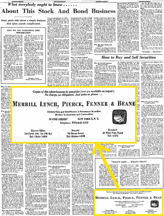
It wasn't long after the introduction of the printing press that we saw the first version of a 'landing page': a full-page advertisement in a broadsheet newspaper. The page was free from distraction and deferred user focus from other areas of the publication. Given a scalable version of the printing press was developed in 1640, it could be argued that the current version of the Internet landing page isn't totally unlike what the French might have been serving nearly 600 years ago.
Discussed in more detail in our article titled "How To Create An Effective Lead Magnet (Or 'Relationship Offer')", we provide this example of a broadsheet long-form advertisement from Merrill Lynch that caused a pivotal switch in how business communicated with their print market. Louis H. Engel's most famous and innovative advertisement first ran on October 19, 1948 in the New York Times. The ad contained 6,540 words – the most anybody had ever used in a single page. Notice the small and unobtrusive call-to-action to obtain a copy of the advert. This 'lead magnet' wasn't giving away anything new; they were literally providing the pamphlet containing the text in the ad! The contact made by those wanting the information had a cold market dip their toes into a sales funnel that would ultimately result in an invitation to watch a 30-minute movie in "full color".
Think about the effort and cost historically required to simply sit a prospect down in front of a video... and compare that against what's required today. In essence, this advert - and thousands of others like it - were landing pages.
The nasty old squeeze page was historically used to 'squeeze' contact details or a sale from an online user at any cost. The page was full of bold testimonials (fake, of course), inflated worth, and false promises. The squeeze page and the potential income that was derived from their use gave birth to a new wave of "digital marketers" (i.e. scammers) that were in it to make money at the expense of their soul. They'd push 'magic potions' that had no value whatsoever, and they attached an arbitrary price to a product that promised "secrets" and opportunity - none of course which was real. These charlatans dragged parts of the legitimate digital marketing industry into a realm of disrepute akin to used-car salespeople (and yes, the tactics are still used today).
So, while the old Squeeze Page might have intentionally over-promised and grossly under-delivered, the landing page (with its associated lead magnet) is a means to slightly under-promise and then overwhelm. It's an opportunity to set yourself apart from your competition and clearly identify you as the business of choice.
There has been a name for the 'lead (or link) magnet' on the Internet long before it evolved into the landing page concept that exists today – it was (and still is) Content Marketing. Your lead magnet is content, and by promoting it you are engaging in content marketing. The underlying concept of the lead magnet by todays' salesy standards is that we're sharing the content with a heightened expectation that it will convert.
There are countless tactics used on landing pages for which we vigorously object. For example, a fake countdown timer suggesting that a lead magnet is only available for a short time is a lie – don't do it. Advertising a live webinar (as a magnet) when in fact it's a reply recording is another lie; if it's a replay don't be afraid to say so – it doesn't diminish the value. The list goes on and on. Generally speaking, if a company is prepared to lie to you in their marketing material they'll do the same once you're working with them. This kind of 'urgency' marketing tends to be rewarded in our industry because it does work. However, it's something we won't do and generally won't allow our client to do.
Every Website Entry Page is a Landing Page
Keep in mind that we treat every page on your website as a 'type of landing page'. Since every page on your website is a potential entry point (driven in part by Search Engine Optimisation), every single page on your website is also a 'landing page'. So, every page on your website needs to provide some sort of conversion opportunity; it's time to stop treating your website as if it were an online business card and instead turn it into a lead generating machine.
If you're using third-party landing page websites such as leadpages of any 'click funnel' style of service to host your landing pages, they're objectively costing you conversions. Simple as that. Designed for those that don't have a website or technical expertise to build anything themselves, these third-party sites offer a short-term fix to a much longer term problem of lead generation. These external websites fractionalise your website integrity, often incur an ongoing cost (sometimes in the hundreds per month), don't provide your own website with any SEO benefit, potentially violate financial privacy expectations (if you're in the finance space), and they often operate outside of the parameters of the (Australian) Privacy Act, or those governing requirements implied directly or otherwise by the operating terms of an Australian Credit Licence (if applicable). We're seeing misguided finance professionals flock to these services despite having their own website... and often it's the digital oversight provided by industry pretenders (posing as "professionals") that seemingly advocate their use.
Hosted Landing Pages
Hosting a landing page within the confines of your own secure website adds trust by way of your own trusted domain. Additionally, certain styles are inherited making the landing page consistent with your own style guide meaning brand awareness/value isn't lost. The most important feature of a self-hosted landing page is that you retain full ownership - something that is difficult to claim when the page is hosted on a subscription-based service. The notion that finance professionals will send a lead to a third-party website when they have the capacity to host it themselves is simply absurd, and it's a practice that has to come to an end.
We talk a lot about building trust in a digital relationship, and sending a visitor to an unknown website often has the opposite effect to that which is intended. In the finance industry in particular conversions are often twice that on fully hosted and branded landing page when compared against any third-party websites. We want to make one point very clear: building a landing page on a third-party website is a defining characteristic of a digital agency that has no place in the industry.
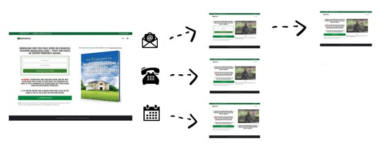
Discussed in an article introducing the value of the second page in the funnel flow, we introduce the value of what is traditionally a 'thankyou' or booking page. The second page is extremely high value and should offer content based on the escalation of subscriber commitment. We're the only company in our space to offer fully hosted landing pages with conditional redirect functionality.
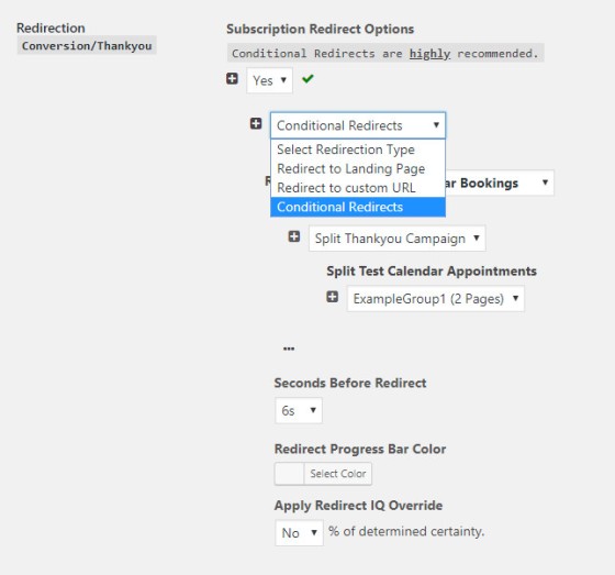
Pictured: Our preferred means of redirection to the second page is predicated upon conditional first page interactions. This means that basic subscribers, those that provide a telephone number, and those that make a booking, are all treated differently. Coupled with the "First Email" and associated relevance you might easily double your existing conversions using this technique.
Our top-of-funnel experience is discussed a little further here, and our landing page creation plugin is introduced here. You should follow the "Marketing Funnel" tag for broader context. The side-wide conditional content features served as a result of landing page interactions are introduced here.
Creating a Landing Page
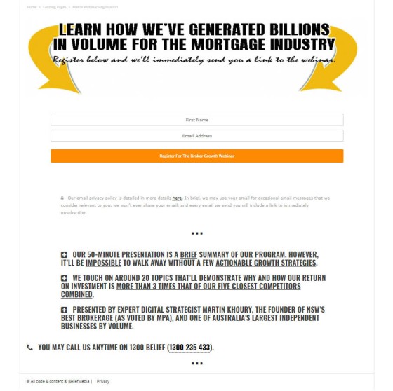
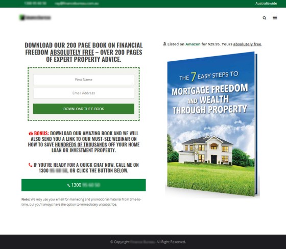
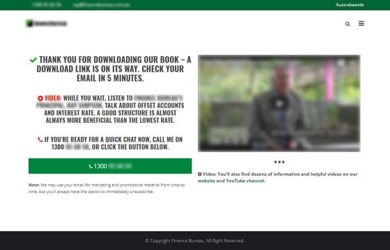
As mentioned above, creation of a basic landing page is easy. As described in this article you can have an integrated landing page within WordPress within just a few minutes. The super-simple one-page landing page below is one we've used for a long time, and it's also the one that generally converts more than any other (generally around 85%). We create very simple landing pages (similar to the one below) but also those that are design-focused and integrate a range of funky features... although it's the former that almost always performs more efficiently than the latter.
An example page that might be built using our very basic two-column landing page code is as follows.
If you're somebody that prefers email options to launch in a modal popup, that functionality is available in our Landing Page plugin (with dozens of other features).
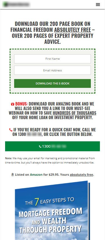
Obviously, as with all web design, all landing pages should be mobile responsive. The above pages stack as follows on a mobile device.
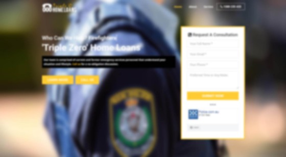
The image below shows a WordPress landing page on a website with a background image and other basic design elements. It's a full-length page that scrolls through a number of areas, but the primary area presented to the user on page entry emulates a simple landing page free of further distraction. It's blurred to de-identify our client.
Again, our methods of creating landing pages and split test campaigns is discussed in more detail here.
Keeping the Form Simple
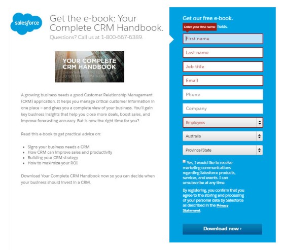
Any barrier to entry makes a conversion more difficult. Any layer of abstraction potentially detracts from the 'purchase' experience. This includes any field that isn't immediately necessary to serve the product. For example, consider the following download page from Salesforce.
Anything other than name, email, and possibly phone number should be justified by a clear operational need. Fields such as state, country, region etc. can all be resolved by way of an IP address and can be submitted 'covertly' via a form with a reasonable degree of accuracy.
Delivering Popups on Internal Web Pages
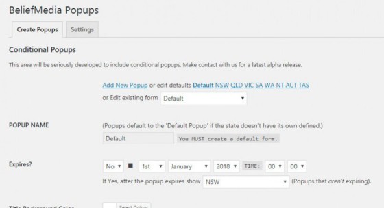
Since every page is a potential opportunity you should consider using a popup on non-landing pages. Our own WordPress plugin makes this easy with all the standard popup functions, but also includes the functionality to deliver popups based on geography or origin (a URL parameter is stored in a session so you're aware of what popup to serve). The latter feature has increased our popup conversions by over 300%. It's not uncommon to use popups on landing pages but it's normally the exit intent popup we'll show as a last measure to convert before a user vacates our page.
Our splash page plugin (soon to be integrated with the popup plugin) includes the same features.
The Most Trafficked Landing Page on Your Website
We talk a lot about optimising all areas of your website, particularly in the finance space where a website is often treated as an 'online business card'... or even ignored altogether. If you've ever uttered the words "my website is more for people to look at and doesn't really generate business" you're one of the many that hasn't optimised one of the most profitable drivers of your business growth. If you've ever directed traffic to an externally hosted landing page rather than your own website (as described above) you really need to rethink your life choices.
One of the most organically trafficked pages on your website is your front entry page and should be treated as a conversion opportunity. To that end, it's worth reading our Your Finance Website Is As Important As Ever"  article and alter your entry page methodology as appropriate. In brief, do way with sliders, distracting and non-converting elements, make the most of your entry top-half, and provide a clear call-to-action.
Again, every page on your website is a potential entry page and therefore a landing page... so each and every page should curated for a conversion opportunity of some kind.
Call to Action Buttons
It's not uncommon for many to create call-to-action buttons based almost entirely upon the default features provided by their WordPress theme. The problem with this is that the buttons (like any theme-specific shortcode) aren't portable if you alter your theme, and the buttons themselves are usually rather generic. The solution is simple: create button to your liking - and it's easier than you think. We've scheduled an article here that will show you how to create a large number of CTA buttons (using shortcode) you can modify to your liking with ease.
Rather than a generic 'Download' text on your button, consider text that is more specific and more likely to attract attention (e.g. "Claim My Free Offer"). Consider a bold color, ensure the button sits above your fold, and generally aim to have white space around the button to provide sufficient contrast.
A text-free button we often use on a few of our own websites (below) converts nearly twice as many visitors as any other.
Buttons are exceedingly easy to create and generally take no more than 30-seconds with our simple shortcode.
Note the use of the word "My" in the button rather than "Your". It's claimed that changing button text to the first person increases conversions by nearly 30%.
Generally speaking, green and orange buttons are reported to perform best although it ultimately depends on your site design, as contrasting colors work best to make striking buttons that stand out.
Simple Forms
Forms themselves alter conversions significantly. Form fields should be large and include placeholder text, and they should always include AJAX on-page functionality. Error checking should be simple, and user errors should ideally be corrected in real-time (forcing lower-case text in an email field is just one example since many users will correct any uppercase text assuming that it'll result in an error). Those fields that aren't required and may compromise on conversions should be clearly be marked as such (e.g a phone number). Read more about our industry-leading form experience here.
Relevance
If you're adding social proof by way of testimonials, ensure that they are served in a segregated manner (our testimonial plugin supports categories and tags, of course). In our own tests, serving testimonials that are entirely relevant to content served on the landing page increases conversions by over 37%. For example, if your landing page is delivered to a global audience, try and resolve your users' IP address and serve those testimonials that are geographically relevant. If you're passing URL parameters to a single landing page you can further filter testimonials to return those industries (or any other attribute) that is most suitable to your users' origin.
Of course, to mitigate the technical barriers necessary to create the functionality described above you might simply create multiple landing pages intended for different audiences and risk taking a small hit with the cross-pollination.
We introduce relevance to your landing experience by way of Conditional Redirects, a customised First Email, and a highly customised funnel journey. In fact, we introduce numerous measure to fully personalise the experience.
Pictured: Conditional Redirects (top) and creating the conditional redirect (bottom). The subscription might take the form of a phone booking, calendar booking, or email subscription. The second-page should always take advantage of this variance in order to convert. Read more here.
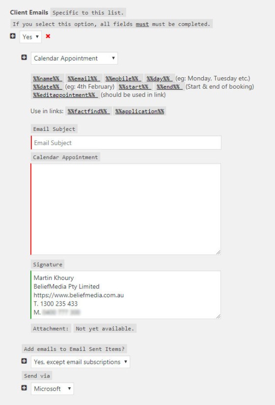
Pictured: No landing experience is the same... so the 'First Email' should be sent so on the basis of former interactions. Pictured is an email created for cases where a calendar booking is made on the first landing page.
Nothing adds relevance to your website experience more than delivering conditional content based on other interactions (including landing pages). All our website content is served on the basis of user interactions or geography; this holistic online experience is discussed here.
Statistics
The success of a landing page can't be assessed unless you're using analytics to measure conversions and activity. We recommend traffic-based analytics (such as Google analytics), screen recording features to watch replays of actual user behaviour, our own BeliefMedia Pixel, and heat maps so you're able to scrutinise your design based on mouse-movement activity. Any serious campaign that doesn't include these three features (as a minimum) is crafted based on ill-informed guesswork.
Landing Page Builders
Landing page builders aren't entirely different to the tools you might already be using on your own website - and many of them are excellent. To mitigate the technical learning curve a simple drag-and-drop editor can be used to simply build the page in blocks. Some themes, such as Divi  , come packaged with a builder by default while other products, such as Thrive Architect
  and Elementor
  , are available as standalone plugins. Of course, BeliefMedia has our own plugins available for client use.
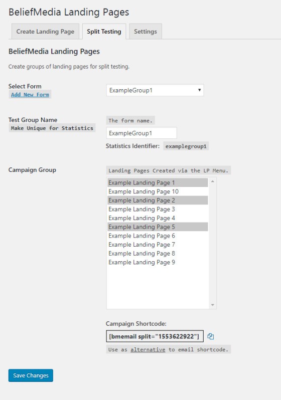
Pictured: Split testing landing pages with the BeliefMedia client plugin.
Conclusion
The landing page is intrinsically connected to the psychology of human behaviour and the only suitable method to determine what page works best for a specific audience or product is to engage in a relentless split-testing campaign.
There is no such thing as a fully-optimised landing page - there's always something we can be doing better.
In our experience the most significant means of ensuring high conversions is to keep the page extremely simple. Any element you add to a landing page that isn't entirely necessary simply adds more clutter and distractions, and potentially compromises your conversions. If your landing page starts to look like every other webpage on your website, it's time to start over.


