The one truth that the higher-end of the industry acknowledges as an indisputable fact is that self-hosted landing pages with an integrated experience convert far better than the generic lpages, leadpages, and clickfunnel style of tool intended for DIY businesses. Sadly, with the introduction of the "Facebook Marketer" to the digital industry (basically a slick salesperson with a Facebook account) we've seen the introduction of worst practice into the funnel flow. No self-respecting marketing expert should ever revert to third-party page tool when they have the capacity to build that page into the client's website. As we've said over and over, the notion of paying for a fractionalised product when the self-hosted alternative is infinitely more effective and far more cost-efficient is simply absurd. Worse still is that the same charlatans will introduce third-party calendars, third-party email services, third-party analytics, and about third-party 'everything else' in order to hack together a system that we'd describe as worst-practice. Of course, the landing pages themselves are an example of mediocrity, advertising copy is atrocious, and the associated email campaigns are deplorable. For the sake of broker's well-being, peddling this worst-practice and entirely generic solution (with a grossly inflated premium price tag) has to come to an end.
In a series of posts to this website we'll be introducing a number of systems and tools we've kept hidden behind a veil of 'secrecy' for as long as we've been in business. As part of a campaign where we take aim directly at the conduct of others that share our space in the finance industry, we'll be drip-feeding some information on our own hosted technology and tools in order to demonstrate the poor quality of competing products. Further, we'll be giving away a product with no obligation that others are selling for thousands. The reason? It's a product that isn't worth paying for.
This article introduces our proprietary method of creating landing pages and optionally split testing landing pages. Again, using a third-party product for the landing experience is never an acceptable solution from a professional. If this is what you have been provided, we have a 'Rescue Package' designed to give you the returns that paid promotions are capable of delivering.
The Landing Page Experience
If you don't know what a landing page is, it might be worth reading this post as a very general introduction. Our subscription experience is introduced here (an integral part of the landing page functionality), our conditional First Email experience is detailed here, and our enhanced high-converting conditional first page experience is detailed in a little more detail here. There's a growing number of articles that'll help you navigate the Finance Funnel experience by way of our marketing funnel  post tag.
While this article focuses on dedicated landing pages that are intended to convert off the tail end of paid promotion, it should be remembered that every page on your website is a potential organic entry page and therefore a quasi-landing page. Every page on your website should offer a conversion opportunity.
The primary purpose of a landing page is a conversion. The secondary experience is one that takes shape by way of a crafted email education campaign.
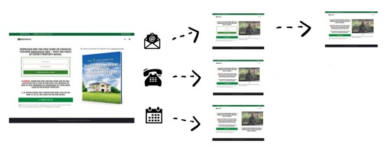
Our landing page experience converts higher than anything else on the market for numerous reasons, but the most obvious is the conditional redirect functionality.
With the secondary purpose of a landing page (or any page) designed to capture a non-converting market by way of a subscription, we also provide a conditional "First Email" on the basis of landing page interactions.
The conditional and highly targeted nature of our landing experience provides a truly personalised experience; it delivers relevance to the client and conversions to business. Our proprietary funnel follow-up - a little outside the scope of this article - converts in an extraordinarily personalised and professional manner.
We turn 'Landing Pages' into 'Conversion Pages'.
Creating a Landing Page
There are at least three primary means of creating landing page content (we'll call ours the fourth).
- Raw HTML. Raw HTML pages are created as the name implies - simply using HTML to code your pages.
- Page Builders. We listed a few (of many) landing page builders in our introductory article on Landing Pages. Landing page builders aren't entirely different to the tools you may already be using on your own website... and many of them are excellent. To mitigate the technical learning curve a simple drag-and-drop editor can be used to simply build the page in blocks.
- WordPress Gutenberg. WordPress introduced the Gutenberg Editor in version 5.0 of the software to compete with the emergence of commercial plugins polluting their own plugin system... but it also permits WordPress to remain competitive in the face of inferior services such as WIX. While we're not fans of the Gutenberg editor it is an acceptable means of creating landing pages.
We've not included third-party tools such as the various 'lead pages' websites because they're not acceptable solutions.
Most of the businesses we work with are not very graphically orientated (nor should they be); they're business people that want solutions - not more problems. Given that landing pages should vacate traditional fancy-pants design principles we've created a template on the back of millions of page views that we've determined to return more than any other. So, our general pages are quite simple in nature... and our WordPress plugin currently serves those designs that we've determined converts more than any other. Rather than forcing design on our users we'll simply have them fill out a few textboxes and other fields to return a quality landing experience.
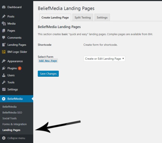
Before we can use a landing page we must first create it. We do so via the BeliefMedia -> Landing Pages menu.
We simply select an existing page or create a new form... and then fill in the blanks.
Once the page is created, we simply save it, copy the shortcode to a landing page, and we're done. The pages support various auto-detect features, FontAwesome icons, and shortcodes.
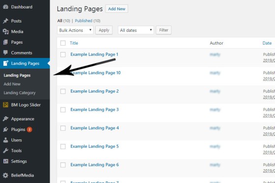
Landing pages are selected via the 'Landing Pages' menu. All landing pages inherit certain behaviours, and interact with our analytics tool in a manner that is slightly different to 'normal' pages.
Note: While the landing page currently requires that you cut-and-paste a small shortcode to return a page, we're currently testing a feature where a user merely selects a page to show via a select menu. The advantage of showing the editor, of course, is so additional content can be created below that which is automatically created.
The simple shortcode copied into a landing page returns a fully formatted landing experience.
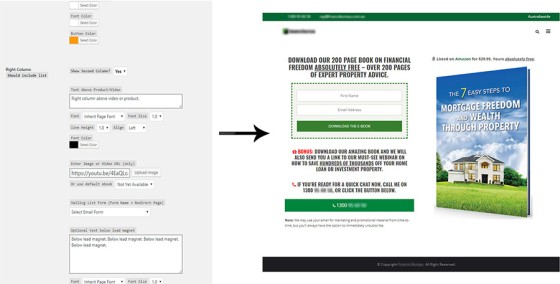
The form allows for the inclusion of images, text, videos, and various high-impact styles to be applied. The mailing list is selected in a dropdown menu from those that you have previously created (we never use embed code).
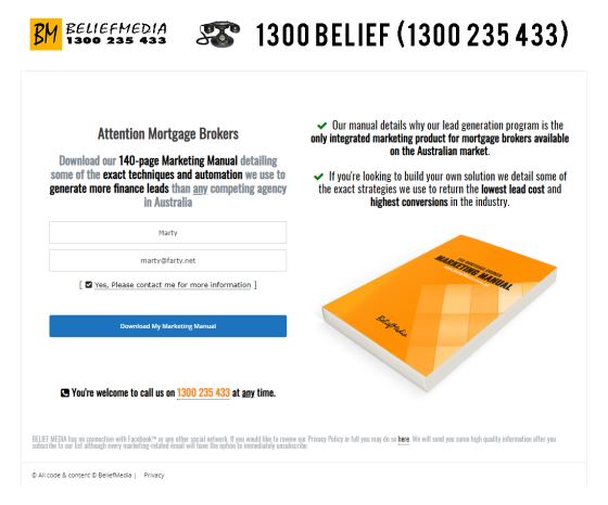
Pictured: A "naked" landing page we're using at the time of publication. We'll create larger more graphically intense pages when required but they almost always convert far lower than simple solutions. Note the use of white space - one of the most underutilised features of a high-performing landing page.
The simple process described above will render a high-converting landing page in just a few minutes. While it's easy to get caught up in the complexity of design, it's white space, product focus, a clear Call to Action, and super-simple presentation that will always perform more efficiently. There are other features and shortcodes we use to enhance page appearance (so it's not too naked), such as the feature to include FontAwesome icons or style text.
There are numerous features associated with our landing pages. As an example, any Wistia video link provided (on a landing or any other page within your website) will automatically associate the user with their analytics (as you would expect), we apply placeholders for text (such as name, email, phone, and the various booking elements), and the page is fully integrated with your website so the interactions are recorded in a session (and saved in a Cookie) so we can continue to serve and apply the most relevant information to the user in continued or subsequent page visits.
Split Testing Landing Pages
If you're sending traffic to your website from paid promotion you'll want to ensure your page is optimised by way of ongoing split testing to ensure you're always rendering the experience that delivers optimal conversions. Split testing (also referred to as A/B testing or multivariate testing) is a method of conducting controlled experimentation on single page campaigns with the end goal of identifying and then improving upon a single website metric, such as clicks, email subscriptions, or downloads. Incoming traffic to the landing page is distributed between versions of the page in order to identify significant difference in behavior to emerge. The 'winning' page becomes the "control" and is used as a benchmark in further split campaigns.
Split testing isn't limited to just landing pages. Facebook campaigns, Google AdWords campaigns, and standard web pages are all relentlessly split tested to ensure your campaigns are always optimised.
Note: Our own pixel that returns the most significant data for the purpose of evaluating campaign success. However, since our product is fully integrated we include an extremely comprehensive means of integrating with Facebook analytics. Standard page views, landing page views, thankyou page views, submit buttons, and other Facebook or custom conversion tracking  features may be assigned to various events at any time.
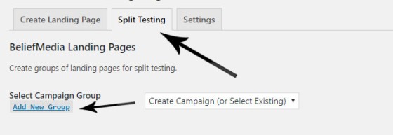
Our goal with our website management tool was to provide the easiest split testing experience. From the BM 'Landing Pages' menu, select 'Split Settings' and select 'Add New Group'.
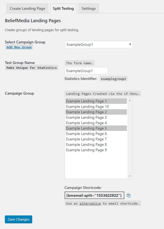
Once you select an existing group to edit, or select a new group, you simply assign a campaign name and add relevant pages you want split against each other. Any number of pages are able to be split tested against each other.
A 'Statistics Identifier' is returned for each group and it is this string that'll be used to identify each campaign group via our proprietary analytics. To enable a split test campaign we use the split test shortcode rather than the standard landing page shortcode.
Text Placeholders, Sessions, and Cookies
When a user first lands on your website we'll first determine if they've visited before by way of a cookie (or checking for an active session). If not present, we'll resolve their IP address and record a number of details in our session (and save to a Cookie). When a user fills out a form or makes a booking of any kind we'll save that data in the same way. When we're serving a page we can check for this information and conditionally serve information based on their location or past behaviour (supplemented by a system we call Skynet which introduces a type of AI into browsing behaviour). While we have an article scheduled that details how you might serve geographically relevant information to various pages (usually First Home Buyer Information), the reality is that we might conditionally serve custom content to each visitor on any page (and not just on landing pages).
Because we employ our proprietary conditional redirects during the linear landing experience we know what sort of information we might present to a user on the second page. If a user makes a calendar booking we know that they've provided their name, email, telephone number, and a booking date. If our user has provided us with a phone number without making a booking we know that they've provided a name, email, and phone number. Knowing this we can build these pages with an entirely appropriate and personal response.
Available placeholders are as follows: %%firstname%%, %%email%%, %%phone%%, %%mobile%%, %%day%%, %%date%%, %%longdate%%, %%year%%, %%start%%, %%end%%, %%cityname%%, %%region%%, %%country_name%%, %%latitude%%, %%longitude%%, and %%postcode%%. It's the landing experience where the passage from one page to another makes appropriate placeholders entirely predictable... although you may use them on any page.
Resolving location and custom content forms the basis for our scheduled post on conditional website content. For example, we've resolved your state to be Kentucky (if we were unable to show your location we'll show 'Unknown'). Other geographic data is less accurate although we're working on making it more user-friendly. Your resolved city of Jackson and 'nearest' postcode of is probably way off... although the returned coordinates are usually suitable for finding a nearest broker or franchise office. So, given that we record each offer (or Lead Magnet, or "Relationship Offer") the user has subscribed to, and since we resolve location, we might conditionally serve a new offer which is entirely relevant to that specific audience. While not entirely accurate (just yet) we might further discriminate between the type of content we serve to different areas of the same area - such as the Eastern and Western suburbs of Sydney (in the same way we'd rarely serve the same advertising to the same areas of the same city).
The benefit of saving user data, of course, is that the second landing page becomes more personal (and far more relevant). On non-landing pages we conditionally check data and serve appropriate content in the same way (this might include features such as checking for an active booking and rendering a small edit option, showing a custom bookmark feature, or serving content specifically crafted for those you're scheduled to talk to).
BM Pixel
The BM Pixel is described in more detail here. It isn't overly different from most analytics software except that our proprietary solutions are designed to provide more details specific to WordPress (and various details necessary to build a 'Redirect IQ' score). Sending the Post ID, title, and slug, for example, allows split testing on a level not typically available.
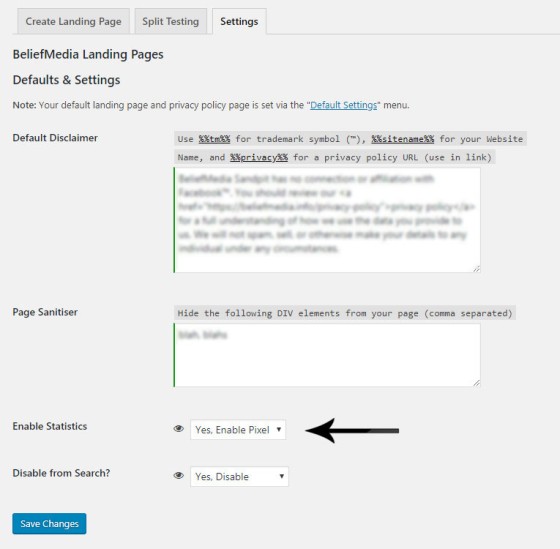
The 'Page Sanitiser' is used to remove unwanted elements from a page, such as headers, menus, and large footers.
The pixel is enabled by default. If you're using our plugin already you'll see significant additions by the middle of 2019.
Conclusion
Ease of creating landing pages and split test groups is essential... and our solution makes the process an easy one. We'll generally review our clients' split tests every two days and make adjustments every three days if we've seen sufficient traffic (the larger number of page views the more reliable the data). It's not uncommon to consistently double the improvement of early efforts with further incremental improvements achieved via a relentless and ongoing effort to achieve perfection. When we inherit campaigns via the generic "Facebook Marketer" brigade we'll normally quadruple the effectiveness of pages very early... and we'll usually have the same effect on Facebook ads (which are also split tested in groups of 2 to 6 depending upon the assigned budget).
Given that we're the only company in the finance space offering a high-level proprietary solution is another reasons that has us stand out in a crowd populated with mediocrity.


