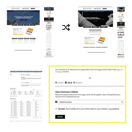
We say over and over that the glue that'll keep funnel participants engaged is relevance, and this was demonstrated with a post we shared this morning which showed how various blocks of content (particulary on the front page of your website) may change shape based on the resolved borrowing objective of your user.
Why show investor information to first home buyers? And why show first home buyer information to SMSF borrowers? The conditional (front page) ensures that your primary website assets are speaking in a language that supports your promoted claims. In other words, our website (and broader funnel) will course-correct to maintain relevance.
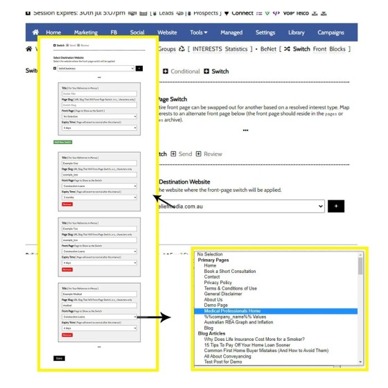
The Switch module takes this conditional method one step further and completely swaps out the front page for another. It does this in one of two ways: resolved borrowing objective/industry; or based on an entry slug (part of the URL). The front page then swaps out for another for that *specific* user, and it stays that way.
If you're promoting to a specific niche, such as the Medico or Legal industry, this kind of chameleon effect ensures you're presenting yourself in a manner that supports your claimed expertise (how often do we hear 'Medico Specialists' when that claim isn't backed by supporting digital?).
There's no limit to the number of Switch options set in Yabber. You may have just one or 100 Switch rules - it's up to you.
To be clear, the Switched front page presents itself *as* the front page, and there's no indication that the standard page even exists. If a Switched user comes back in a month, the altered page will continue to show.
There's hundreds of reasons why our digital solutions are the most effective in the industry. This is just one of them.


