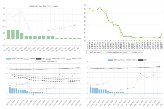
There's not a single graph that is more necessary on a broker website than one that shows the movement of the official cash rate. There's no clearer way to illustrate the fluctuations in the official cash rate over time, and inclusion of CPI/inflation data visually articulates the relationship.
The default BM plugin includes a bunch of RBA tools and various formatting options, but any broker can access current data via the dynamic JS graph with our free RBA plugin.
Both the free and client plugins will return the 'naked' cash rate anywhere on your website with the 'cashrate' shortcode (useful when linked to data in your footer).
The reason we built a free plugin with various types of RBA data is clear: it's a broker website necessity.
Pictired is just a few examples of the graph with basic styles applied.


