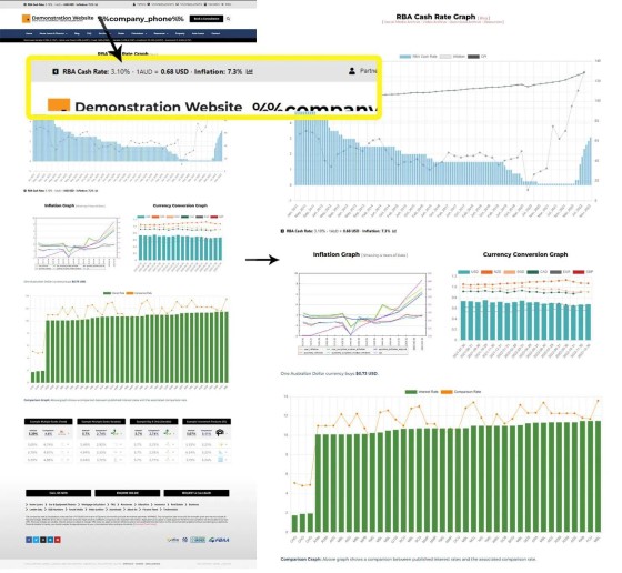
Note to clients. Yesterday we shared an insignificant update to the standalone graph page, which is hidden behind a graph icon in the header. We've made a few additional modifications (if you want to make them yourself we'll have an FAQ on our website in a couple of days).
As shown in the image, we've made the inflation and currency graph a little smaller, and the currency graph now shows the USD (measured against the AUD) as a bar graph, while other currencies remain as a line graph.
What we've described is obviously a seriously insignificant component of the framework, but it does attract traffic, so it needs to be functional and look good.


