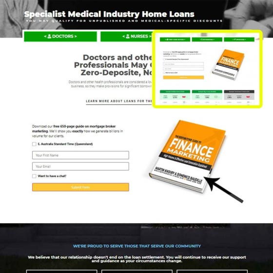
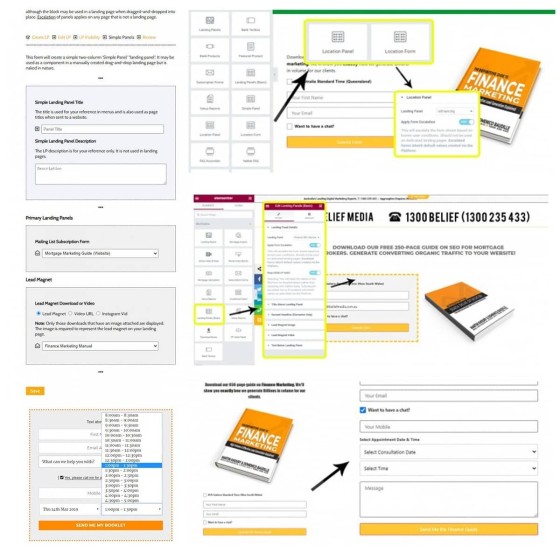
As the conduit between your website and your top-of-funnel, your website forms have to be attractive, fully customisable, easy to use, and functional. Yabber provides the *only* drag-and-drop forms in the finance world with almost triple the automated options that may apply when a user subscribes. Form features are fully integrated meaning that they're part of your website - they're not a third-party plugin.
When a user submits a form it is a declaration of interst - we now *know* what the user is most likely interested in. As such, we're able to serve conditional website content that is most likely to convert. We also know whether the user has made a booking with us or not (via the only fully-integrated calendar in in the industry) so we're apply to apply a conditional redirection to an appropriate second page (part of our proprietary escalation of commitment strategy) meaning that the relevant funnel journey starts immediately.
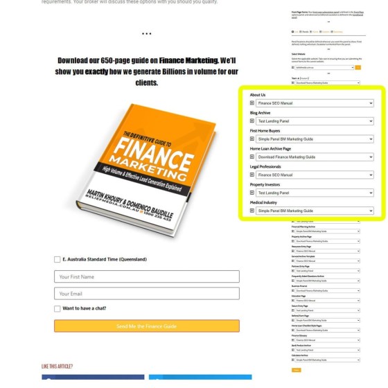
Every page on your website is a potential organic entry point, therefore every page is 'type' of landing page, therefore every page on your website needs to provide a conversion of some kind. Don't assign all your conversion efforts to landing pages when traffic comes from anywhere... and certainly don't make a user navigate to 'another page' for an offer (every subsequent page view diminishes through traffic and conversions). Yabber includes a menu where you simply assign a specific vertical form or two-column landing panel on every page - easy).
While the form on each page is defined in Yabber, if we're able to resolve the interest of a user we can show them an alternate interest-based form. Then, after a user subscribes to that offer, we don't want or need to show them the same form again, so we escalate vertically through a list of defined alternatives. Then, of course, the conditional redirection applies.
Our form includes a ton of features design to convert audiences.
As the digital handshake between your website and the real world your forms need to be great.


