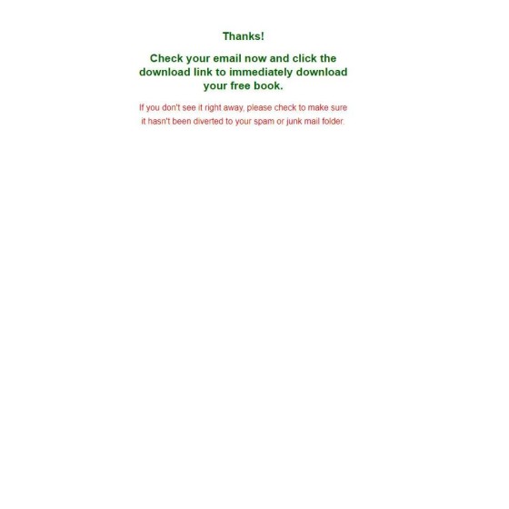
I required a book from a broker so I could upload it into Yabber and create some 3D book covers, so what's pictured is the second page after the subscription.
First, a funnel is a journey, and the subscription funnel is the entry point into the marketing funnel, but the subscription itself has the capacity to build pathways by delivering fresh content to an engaged user. The entire funnel process is built upon the principal of 'escalation of commitment', meaning that 'what comes next' is more (or just as) important than the previous user interaction. We know that engagement, escalation, and relevance are core ingredients to a conversion - (all factors that underpin and contribute towards our expertise and authoritativeness) - so a 'simple' subscription should continue to deliver value page after page... but in the simple page used by Mortgages Australia we reach a literal endpoint.
The pictured page doesn't show a video, additional resources, FAQs, fact find reports, property data, or *anything* else. There's no mention of the referring broker, or even a link to the parent website. The second page is (or should be) a gift to business owners because it allows us to guide an engaged user into a conversion funnel, so the second, third, fourth, and other pages absolutely shouldn't be wasted.
For comparison, our forms are diametrically opposed in terms of functionality when compared to the pictured atrocity. We apply conditional redirections based on the first page interaction (calendar booking, phone booking, email subscriber etc), and we have the capacity to deliver conditional content so relevance is maintained. Bottom line: the second page is another landing page, as is the third page and each page that follows. Don't throw away the opportunity to further engage with an active user.


