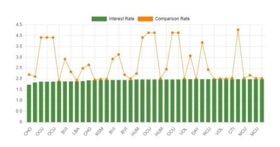
The interest versus comparison rate graph is one we introduced because it's an effective means of communicating the salesy nature of the published rate. It's a default inclusion in our client website plugin (as a drag-and-drop widget or shortcode) and in our free 'Core + RBA' plugin.
In our standard email follow-up sequence we introduce the nature of rates and link to a page on your website that includes this graph alongside standard cash rate graphs. It's actually become quite an important tool to visually illustrate the gap, and it feeds us with an opportunity to discuss the 'relevance' of the comparison rate. The net result is that the graph encourages a discussion that leans towards more important structural attributes.
Data returned in the graph is always current,and it is available in a dynamic JavaScript or image format.
It's a basic graph, but it has a big impact.


