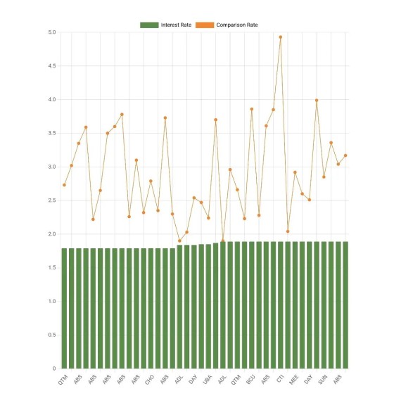
The comparison graph shows a number of competing bank products with their published and comparison rates. The purpose of the graph is simply to illustrate how the lowest published rates don't necessarily equate to the lower or more appropriate comparison rate. To be fair, we've sourced all the products with the lowest and current interest rates made available to the market.
You'll note that the published rates might appear fairly consistent and 'flat' as this is a figure the banks might often use to appeal to customers and compete against each other, but it doesn't necessarily represent the true rate provided by the product (as illustrated by the accompanying comparison rate line in orange).
The always up-to-date graph, including a number of others just like it, is included in all our products by default. All graph attributes may be altered.


