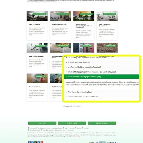
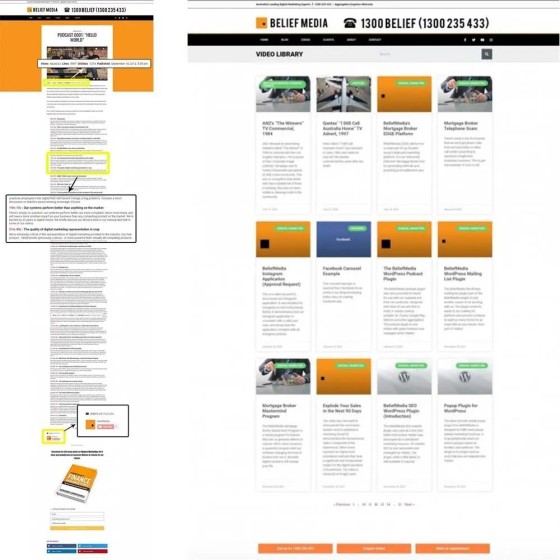
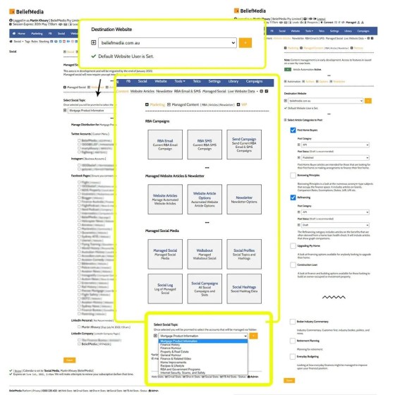
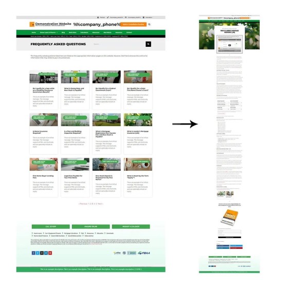
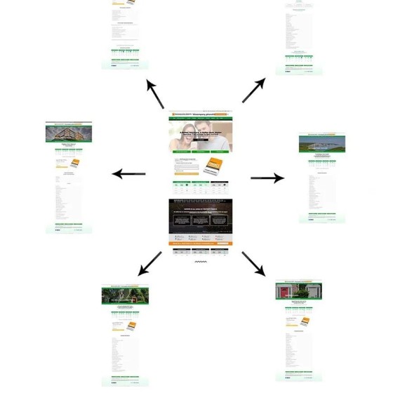
We're asked all the time how our digital systems are able to convert as high as they do, and why they're so much more effective than the pedestrian experiences in the market, and we point to our focus on ROI and funnel engagement. Our design is one that looks good, sure, but our website and funnels are designed to lock a user into an attention-focused pathway with the funnel or phone call as the primary objective. Does your website have a clearly defined objective, and do the resources on your website actually funnel users into meeting certain funnel endpoints?
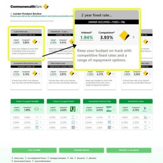
Do you present three home loan options to your client, or fifty? Clients will be attracted to brokers because they're able to cut through the noise and centre in on what the client actually needs. This client need is what's giving rise to the machines - comparison websites (often doing a better job than most broker websites because they present solutions... even if flawed). While far from accurate, and rarely taking all the appropriate borrower attributes into consideration, comparison sites simply remove the clutter and provide the user with the illusion of choice. In a sense your website asset performs the same task; a user wants refined actionable solutions.
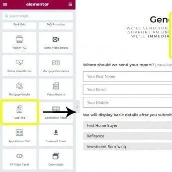
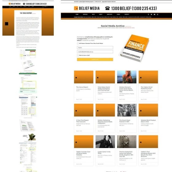
Please don't use those crazy quiz-style questions (it's more confusion; use our fact find our venus report - or provides solutions). The quiz questions are a bottom-of-the-barrel solution introduced by clueless monkeys and lead-generation companies as a poorly designed 'qualification' tool (that doesn't work). The practice violates best interest, industry obligation, common sense, and they seriously compromise your conversions. Call us for details.


