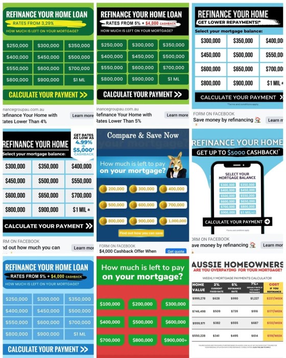
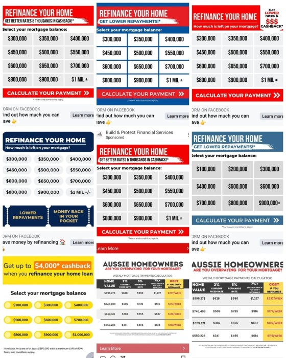
We wasted a budget to see how the creative performed when compared against something compelling. We compared use of the boring image against an ad from a new broker. Leads and conversions were *initially* 7X higher, so it'll likely increase.
In a world where we move mountains to see incremental improvements in ROI, there's really no excuse for knowingly throwing money into something that simply doesn't work.
Creative has a *big* impact on the success of your ads and campaigns.
Now is a good time to consider just five relevant pointers from David Ogilvie.
***
1. Headlines are the most important part of your advertisements. According to Ogilvy's research, "five times as many people read the headlines as read the body copy. It follows that unless your headline sells your product, you have wasted 90 per cent of your money."
2. Promise a benefit. Make sure the benefit is important to your customer.
3. Make your advertising persuasive, and make it unique. Persuasive headlines that aren't unique, which your competitors can claim, aren't effective.
4. People often skip from the headline to the coupon (image) to see the offer, so make the coupons mini-ads, complete with brand name, promise, and a mini photo of the product.
5. The best images arouse the viewer's curiosity. They look at it and ask, "What's going on here?" This leads them to read the copy to find out. This is called "Story Appeal".
***
Does the carbon-copy advertising showcase the brokers' expertise and authoritativeness? Does it have the necessary story appeal to tickle the mind of the reader? Do the businesses use the image to leverage the offer or value? Does the ad position the broker in any way? Does the advert differentiate one business from another?
Bottom line: it's just garbage.
Accept no less than excellence.
Stop the finspam.


