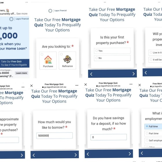
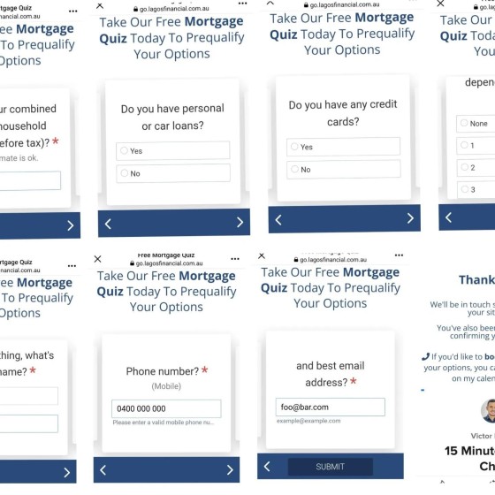
Let's talk about the 16 panels required to get a booking form. We know, categorically and with data to support the claim, that 'qualifying' a client by way of a 'privacy-hungry' form, will drive away the highest-value candidates. And we know that making a lead jump through hoops with the promise of some sort of answer, but failing to provide any answers or value, will alienate them.
This style of form is illegal (leaning towards baiting, and certainly false advertising). Ironically, providing value and solutions (rather than illegal hype) would improve on the number and quality of leads. The arse end of the leadgen industry just doesn't get it.
A full 16 pages to reach the appointment form, and not unlike the 'quiz" itself, the off-site booking form is stuck in a poorly formatted iframe (so it cut off most of the content). In contrast, we provide a' hidden' booking option behind a checkbox on the first page, and we provide a open calendar on subsequent pages (our conditional solution is integrated with your website *and* Outlook).
The form itself. No valid reason could be found to include the quiz questions in the subscription flow. Remember, your job is to qualify yourself - not the client... so unless your form sends a PDF report to the client (as ours does), then don't show it. The quiz is completely unnecessary, adds zero value, and contributes to the non-compliant nature of the experience. Every single page view of any kind, and a keystroke of any type, objectively decreases conversions. This means a minimal experience will *always* perform better.
There is no funnel - it's just a subsciptions form. Our free broker plugin provides an experience that vastly outperforms this garbage.
Please use our *free* plugin. There's not a marketing company in the industry that comes close to providing an experience that returns more value than our plug-and-play broker plugin.


