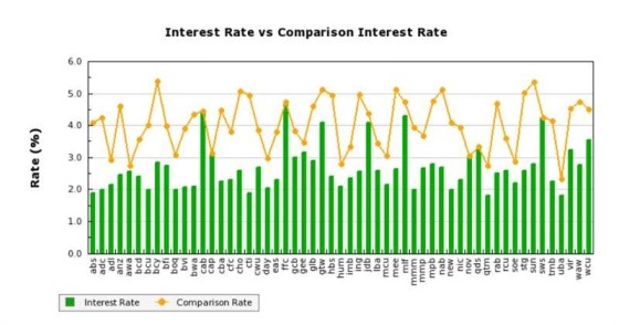
We've always had a JavaScript graph to render various interest rates against their comparison rates (it's in the Yabber Plugin and our free Core plugin). However, we've just added the same style of graph to the image-based Loancalc API (the Loancalc API is designed for applications such as Venus).
The graph shows rates associated with those lenders on your panel, and it's designed to illustrate the differential between the published figures.


