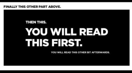
The former principle is related to time; that is, the more information you present the longer it takes to reach a conclusion, while the latter study leans towards the 'less is more', or KISS principal: it's easier to make a decision when you have fewer choices to make. It's these two considerations that helped us shape a website experience that converts more than any competing product on the market.
We've designed our mortgage broker website to be consistent with the known psychological behaviours we've just introduced, but before we accepted the claims, and without investing our faith into the proven psychology that has withstood the test of time and scrutiny, we tested and analysed conversions over several million page views, pathways, and funnel excursions in the online world. As a result of what we now know to be true, and what we know converts far better than competing designs, we've completely altered the manner in which we render information to a page. In essence we have completely removed any element that doesn't serve a specific purpose, or doesn't make our user experience a more enjoyable journey. As such, we've done something that is diametrically opposed to what you're told will work on a website - we removed the clutter.
http://shor.tt/Jy8


