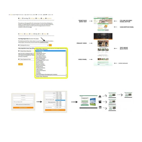
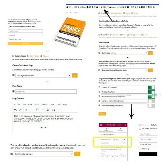
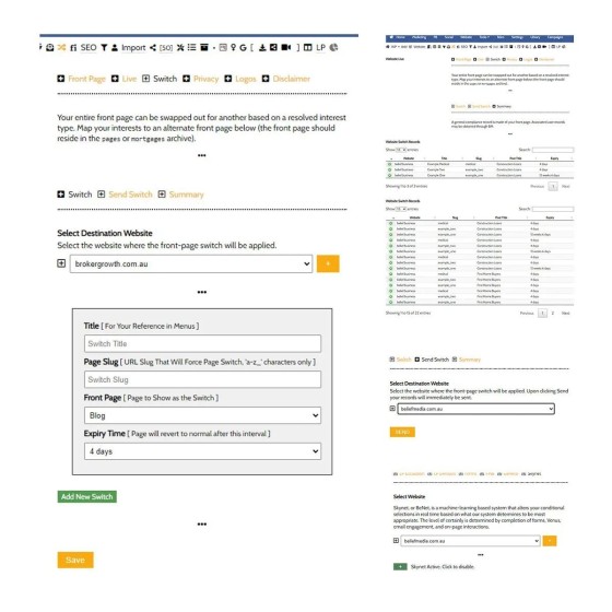
As you might be able to tell, the feature is advanced and usually isn't employed when creating your first few custom campaigns, but it's often applied in Solis campaigns (automatically created by Yabber).
By resolving relevance any website page (primarily your front page) can change shape, or we can swap out the front page entirely via Yabber's 'Switch' module. When one of the primary funnel objectives is orientated around "what comes next", the relevance drives this nested experience and *will* return more conversions.
A commonly used feature is form or simple panel escalation. What escalation does is show another form in a sequence once a user has interacted with the first. This becomes particularly important when the offer on your landing page (if used) is also shown on other pages, since the funnel will drive a user back to your website experience.
We are the only company in the finance space to provide advanced conditional features (and one of the very few in Australia), and the only company to fully integrate your website with your funnel and periphery experience - something we've determined to be ridiculously essential in the funnel. When you consider the array of Yabber features you might start to appreciate why we get a little frustrated with the low-performing products peddled to the market.
Keep in mind that your 'forever' 130+ page website, packed with hundreds of features, is still priced lower than a pedestrian 10-page site.
More information is available on our website.


