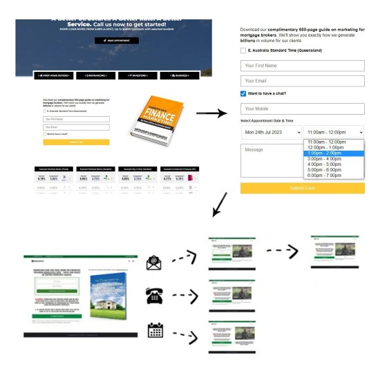
The first part is easy.
Put a lead magnet and subscription form on *every* page of your website. Every page of your website is a potential entry pathway for 'somebody' (traffic comes from anywhere), so it *is* a type of landing page and needs to be treated as such.
Don't make the mistake of thinking anybody is going to visit your contact form - most browsing traffic is 'research traffic' - they'll only respond to and engage with something of value. What are you giving them? Whatever it is that you have on offer, it has to exceed the value of an email (a 5-page guide on refinancing is like using a fake photo on a dating site).
Is you're using Yabber and our website, assigning a new form anywhere in your website is a point and click exercise. Select your form (with lead magnet) and location, then save. If you're using another product it'll take considerable time, but it'll be worth it. If your don't have the ability to do what I've just described, you need to make some decisions.
The second part.
It amazes me that brokers use off-site calendar scheduling tools. We built an Outlook-integrated calendar option into *every* form of every type (so, on *every* page of your website). If you have traffic, it'll explode your organic conversions.
On the basis of the form action (calendar, phone, subscriber), we employ conditional redirects, meading we'll send the user to a page based on their interaction.
Why conditional redirects? Because this is the start of their funnel journey. The second page is the next step in their excursion, and it's designed to support necessary escalation of commitment.
But that's not all.
A form submission is a 'declaration', meaning we know what interests them, and we can show more relevant website content. The form itself escalates - they don't need to see if again... so we'll show them something new.
When submitted, 35 points of automaton optiionally applies, including email (of course) and SMS.
Forms are more than forms.
Dare to compare.


