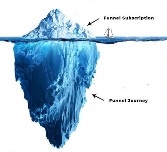
It needs to be understood that once a user is subscribed to 'anything', a deep, immersive, engaging, and education-based journey continues to apply, and it's the latter funnel excursion that is just as important as the initial transaction.
A funnel starts when a user lands on *any* page. From that point forward we need to think about the contact conversion, the subscription conversion, and the pathways necessary for that user to stay engaged.
The Conditional Redirection ensures that the second page (after a subsciption) escalates the user appropriately based on the type of form interaction. The second page shouldn't be a 'thank you' page - this is a wasted opportunity. The second page, or the page shown after any subscription, is a gift to your funnel. We know that each page view or keystroke objectively decreases conversions, and this means we're obligated to minimise the effort required to submit a single form, and we're required to show *relevant* content.
What we've just described is a mechanism that allows us to achieve in two pages what takes others 5 or more pages to do far less efficiently.
How do we create a conditional redirect? We make it easy for a user to make a booking with an Outlook-iintegrated calendar booking form (*always* a checkbox option on any entry landing page). The calendar interaction determines the redirection.
The article describes how the subscription, conditional elements, modals, and early pathways, are all created.
Digital funnels are an absolute necessity for your business, and your website itself needs to support the nested experience to educate and inform potential clients.


