A short time ago we introduced how Yabber manages the various panels on the front page of your website. Each panel on the front page is designed to convert, and appropriation of these front page assets go a long way into facilitating conversions. While every page of our mortgage broker website is designed to convert, it's the front page that attracts the majority of your traffic, so it stands to reason that it'll provide the features necessary to quickly convert an opportunity or create the necessary website-based funnel pathways.
In this article we'll look at just one component of the broad conditional content methodology that permits you to alter the primary front page panels shown to traffic entering your website for the first time, or show new content to existing users that expose their borrowing objective by way of their browsing patters. Subsequent articles discuss how you can completely swap out your front page for another, or show positioned and highly-targeted conditional panels anywhere on your website to specific groups of users. The Yabber experience provides an array of conditional features that add incredible power to your marketing funnel (our own website should be referenced for the various features made available).
The Conditional front page is an advanced feature. Not all business owners will use it straight away, but as your marketing matures and you start to develop an appreciation for the important part your website plays in your holistic funnel lead generation, you'll start to assign the appropriate resources to make your experience come alive. That said, conditional features are simple to use.
If you haven't heard of this or any of the hundred-or-so other website features made available in our broker website, it's because we design our technology internally for use specifically by mortgage brokers. Our broker website is, without question, the most functional and powerful in the market... and it's the only website integrated with an AI-driven digital system. The website is part reason why our campaigns (such as Facebook) are up to 500% more effective than others made available in the market.
The Conditional Front Page Panels
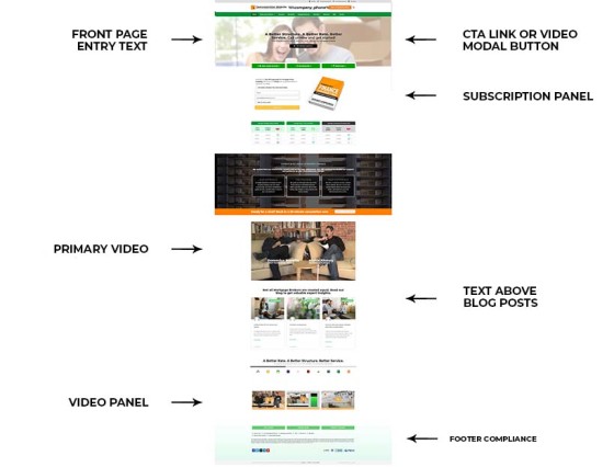
The assignment of various front-page assets are described in an article title "Managing Front Page Website Content Within Yabber". In summary, the Yabber panel allows you to assign the appropriate media or text in various locations on your front page at the click of a button. In summary, the primary entry-page assets are as follows:
- Call to Action Text on Entry
- CTA Button (Link or Video Modal)
- Entry page lead magnet panel (offer and subscription)
- Front page primary video
- Primary video panel
- Text above front page blog articles
- Live Bank Product Widgets
Of course, these front page panels are supplements by the footer panel, broadcast messages, and other in-post options (including compliance text). The point to these particular front page panels is that they are all proven to convert. However, they convert to a general audience - not a specific audience... and it's this specific audience that conditional changes are designed to convert. The improved relevance and targeted messaging massively improves upon conversions.
Pictured: Pictured is a typical and generic entry page. The seven primary conditional marketing assets tend to cover the entire page, and they change based on identified browsing habits (or on entry back to a website after browsing various pages). It's a simple conditional model but is highly effective when used correctly. As with any website front page, we only serve content that serves a conversion purpose. Anything that detracts from any primary conversion objective will diminish conversions.
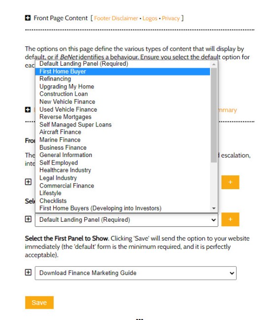
Pictured: The landing panel form, showing the interest types that can be assigned to the subscription (the selection is identical for each panel). The interest types are defined by you.
The entry assets may optionally be defined for each identified interest type. You may define changes for each panel or every panel. if an interest is identified and no panel exists we'll always revert to the default panel.
In summary, you can force the content on the front page to be consistent with the borrowing objective of the client. You'll shown first home buyer information to first home buyers, investor information to investors, SMSF to Supper borrowers, and so on.
Identifying Interest
There are two primary mechanisms used to identify or force the interest of a user (we'll ignore the AI BeNet system for now). These methods are as follows:
- Using a defined entry URL (for example, https://YourWebsite.com.au/?my=first_home_buyer).
- Identified interest based on browsing behaviour.
The URL entry method forces the interest to be identified and changes any content assigned to that interest for a defined period (usually just a few days). The second method - by way of browsing behaviour - is defined with each link. Each link in our system is generated using a shortcode of [link url="123"]Your Anchor Text[/link]. The optional interest type as a shortcode attribute will force the system to identify that interest type (so, interest="first_home_buyer"). More information on the latter method is introduced in an article titled "How Interest Types Shape Conditional Content on Your Finance Website". As the 'interest score' differential increases the new content is shown to match the higher value interest.
If it sounds complicated it is only because it's a new concept, but it's also one that'll have a significant impact on the quality of your customers' funnel experience. Remember that what we've described in an option, but it's also one we'd recommend.
Links are Weighted. Some links are more relevant than others, and some provide a better contextual understanding of the user. For this reason, you may assign a higher 'interest score' for each link you create. For example the link shortcode introduced above, in full, would like like this: [link url="123" interest="first_home_buyer" rs="20"]Your Anchor Text[/link]. The rs="20" attribute assigns that link with 20 'interest points' instead of incrementing the interest by just a single point (which is default behaviour). A jump of 20-points by a new user early in the navigation is often enough to force the new borrowing-specific content to be shown.
You may use the interest types in email marketing as well as internal links. Additionally, all articles submitted to your website via our article distribution system creates links with weighted interest scores. When a user enters your website via a link carrying a forced interest type, that content continues to be shown for a period of time defined in Yabber regardless of the aggregated interests score.
Conclusion
We appreciate that the concepts introduced above might be a little confusing, but they won't be with our guided education programs and support. While the conditional front page features they're also extremely powerful.
BeNet wasn't introduced in this article because it introduces a measure of complexity we wanted to avoid. In summary, the BeNet system is an AI-engine that works at resolving the interest of a user (usually a user involved in a Facebook or organic funnel), and BeNet will send that information to your website and start crafting their journey based on known or identified conversion funnel pathways.
Until you have a website that is actually designed to attract, engage, and convert, you will not realise the potential or organic traffic, and you certainly won't realise the potential of a real marketing funnel.


