An FAQ titled "The Website Modal Overview" introduces the modal module in Yabber and on your website. This FAQ will show you how to create a standard and full screen modal, while other FAQs will discuss how the modal system functions in more advanced funnel-centric ways.
The most basic way to reference a modal in Yabber is via simple shortcode. Shortcode of [link modal="0a36c5e9fb0a3813091a317d2676430c"]this demo link[/link] returns this demo link . We'll come back on how to reference the modals you create towards the end of this FAQ, but it is important to see a simple example so you know what you're creating.
Locating the Modal Module
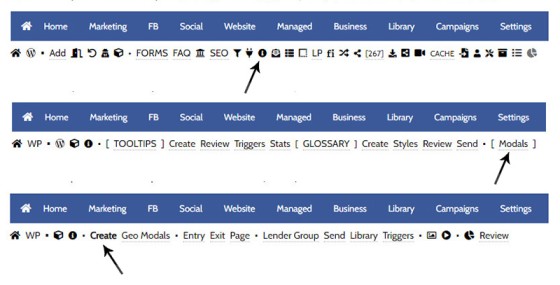
The modal module is in the 'Information' module. Select the small 'info' icon in the Website module, then select 'Modals'. The panel returned defaults to the 'Create' panel.
Pictured: The modal module is in the 'Information' module. Select the small 'info' icon in the Website module, then select 'Modals'. The panel returned defaults to the 'Create' panel.
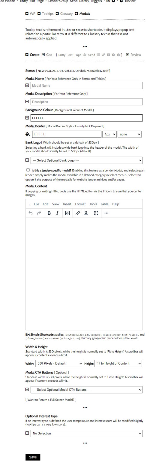
The naked modal panel is generally quite explanatory. The panel requires a name and description (the former for use in forms, and the latter for your reference), The only area that is really required is the content area, so you create the text or embed the media that'll show in the modal when it's returned to your website. The WYSIWYG makes editing easy - if you can use MS Word you can certainly use the Modal Editor. The naked modal template looks as follows:
Pictured: The panel requires a name and description (the former for use in forms, and the latter for your reference), The only area that is really required is the content area, so you create the text or embed the media that'll show in the modal when it's returned to your website. The WYSIWYG makes editing easy - if you can use MS Word you can certainly use the Modal Editor.
The following modal is the modal linked to earlier:
Pictured: The modal module is in the 'Information' module. Select the small 'info' icon in the Website module, then select 'Modals'. The panel returned defaults to the 'Create' panel. We've applied a few stylistic options that we'll discuss.
The first thing to note that - as a CommBank modal - we've selected the small checkbox that asks "Is this a lender-specific modal?" Selecting this option categorises the modal as a 'Lender Modal' and simply makes the modal available in a defined category in select menus. Selecting the option returns a select menu where you will be required to assign the modal to a lender. You should select this option if the purpose of the modal is for website lender archives and/or pages. The purpose becomes clearer when we introduce various lender modals and archive modals. The only other option we've introduced is the background colour. The width and height of the modal retains default values  .
.
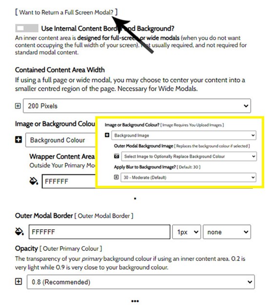
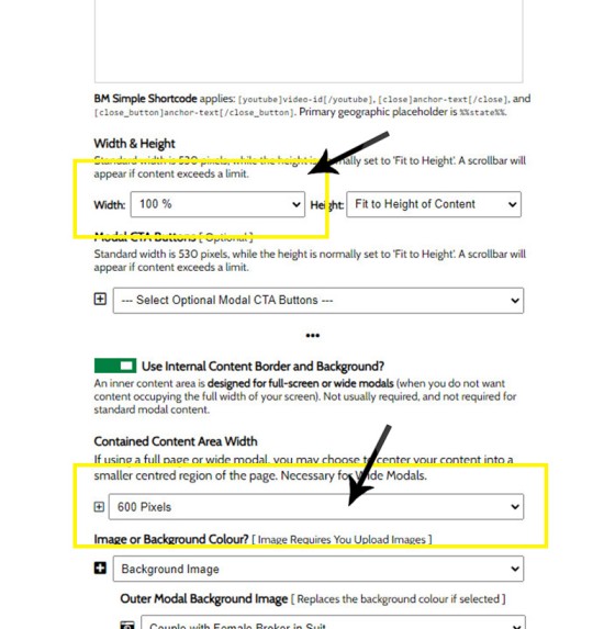
Full screen modals should generally be avoided because they're intrusive and ugly. The exception to this subjective rule is when they're used for video, or when launching loan application pages or similar. TO create a full screen modal you should select the "Want to Return a Full Screen Modal?" option which in turn will return a number of other options.
Pictured: Full screen modals should generally be avoided because they're intrusive and ugly. The exception to this subjective rule is when they're used for video, or when launching loan application pages or similar. TO create a full screen modal you should select the "Want to Return a Full Screen Modal?" option which in turn will return a number of other options.
An example full-screen ANZ modal is as follows (intentionally quite crappy to illustrate how annoying they are). The modal was created in Yabber with the pictured attributes  . At the time of writing we don't force the close button, and instead hand over control to the person building the modal. In the next Yabber update we include the Close button in the top-right by default.
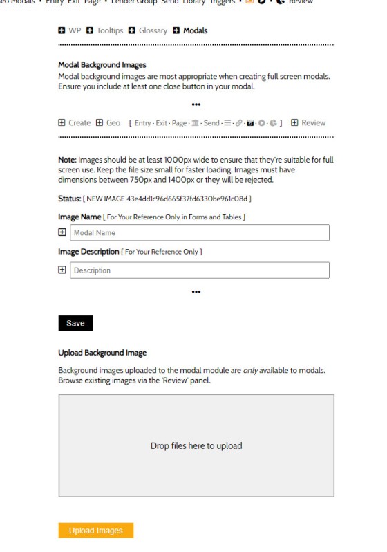
Note that the background image is selected via a Select menu. Modal images are uploaded via an image panel within the modal module. These background images are modified so they're not available in other Yabber modules.
Pictured: Note that the background image is selected via a Select menu. Modal images are uploaded via an image panel within the modal module. These background images are modified so they're not available in other Yabber modules.
To set the full screen modal, we'll set the parent container to 100% and then defined the inner content as required. (pictured). In our ANZ example we've set a small outside border on the inner content and included a YouTube video with Yabber shortcode.
Pictured: To set the full screen modal, we'll set the parent container to 100% and then defined the inner content as required. (pictured). In our ANZ example we've set a small outside border on the inner content and included a YouTube video with Yabber shortcode.
Review and Edit Modals
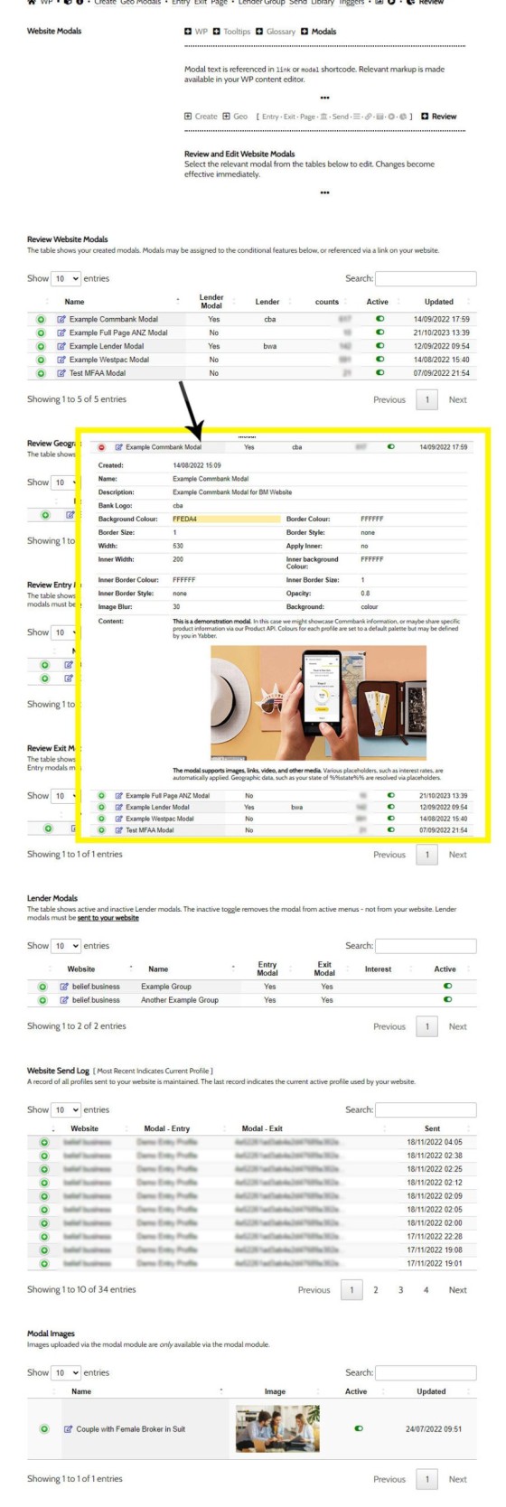
You may review and edit modals via the 'Review' panel. To edit any modal, select the 'Edit' icon and edit as required. For general linked modals you are not required to perform any kind of update on your website, but for groups, conditional, and extry/exit modals, you will be required to update your website with various rules.
Pictured: You may review and edit modals via the 'Review' panel. To edit any modal, select the 'Edit' icon and edit as required. For general linked modals you are not required to perform any kind of update on your website, but for groups, conditional, and entry/exit modals, you will be required to update your website with various rules.
The aggregated count of all modal views is returned in the 'Review' table, although the Modal Statistics should be referenced for a better understanding of how modals are performing.
What Happens Next?
Creating a modal is easy, and should take no longer than a couple of minutes to manufacture basic content. Once you wrap your head around how the system works, you can start to introduce lender-specific modals, archive modals, geographic modals, interest-based modals, and so on. Remember, the funnel should escalate with relevance, so delivering content the user actually wants to engage with is paramount. The entry modal is often useful for directing a user on a preferred pathway, and an exit modal is suitable for course-correction or a catch on vacating a manufactured funnel. Modals may be delivered based on location, interest, specific pages, and so on, so they're an asset you can built into your program wherever they're required.
As a first step, consider implementing appropriate First Home Buyer geographic modals on page entry to just the First Home Buyer primary website page. If you're creating your first Landing Page, consider building an exit intent modal on the first and second page - it improves conversions considerably (other modals introduce the methods applied in these cases).
Tooltips or Modals?
In another FAQ we introduced the tooltip via an article titled "How to Create Trackable Post Tooltip Terms in Yabber. The tooltip is a 'kind' of modal - albeit short and sweet, so when should a modal be used, and when should a tooltip be used? We expect that you'll have an understanding of what asset might be required, but in essence, a tooltip is the equivalent of whispering into your users' ear, while a modal is more of a conversation.
Use interruption modals, such as the 'Exit Intent Modal' only when required. Modals are intended to add value - not make a last-second effort to spam the client with something that they're not interested in seeing.
■ ■ ■
Related Modal FAQs
Website Modals are a big topic, and your website includes dozens of modal features. The following FAQs should be referenced for various Modal tools.
Your website includes a very large number of methods to include different types of headings, including Titles and Statements (both of which serve a specific purpose), with other shortcode and Elementor tools making the addition of various 'headings' a piece of cake. While there are any number of ways to generate page titles,… [ Learn More ]
The trigger system in Yabber is detailed in an FAQ titled "How To Create Marketing Triggers". It details how to create email, website, webpage, video and range of other triggers within your marketing funnel. Yabber - supported by a conditional framework that is ridiculously powerful - might be considered a Trigger-focused marketing system… [ Learn More ]
An inline frame (iframe) is a HTML element that loads another HTML page within the document. It essentially puts another webpage within the parent page. The modal link we're about to describe loads a very simple modal and then loads the content of another page within that iframe. Because it's a feature that's rarely used,… [ Learn More ]
in a previous FAQ we introduced how to include calculators on a page with Elementor or Shortcode. The problem is that they don't look real good. As part of the linking architecture, the [link] shortcode provides for a fully trackable popup modal, meaning that you can include multiple calculator links on a single page.… [ Learn More ]
In this FAQ we'll provide the basic shortcode necessary to return a video modal to your page. There are two methods for returning a video modal: a Yabber modal, and a full screen modal, with the former preferred because it is fully tracked and integrated with the Conditional Framework.
Modal Module Overview:
Your website… [ Learn More ]In an FAQ titled How to Define and Send Lender-Specific Videos for the Lenders Archive and Product Pages we looked at how to assign videos to the Lender Product Archive and Pages on your website. Familiarity with the former module is required, as this FAQ will simply show you how to link directly… [ Learn More ]
Your website modal module is the most sophisticated in the industry, and one of the most powerful systems created for any industry. A large number of FAQs reference how the modal system functions, with most of the functionality focused on entry and exit modals, with the modal resolved by your preference, interest or resolved borrowing… [ Learn More ]
The Modal Module made available in Yabber is an incredibly powerful feature that provides enormous flexibility in how and when we interrupt the funnel in order to provide appropriate course correction. The system is supplemented by a linking feature that permits you to link directly to any modal manicured within the system. In order to… [ Learn More ]
Lender Modals are popups shown based on the lender pages on your website. Each lender is assigned to a 'Lender Group' with a group consisting of a single lender or multiple lenders, and the defined modal will show when a user visits the specific lender archive product pages on your website. A default lender… [ Learn More ]
In a previous FAQ we look at how to create and manage "Entry and Exit Intent Modals" for Your Entire Website or a Single Page. The system defined modals that will shown on your website after a defined number of seconds, or when the user indicates intent to leave the page. In this FAQ… [ Learn More ]
This FAQ will details how to use the standard Entry and Exit modals on your website. The Modal module is quite large and includes a number of options designed specifically for the finance industry, so what we're dealing with here is how to create and maintain the 'standard' entry and exit modal as it applies… [ Learn More ]
An FAQ titled "The Website Modal Overview" introduces the modal module in Yabber and on your website. This FAQ will show you how to create a standard and full screen modal, while other FAQs will discuss how the modal system functions in more advanced funnel-centric ways. The most basic way to reference a modal… [ Learn More ]
The Yabber modal options made available on your website are extremely extensive. This FAQ merely provides a fairly broad modal overview that will direct you to an appropriate resource based on the type of modal feature you would like on your website.
What is a Modal?
A modal is just a popup. Click on
Your Media Library will invariably populate itself with PDF documents 0 not entirely ideal for website viewing. The PDF Modal, however, presents the opportunity to share our PDF material in a unique way, track it, and action triggers on the basis of a user interacting with the asset (although the latter is quite advanced). You… [ Learn More ]


