In a previous FAQ we introduced to the the 'BM Box'. The 'BM Box' is a navigation and panel element that provides information in a format that was deliberately designed to emulate the general presentation of the Lender Widgets on your website. The BM Box is created in Yabber or Elementor, and a number of attributes apply that'll alter how each container is returned. This FAQ will not look at BM Box creation, so you should consult the article titled "How to Create and Manage Website BM Boxes" for guidance.
BM Panel: Other navigation and information panels are available, such as the more robust 'BM Panel'. The Panel is a more recent addition that offers multiple display formats and allows for more creative freedoms.
This FAQ will introduce you to the BM Box Grid, or rows of BM Boxes.
The reason for the Grid is clear: as with virtually all other website elements, you may update your website information completely within Yabber and without having to mess around with website design.
The Result
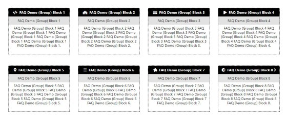
If you're familiar with the primary 'Services  ' or 'Home Loan' pages, you'll be familiar with how these grids are used. The block of Boxes below were created, styled, and grouped in Yabber as an example, and it's the basic grid of boxes that we'll look at in this FAQ.
Pictured: If you're familiar with the primary 'Services  ' or 'Home Loan' pages, you'll be familiar with how these grids are used. The pictured block of Boxes were created, styled, and grouped in Yabber as an example, and it's the basic grid of boxes that we'll look at in this FAQ.
Creating a BM Box Grid may be accomplished with Elementor or shortcode, and we'll show you both methods.
Yabber's BM Box Module
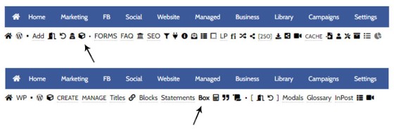
You will find the BM Box module by first following the 'Contentus' icon in the the 'Website' module. You should then select the 'Box' submenu item.
Pictured: You will find the BM Box module by first following the 'Contentus' icon in the the 'Website' module. You should then select the 'Box' submenu item.
Creating a BM Box Grid
The grid is created entirely in Yabber, so you should ensure that you have created a default style. For the purpose of the demo above, we've also created eight individual boxes, and while you might use these boxes individually, we'll group all eight of them into a 'Group'.
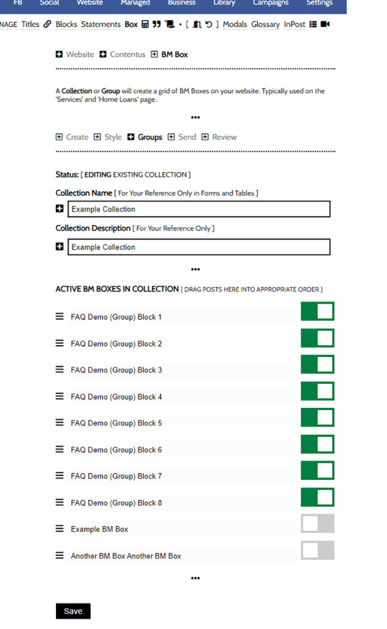
We'll group our individual Boxes via the 'Groups' panel. Drag and drop each Box in your collection into the order they'll be shown on your page, and selectively toggle them on of off to include them in your collection. Once done, select 'Save'.
Pictured: We'll group our individual Boxes via the 'Groups' panel. Drag and drop each Box in your collection into the order they'll be shown on your page, and selectively toggle them on of off to include them in your collection. Once done, select 'Save'.
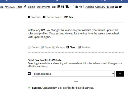
Yabber is a multi-website system so we're going to have to update those websites that require the new data. Select the 'Send' panel, select your website, and submit. Once your website is update the Grid will become available as a shortcode or Elementor option.
Pictured: Yabber is a multi-website system so we're going to have to update those websites that require the new data. Select the 'Send' panel, select your website, and submit. Once your website is update the Grid will become available as a shortcode or Elementor option.
BM Box Grid with Shortcode
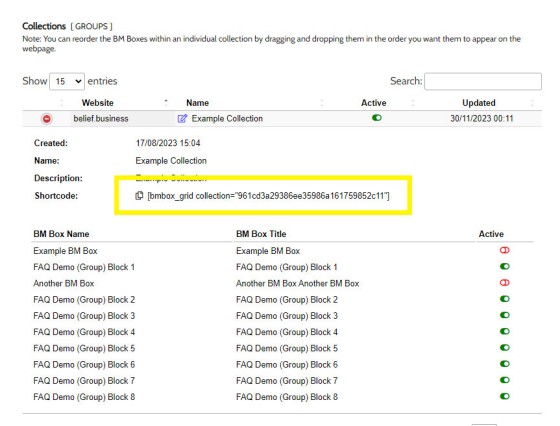
The shortcode required to return a BM Box is found within the 'Review' panel (pictured), or on later frameworks, from the BM Shortcode option attached to the WP WYSIWYG Editor. Copy this shortcode in the location you would like your Grid to be shown, and 'Save'. The format of the shortcode will be similar to the following: [bmbox_grid collection="group-collection-id"].
Pictured: The shortcode required to return a BM Box is found within the 'Review' panel (pictured), or on later frameworks, from the BM Shortcode option attached to the WP WYSIWYG Editor. Copy this shortcode in the location you would like your Grid to be shown, and 'Save'. The format of the shortcode will be similar to the following: [bmbox_grid collection="group-collection-id"].
Note that the 'Review' panel itself allows you to selectively removed or reorder content from your Box Grid
BM Box Grid with Elementor
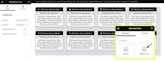
To use the grid with Elementor, search 'BM Box'. Select 'BM Box Grid' and drag it onto your page. Select the Grid and Style you created in Yabber, optionally define the height applied to all boxes, and set the margin above each row. The Grid will render. Click 'Save'.
Pictured: To use the grid with Elementor, search 'BM Box'. Select 'BM Box Grid' and drag it onto your page. Select the Grid and Style you created in Yabber, optionally define the height applied to all boxes, and set the margin above each row. The Grid will render. Click 'Save'.
Rate Placeholders: Remember that each box supports Rate Placeholders. You wouldn't use the BM Box as a replacement for the Lender Widget, but it's nice to know that they're available when required. Since the BM Box includes lender rate data, we cache the Box for up to two days
The Elementor options is obviously ridiculously easy to use, and it is generally the preferred option.
Review and Edit Box Groups
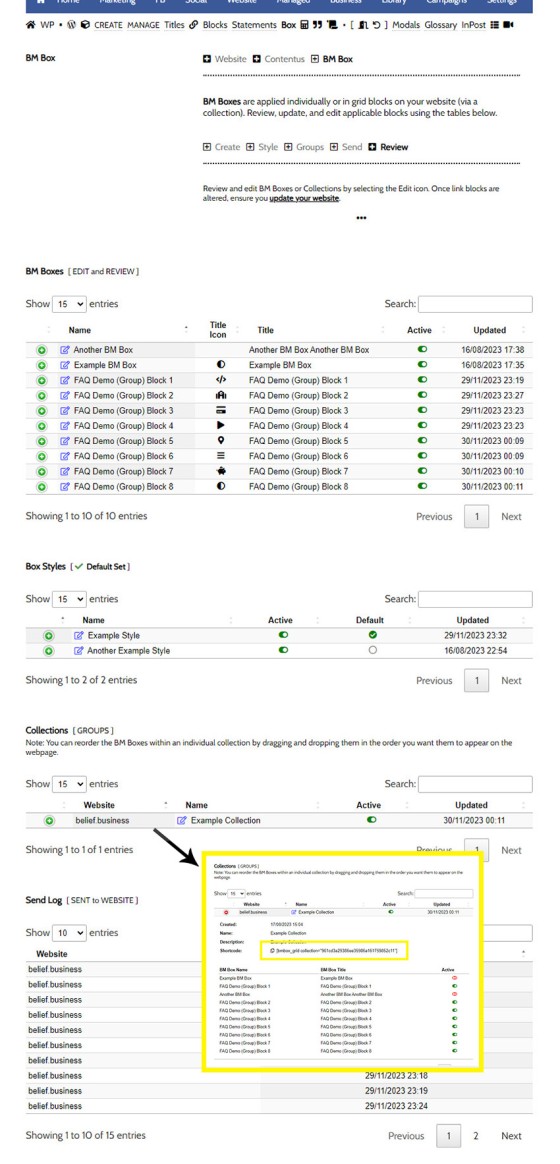
You may review and edit each Box and Group from the 'Review' panel. Select the green icon to return information on each asset, and the 'Edit' icon to return you to the applicable edit page.
Pictured: You may review and edit each Box and Group from the 'Review' panel. Select the green icon to return information on each asset, and the 'Edit' icon to return you to the applicable edit page.
■ ■ ■
Related Content Block FAQs
FAQs relating to use of Content Blocks.
Your website includes a very large number of methods to include different types of headings, including Titles and Statements (both of which serve a specific purpose), with other shortcode and Elementor tools making the addition of various 'headings' a piece of cake. While there are any number of ways to generate page titles,… [ Learn More ]
There are an extremely large number of tools we make available in Yabber and on your website to create and modify lists and other content blocks, and each method introduces variation on the 'global content theme' in that they present differently and are handled differently on your website. The one premise that underpins any type… [ Learn More ]
There's a large number of ways to return hidden content to your posts and pages using shortcode, and the Toggle Shortcode is simply another option you might choose to use. The feature utilises the same toggle mechanism used in the Formly (form) module. This FAQ will describe basic usage.
The Result
Shortcode ofPlease add content between opening and closing bm_toggle shortcode tags.
This is… [ Learn More ]In a previous FAQ we introduced to the the 'BM Box'. The 'BM Box' is a navigation and panel element that provides information in a format that was deliberately designed to emulate the general presentation of the Lender Widgets on your website. The BM Box is created in Yabber or Elementor, and a number of… [ Learn More ]
The Conditional Content Blocks arguably the more effective method of rendering blocks of conditional content. The 'Blocks' module introduced similar functionality to what we're about to described, but if you're starting with Conditional Content, we'd suggest you use this module rather than Blocks simply because of the ease a single page may be assigned… [ Learn More ]
Conditional Content is one of the defining features of your website framework. Despite the fact the Conditional Content blocks are often avoided because of the perceived complexity, they seriously amplify the effectiveness of any organic or promoted funnel. We appreciate that many brokers just 'want a website', and that's find, but if and when the… [ Learn More ]
The BM Box is simply a small element used for the purpose of navigation or information blocks. It is one of two primary blocks we've built, with the second being the BM Panel. The Panel is far more robust and is pending migration into the standard framework. To 'Services' page, accessible from the primary menu… [ Learn More ]
In this FAQ we introduce the very basic 'Reveal' (or 'Blind') shortcode and Elementor widget. Hidden content is revealed after a 'link' is clicked. It's a very simple but highly effective tool. The 'Reveal' tool requires familiarity with the Blocks Module as it is block content that is returned in the blind.
Note:
Blocks are simply blocks of content of any type that may be recycled in multiple locations on your website. When they require an update, a single block only needs to be updated in Yabber to globally alter all occurrences of that block on your website. Block content is easy to create, easy to modify, and… [ Learn More ]
Resulting from various State-level Government incentives and fees, one of the areas that differs significantly from state-to-state is the purchase of a first home. The FHB Panel is one of the simplest conditional features of any type to use because it serves content that is resolved by State - not interest, which is the typical… [ Learn More ]
Your website includes a large number of tools to group related content into an accordion-style panel - the Post Accordion is just another one of them. The feature is supported by shortcode and an Elementor block, and the style/presentation is managed in Yabber. This FAQ will show you how to use the tool. An example… [ Learn More ]
Scrollable is a content tool we've introduced as part of our 'Blocks' module, and downline to Yabber's parent Contentus module. Scrollable simply allows you to include blocks of content in a scrollable window for those cases where you choose to contain large amounts of text in a smaller contained area. An option to render… [ Learn More ]
The HTML <details> tag is a lesser-used HTML tags which often negates the need to use fancy-pants JavaScript to return 'hidden' content. Our shortcode that references this tags is a ridiculously minor feature, but since it utilises the Blocks Module it was worthy of inclusion. Many businesses have found use for the feature. Your… [ Learn More ]


