This feature can largely be ignored. This was a feature introduced to support our managed article program, and a former plug-and-play Platinum graphing block is forthcoming. It is expected that you will not use this shortcode.
It should be noted that shortcode is never a good way in which to create custom graphs as the attribute usage simply becomes too confusing. Good graphing is almost always handled programmatically, and the latter method allows more detailed or complex graphing with ease.
The following graph is one that shows broker originated volume measured against leads delivered exclusively via our Facebook Program (manufactured in July 2021). We automate this graph in Yabber but for the sake of the example we've hard-coded the volume into a shortcode. So, [bm_graph type="bar,line" labels="Q1 2020,Q2 2020,Q3 2020, Q4 2020,Q1 2021, Q2 2021" label="Percentage of Loans Written by Brokers, Belief Facebook Volume" background="#FF0000,#549A52," data="57.6|42195,58.4|38955,57.6|32542,60.1|44523,61.1|41588,59.8|40151"] returns the following:
Yabber delivers around 10k Facebook leads per month fairly consistently (growing as more subscribers take advantage of the system).
A grouped bar graph with a single line is returned as follows: [bm_graph type="bar,bar,line" labels="Alpha,Bravo,Charlie,Delta,Echo,Foxtrot" label="Foo,Bar,Bel" background="#FF0000,#549A52,#000080" data="9|8|72,22|5|67,7|8|92,10|11|125,13|14|150,16|17|45"].
A pie chart can be returned as follows: [bm_graph type="pie" labels="Red,Blue,Green" label="Colours" background="#FF0000,#0000FF,#286C4F" data="20,50,70"]. The pie chart can be rendered in 3D (as can any other chart) with the dimension="3d" attribute.
A pie chart can be returned as follows: [bm_graph type="pie" labels="Red,Blue,Green" label="Colours" background="#FF0000,#0000FF,#286C4F" data="20,50,70"]. The result:
The pie chart can be rendered in 3D (as can any other chart) with the dimension="3d" attribute.
■ ■ ■
Related Graphing FAQs
Related Graphing FAQs.
We archive about as much data as ASIC and other regulatory bodies or institutions make available. The API we make available to all clients by virtue of their assigned key provides access to a large number of resources and tools - most of which you will never use. The API itself is used to measure… [ Learn More ]
The Published versus Comparison Rate graph was created to support a single FAQ on 'What is a Comparison Rate', but the graph often finds value elsewhere. To include the graph on your page, use the shortcode of [comparison_interest_faq]. The Result:
The graph simply illustrates how the published rate is often vastly different to the… [ Learn More ]
This feature can largely be ignored. This was a feature introduced to support our managed article program, and a former plug-and-play Platinum graphing block is forthcoming. It is expected that you will not use this shortcode. It should be noted that shortcode is never a good way in which to create custom graphs as the… [ Learn More ]
The exchange rate graph return major currencies compared against the Australian dollar. It's not a particularly pretty chart but the colour values may be altered by way of shortcode (we've used very different bold colours to clearly differentiate one currency from another). Inclusion is made with the shortcode of [bm_exchange]. The result:
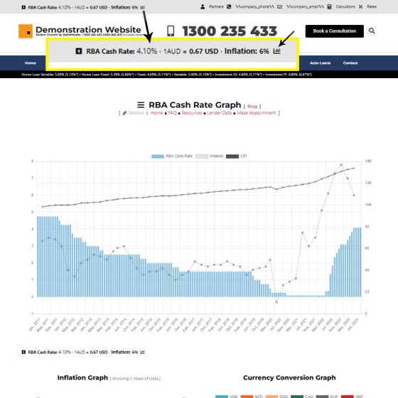
An RBA Cash Rate graph is shown by default on a page linked to in your header (image below), although the graph may be shown anywhere, and its presentation may be altered in a large number of ways.
Pictured:
An RBA Cash Rate graph is shown by default on a… [ Learn More ]The 'ImageCalc' graphing tool was initially designed to easily integrated graphs into automatically generated PDF documents. It has since been used by brokers in their articles because of its ease of use. The most common methods of including the graphs into standard articles is with simple shortcode, while Elementor is the methods generally sued when… [ Learn More ]


