In two previous articles we reinforced the concept that every page on your website is a type of landing page, therefore every page should provide a conversion opportunity. Traffic can come from any source to any page on your website, meaning that the page your audience lands on must provide a means of ingesting the user into their marketing journey (the arrival page for your visitor was their landing page). This article simply describes how Yabber  enables one-click conversions on every page by way of a lead magnet on every page.
Some of our most successful clients are taking over the space with their next-generation website and relationship programs. Many of them are seeing up to thirty of forty-times more organic growth than they did via former paid promotion, and they're now using our high-performing Facebook program to find or explore new markets or position themselves in different ways, rather than as a primary means of 'survival'. The website conversion methodology described on this page is one that you may introduce to your own business right now without us - we just make it easy.
Providing any effort into your content strategy or your SEO is rather pointless if your website isn't designed to get a user on the phone, or as described in the linked articles, into your funnel for education and development. This is a sentiment we repeat over and over and over because very few websites are designed in a manner that deliver upon their primary purpose: a sale (or transaction).
When we designed our complimentary mortgage broker website we did so with a primary purpose: making it a resource that would be found by search engines, and one that was guaranteed to convert more than any other website in the industry. Introducing the mortgage industry to a website that actually delivers daily leads, website inquires, and phone calls is like pulling them out of the Matrix - for the first time brokers are actually aware of how a website is meant to perform. While we provide the leading Facebook experience in the market (and the only one-click integrated experience, including tools such as the 1-second creation of landing pages), we absolutely don't share that misguided 'Facebook-only' rhetoric spouted by the arse-end of the industry. A well-crafted website, funnel experience, and regular content strategy will return more business than your company can handle. Add the industry's only real post-settlement program and other real relationship-based tools and it's simply a winning formulae for digital success. Of course, we do advocate Facebook advertising - we've got the highest-performing and easiest-to-use program in the market, after all - but failing to apply care to all areas of your business is akin to saving the Titanic with a bucket.
Belief will never, ever provide a system that recklessly and carelessly hosts your landing pages anywhere other than your own website. As we've said many times before, hosting landing pages off-site with services such as Lead Pages, Click Funnels, Kartra, and others, when you have the capacity to serve those pages yourself is utterly absurd. Still, despite the debilitating effect these third-party services have on your website and conditional experience (and ultimately, of course, your conversions) we still see paid representation introduce these flawed systems to businesses. It has to stop.
Every page on your website is a type of landing page that needs to convert. If any page-view increases the barrier to a conversion, and every mouse-click introduces a very real roadblock to a conversion, shouldn't we have a means for a user to contact us or make a booking on every page? Of course we should. It's this absolute page necessity that had us design a form with an integrated calendar (it's also an optional contact form). In addition, we've built in an escalating form feature that changes shape based on previous interactions or subscriptions to ensure that the on-page form will dig a funnel participant deeper into their funnel experience.
Bottom line: all the fancy-pants SEO features we build into your website by design are great, but your website is of no use unless we have on-page elements designed to convert audiences (and we do). It's also important to convert your existing website traffic. Applying page-level optimisation techniques may translate to at least half-a-dozen additional settlements a month - and you don't need Yabber  , necessarily, to achieve the result we've described.
Setting a Default Post Conversion Form
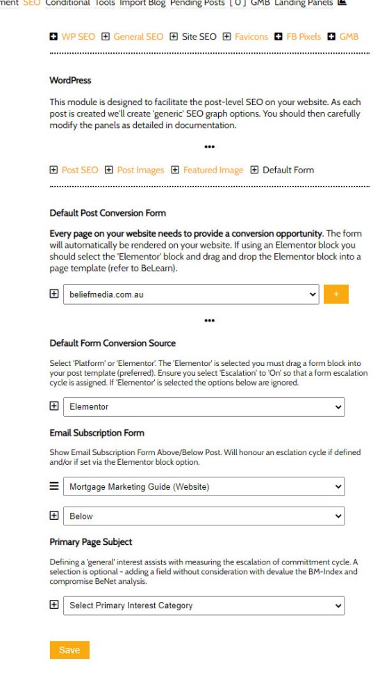
A single Yabber  option is used to define the default form under each post on your website. You simply select your website, select the form, and submit. This causes the form to show globally on all website posts. This single options permits you to create hundreds of 'landing pages' simultaneously.
Pictured: Setting the default form shown under each post. This option changes the subscription form and lead magnet globally (you should see a working example under this post). It's highly recommended you include a calendar option within the form (which integrates with Outlook). If using our Elementor client website the above and below option is ignored, and the form is rendered as per the Elementor post template (below the article). Form escalation will apply for that form if a sequence is defined.
This form is enabled in our client website by default, so selection of a form will show it immediately. If you're using the client broker website you may alter the position of the form by modifying the Elementor 'Post Template' (a simple drag-and-drop exercise)... although the default appearance is designed to work effectively.
Post-Level Subscription Forms
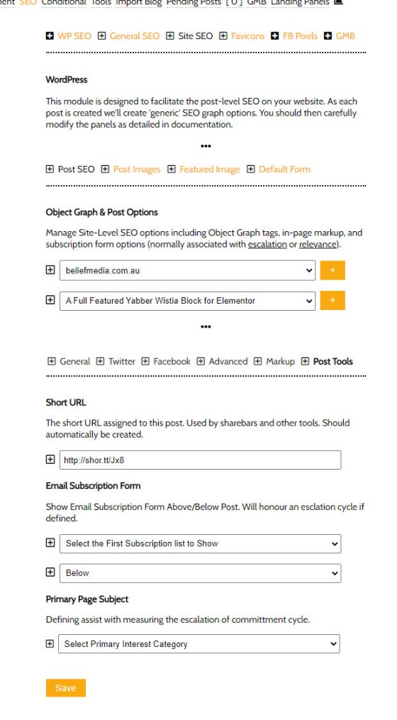
You may alter the default and global post subscription form by way of the Post SEO panel. When updating your post SEO object graph and other tags, you may also define a form to show on that specific page.
Pictured: Setting the subscription form on a post level. Select the website, the article, and then the 'Post Tools' tab. The interest type is the type associated with the page (not just the form). The interest type simply helps BeNet understand primary page context.
Your website posts contain your general blog posts, or articles. We tend to design our client website blog format in a manner not totally unlike our own because we've determined conclusively that not showing a sidebar (on your blog posts), and showing just the conversion subscription under each post, converts far better than a busier and more complex sidebar setup. In a sense, we treat our articles as a quasi landing page and try and remove all distractions from the page.
Hick's Law states: the more choices we have, the longer it takes to make the final decision. Reinforced by Barry Schwartz in his book The Paradox of Choice, Schwartz argues that eliminating consumer choices can greatly reduce anxiety. In analysing millions of pages and their Page Subscription Ration (PSR) we've seen the physiological principal take shape; as soon as we present more page options to a user the conversions drop off. It's for this reason we keep our article page design very simple and include only a single and persuasive (escalating) subscription option.
Page-Level Subscription Forms
Hick's Law and the Paradox of Choice dictates that we remove as much choice or distraction from a page, although this is a little more challenging with pages than posts because design elements are expected. Pages also have the capacity to return good conversions because we have a user at our shop window looking at a particular product - we just need to get them through the door.
Website pages (as opposed to blog posts) are those that showcase our services and and are rather static and bland resources. The important takeaway in terms of the page design we provide brokers is that their complimentary website sidebar isn't populated with irrelevant and busy content (a fairly typical error). Too much information is overwhelming. However, we will include a single subscription (and lead magnet) in addition to some basic and essential conditional content (the sidebar conditional content is manufactured in a way that makes it relevant).
The difference between the global subscription form under each the subscription form we include in the sidebar of each page is that the form and associated lead magnet for a page will be specific to the subject matter introduced on that page. If introducing First Home Buyer information you'll show your FHB Guide; investors should be shown an Investor Guide or similar, and so on. We know what the interest type and intent of a user is and we should apply the appropriate pressure by rendering relevant interest-magnets.
The form rendered on a page is defined in a similar manner to those for each post. You select your website, the applicable page, and define the appropriate form.
Conclusion
In a Lead Page, Click Funnel, HighLevel, and Kartra-driven culture we're led to believe that a website no longer matters. This message is promulgated by those weekend-educated Facebook marketers that provide this horrible solution to paid clients - we see it all the time. Your marketing experience should be one where you maintain complete control, meaning it's owned by you and hosted on your website. Your funnel is a hand-holding journey where the only safe space is your website, yet once again we see brokers resort to fractionalised services by way of misguided representation.
As we've discussed before, Search Engine Optimisation only works if you feed the search engines with the content they're craving. We're sure you've seen the worst websites attract a ton of business - this is usually result of a structured website and sound content strategy. If you're not outranking them and they have no content program in place then it really doesn't take much to overtake them... but it does require a commitment to your own strategic content strategy in various forms. Once you start attracting more traffic you'll obviously see a proportional increase in conversions (although we expect a slightly upward trajectory because of the effort you apply in your online and offline conversion optimisation efforts).
It's worth repeating once again that our integrated calendar-based lead magnet and form on each page is more powerful than most of the landing pages your competition are using for paid traffic, and since you will have your conversions everywhere you essentially have hundreds of visible landing pages on your website. Of course, the forms on each page inherits an optional conditional redirection that guides your visitor into a relevant second page, helps shape your website conditional content into showing more relevant material (something you simply cannot accomplish with off-site landing pages), and it converts more clients.
With all the talk of page-level conversions it's important to recognise that Yabber  provides genuine one-click creation of full-featured landing pages
  on your hosted website - it's the most powerful and only integrated solution in the industry.


