In a previous article we introduced the escalating form features that are native to Yabber  . The forms are designed to support our core 'escalation of commitment' ideology by introducing a new form once a user subscribes to the former. The escalating form is designed to further commit a funnel participant to their marketing journey via the introduction of relevant, conditional, and engaging fresh content.
The subscription form that was previously introduced was just one style of subscription object we make available on your website. A single column by design, the basic subscription form includes text, video, images, and wherever else above and below your styled form, but it is always vertical by design. This article introduces the two-column landing panel, and how an escalation cycle may be applied to the panel.
Please keep in mind that this article introduces the Landing Panel (primarily) and not the Landing Page. The one-click and integrated drag-and-drop landing page features built into our Yabber digital systems are introduced in an article titled "Powerful One-Click Landing Page Creation".
As we'll come to explain, and unlike standard single column and purpose-built subscription forms, landing panels inherit their 'features' from those attributes defined for a landing page. Don't worry, it's not nearly as confusing as it sounds - the feature essentially makes landing panel content available from a stripped-down version of a landing page.
The Landing Panel
A Landing Panel is simply selected 'naked' elements of a two-column Landing Page - normally just the subscription form and lead magnet, and perhaps a title. Once again, these stripped-down panel attributes are defined by the values set for a landing page. It's simple and effective.
An example of a Landing Panel is shown on the front page of our website, and is rendered in numerous other locations, as it will be on your website.
Pictured: The Landing Panel (as shown on BM's website at the time of writing). Note that it includes a high-value conversion offer and a subscription form that includes an integrated calendar. Our single forms and landing panels are more powerful than most dedicated landing pages... and they're everywhere.
The panel on the front page of your website is vital since it's the entry page that most of your website visitors will arrive. Along with compelling product information the front-page landing panel conversion object is a means of ensuring we ingest as many visitors into our funnel as possible. The form that is initially shown is selected via a simple option within Yabber. Simply select your website, select the applicable form, and submit. The featured landing panel may obviously be altered at any time.
The notion that you'll hide panel-style conversion opportunities behind hard-to-find landing pages is somewhat absurd - relevant and high-value conversions should be everywhere.
 to show various forms in defined locations within your website. As with most consumer-facing aspects of your website, most of the features may be modified within Yabber, thus negating the need to mess around with the WordPress administration area.
If you're using Belief's Elementor block, creating the landing panel on your page is easy. Simply drag-and-drop the Elementor block into your page and the landing panel is instantly created. Simple.
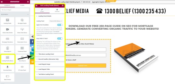
Pictured: The Elementor landing panel (basic) block. Simply drag-and-drop the block into your page. You should select a form (by name) and all the values created on Yabber will appear on your page. The escalation option may obviously be disabled.
The landing panel Elementor block is made available to your website only after using our one-click system from within Yabber to submit a landing page to your website.
Every form you create automatically inherits an automation schedule associated with that form.
Landing Panel Escalation
There's a little crossover between forms and landing panels since they're created and added to your page in a similar fashion. The landing panel escalation feature is illustrated in the video below.
Escalation does not apply to dedicated landing pages since the page itself is designed for a website visitor with specific expectations. The funnel itself will direct a participant to another landing page when it's appropriate (on your website, of course).
The Landing Page (In Brief)
Having just introduced the landing panel, it's important to provide a brief recap on the landing page, although our article on Landing Page creation should be consulted for more information on how Yabber's integrated experience converts more clients.
A landing page is a dedicated type of page free from distraction - so no sidebar, footer, or header. It usually includes nothing other than an offer of some kind - usually a lead magnet, webinar registration, or similar - and a subscription form.
Landing pages are created in Yabber via a simple menu that provides select options for all elements (so no copying and pasting any code whatsoever), and then simply sent to Yabber with the click of a button (or, as described, created via an Elementor drag-and-drop block). A landing page includes various content options such as text above and below the subscription, lead magnet, optional title, sub-title, footer, and disclaimer. Each element of the landing page is designed to convert.
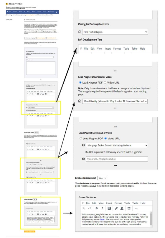
Pictured: Landing pages are created in Yabber via a simple form. We know you don't want to build a page so we simply ask for only the basic data - such as a title. The lead magnet (video, booklet, etc.) is chosen via a select menu, as is the subscription form. Creation of the form can take as little as a minute and sending it to your website as a published page takes about a second.
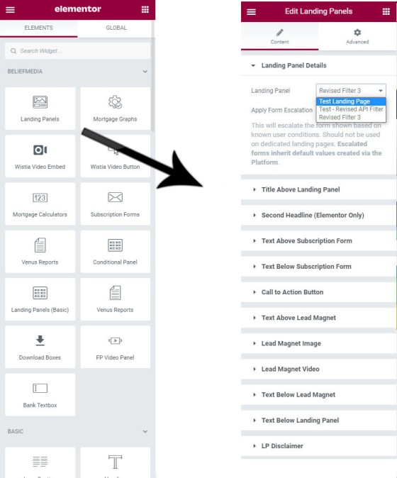
Pictured: Landing Panel options. You obviously don't want to include all Landing Page options in a panel so you selectively enable various sections (again, normally just the subscription form and lead magnet image or video).
Landing pages in Yabber are created on your own website via their own post type, and the landing pages return extremely detailed user and interaction/conversion statistics. In another article we introduce how landing pages are created with the single click of a button  (or optionally via a drag-and-drop Elementor block). You should never ever host landing pages on third-party websites (High Level, Lead Pages, Click Funnels, Kartra, High Level etc.) - they're a business-debilitating and funnel destroying 'solution' usually presented by the arse-end of the industry. Sending your traffic - paid or otherwise - to somebody else's website is just utterly ridiculous.
Conditional Redirections
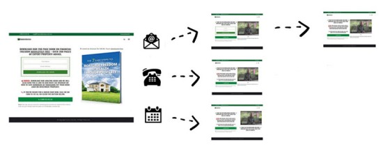
As with forms of any type, you may optionally redirect to a specific and high-performing second page on the basis of the panel interaction (the panel includes a checkbox-enabled integrated calendar making it more powerful than virtually all actual landing pages on the market).
Pictured: Conditional redirections are simply guaranteed to improve upon your conversions. Like all funnel entry points, the primary purpose of a page of any kind is to have a website visitor call us now (and the calendar should facilitate this). The funnel is essentially designed to attract those that are researching the market and don't make those early escalated steps into real-world communication. This means that those riding our funnel will also be engaging with your competition. Every aspect and interaction experience in your funnel journey should be designed to make you stand out and set you apart from your competition. Your funnel should demonstrate your expertise and authoritativeness, and ultimately build a trusting relationship - this starts from the very first funnel interaction.
The conditional redirections will literally explode your immediate phone call conversions.
Conditional BeNet Panels
Described in more detail in forthcoming articles, Belief has developed the only artificial machine-learning intelligence made available to the finance industry. If BeNet automation is enabled, and if we have the capacity to serve content that matches consumer trends or known user behaviour, BeNet can course-correct the user journey and feed content to users that is more likely to convert, and does so automatically.
A high-level conditional feature, BeNet integration relies on higher traffic (required in order to identify behaviour) and is normally used in more advanced campaigns. We've found that aggregated franchise or aggregator traffic is a brilliant food-source for the AI engine.
Conclusion
Website conversions are the result of facilities made available on your website that allow it to happen... and your website won't convert without them. The landing panel is just one of a few different types of subscriptions we make available, and it's exceedingly simple to create.
Despite the occasional complexity we've introduced, a landing panel really is just a two-column form with a subscription and video or image - the level of available features you built into your experience is really dependent upon your desired outcome, or the maturity of your marketing.
In a forthcoming article we introduce the one-click landing page creation (required for panel creation), and how you may create entire campaigns in seconds via our Solis module.


