In a previous article we've looked at how various attributes of your page may be changed based on determined interest type. This interest type understanding is resolved on the basis of user browsing patterns through our website funnel, aggregated interest scores, a forced entry URL, or by way of BeNet, our AI engine. This article introduces an advanced conditional feature built into our mortgage broker and other websites by default that will change the entire entry page based on a defined entry page URL.
It'll become clear to you should you read any further that this is an advanced feature that requires the assignment of some time in its creation, but it's worth the effort. The Page Swap (or 'Switch') functionality is not the only solution to the perennial problem of converting website audiences... it's just one of the better solutions. Towards the end of this article we'll discuss why and how the front-page-swap feature has returned exceptional results in the wild.
Introduction
The purpose of any website funnel is to deliver an experience that is most relevant to the user participating in the journey. Rather than try and develop an understanding of the user over time (often requiring multiple page-views, engagements with certain types of forms, or multiple visits via interest-based email links), the Switch method gives us a head-start and allows us to start the website funnel journey from an advantaged position. The escalation of commitment we often try to manufacture or craft into our digital journey in order to reach a probably certainty of interest is called The Resolve, and when a starting page is forced this excursion is leapfrogged almost entirely by our Classifier engine to the Statuo State where your website knows what information is best served. In essence, we're starting our journey with the insight normally provided by the early website funnel journey.
If we know the primary interest type of a website visitor, the alternate entry URL is used to 'fix' that interest type within your website globally for that user, meaning that any available conditional content associated with a specific interest type is shown to that user by default in addition to the completely altered front page result.
 ). The front page can be anything - even a partner front page or one that returns a single landing page (albeit the latter will usually have a very short expiry time).
If what we're describing is starting to sound complicated it's because it is a new concept to many. For far too long we've seen those that like to call themselves marketers provide no holistic digital support for the marketing experience (usually gravitating to unsupported and very basic Facebook programs). It is your website that provides the digital backbone and framework that supports your continued funnel digital outreach (the email component of your follow-up program is a conduit to other digital resources). Your website is absolutely vital to your marketing experience, and you cannot have a truly effective Facebook program or any other funnel excursion in place without integrating your website to provide the necessary funnel support.
The Result
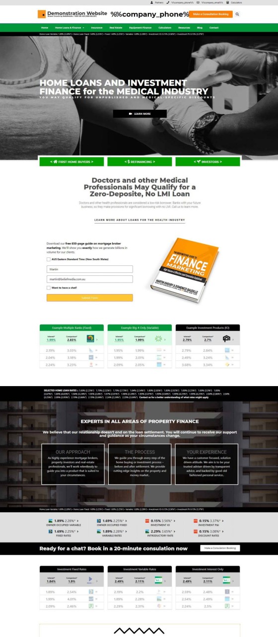
Before looking at the method of creating the Swap feature in Yabber, and forcing the change on your website, we'll have a look at an example alternate front page for the medical industry.
Pictured: An alternate page created for the medical industry (snipped in the middle, so only the top-half of the page is shown). You may create as many alternate Switch pages of your choosing, with each page specifically designed and targeted at various segmented groups.
The most significant difference between the standard front page and the alternate page is that the entry image and messaging is altered, various industry-specific messages are shown, and all the page panels are fixed to a certain resource (with the exception of a vertically escalating simple panel subscription form) and the page usually won't inherit conditional functionality (since the page itself is a conditional funnel endpoint). It's expected that bank rates shared on the page will be tailored specifically for the targeted entry audience.
The alternate page may be designed in any manner of your choosing, and each page takes about 3-minutes to fully build (we'll show you how). Previously a Platinum-only feature, we'd often see ourselves building up to 40 or more industry group pages into the highest-performing experiences.
Creating Switch Pages in Yabber
The Switch pages are created in Yabber by simply associating a slug with a page. The slug is the term connected to the URL that'll force the new page and other conditional content to be shown. Note that while you may serve any page as an alternate front page - including internal industry pages designed as part of normal navigation - the architecture prefers that your alternate pages be created under your 'Pages' menu (a little advanced, but pages created in the 'Pages' menu will show under your primary domain and present as a true front page without any kind of page slug, while other nested pages might show a full URL to the alternate resource).
Pictured: Creating a Switch assignment. You create a slug used to force the new page, assign it to an existing page on your website, and define the expiry time before the page reverts back to your standard front page.
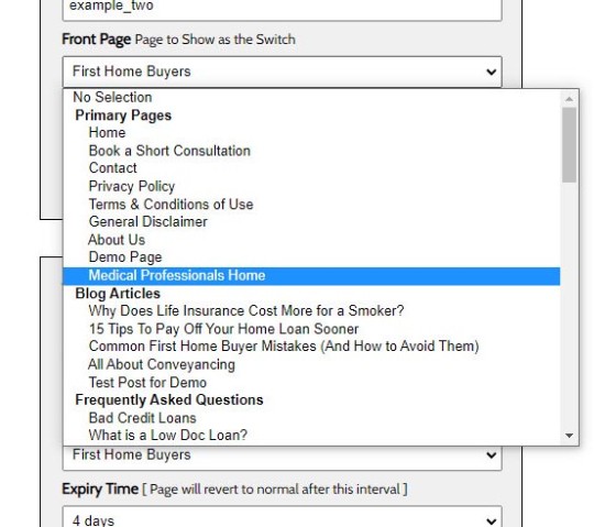
Pictured: Assigning a page to an entry slug simply requires that you select it from a menu. Yabber's fully-integrated system records your website activity and posting patters, and makes all published posts available as an alternate Switch page. Each available post type is segmented, such as primary pages, FAQ pages, finance pages, blog posts, landing pages, and so on. The typical home for your Switch pages is the primary 'pages' menu.
You may want to force the Switch for only a short period of time, and in other cases you'll likely want to make it 'permanent', and the 'expiry' menu presents this option.
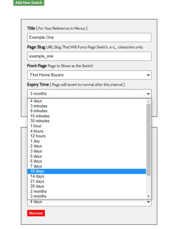
Pictured: The switch expiry. After the expiry time your standard conditional entry page will be shown. If you're sending an email to a medical list, or list of accountants, and you know the siloed positioning of your audience, you'll almost always create a dedicated front page and set the expiry for two years. You may, of course, always have a dedicated Satellite website designed specifically for this audience (this presents issues associated with the management of multiple websites, multiple blogs etc.).
Expiry options exists for intervals between 3 minutes and 2 years, with shorter expiry limited to those very rare occasions where a short-lived landing experience might be shown.
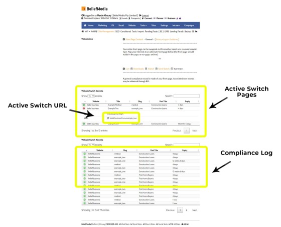
Pictured: The switch summary. A record of each Switch record is maintained, and a summary of all active and available Switch pages is shown with a link used to gain access to the alternate Switch page.
Note that the alternate Switch URL may be used anywhere, from email campaigns through to social media. In every case where a URL is shared you can force the alternate on-site experience. Remember, even an escalated experience is still required to create the appropriate funnel pathways that'll deliver a conversion... it's just that we're starting from a position of advantage.
The creation and maintenance of Switch pages is a simple process.
The Switch Application
The Switch feature is one that is undeniably powerful in every respect, but it's still just one of the features made available within Yabber. Simple to implement, the challenge comes in actually creating the alternate front pages that might be assigned to your available groups. To this end, we will progressively include various alternate front-page assets in our broker website, although their custom creation really does take no more than a couple of minutes.
Does it work? Absolutely. When targeting specific industry groups we've seen conversions over 300% higher than generic front page usage. A cleverly crafted outreach program (email, web, SMS etc.) can easily improve upon that result.
In the past we introduced the concept of Satellite program which included details on positioned websites, such as those we use for our '000' Home Loan program (police.com.au, due to be relaunched in October of 2021), and another that was used to support our FLIGHT program - both collectively and consistently returning well over a billion-dollars in volume each year (and they're just two of the internal programs we assign to clients). In each of the described cases we use standalone satellite websites to attract new audiences, but the workload associated with each is quite high. Done right, and to avoid duplicate content issues, each blog will be entirely different, FAQs are modified for each website, and so on. In our case the positioned satellite sites work well, but we could just as easily migrate the service to a Switch website and see similar results.
Bottom line: the Switch feature supports your holistic marketing efforts. Done right, a well-crafted website experience, carefully curated funnels, and appropriate attention assigned to your content strategy will return you extraordinary organic and promoted digital results.
Conclusion
Our 'standard' mortgage broker website is introduced in an article titled "The Most Powerful Mortgage Broker Website in the Finance Industry", with the title somewhat of an understatement. The article introduces numerous features you've never heard of, and adequately articulates how and why the experience is infinitely more powerful than anything else made available to the industry. To be clear, the single reason we chose to make such as extremely powerful and versatile website experience available is because we're frustrated with the extremely poor Facebook programs delivered to the industry, and the lack of digital or funnel supported provided by these weak and usually non-compliant programs.


