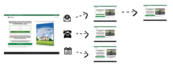
All website users have different objectives, or they are looking for your experience to return a specific type of relevance, and you cannot and will not achieve the degree of success that digital is meant to return by a linear customer journey when that excursion is taking them in the wrong direction. Nor will you possess an understanding of your digital efforts if funnel interactions are ignored.
Conditional Marketing is Advanced: Conditional marketing is advanced, and it's unlikely you'll engage with many of the conditional features that we're about to introduce early on in your marketing efforts. However, many conditional features can be introduced to your funnels in seconds, and they'll have a profound impact on your results. Most early marketing efforts can completely ignore the conditional components.
Belief's proprietary framework - built in-house by our team of former brokers, and designed specifically for the finance industry - remains the first and only conditional experience in the mortgage market, and we provide the only integrated marketing funnel experience in the industry. This nested architecture is part of the reasons our clients' organic website results are phenomenal, and part of the reason our promoted campaigns - such as those run on Facebook - returns results that consistently outperform competing experiences by a ridiculously high margin. This digital success is because we're the only end-to-end digital experience in the market, and a part of this digital success is by virtue of a framework that delivers a conditional experience, or a funnel experience that is crafted out for a user in real-time based on patterned user behaviours and a resolved borrowing objective.
First, it's important to note that implementing a conditional website experience isn't something we build for you. Instead, the conditional features are implemented yourself over time, and it doesn't take long to introduce an experience that is shaped around your specific audience. However, the website we provide clients, coupled with integrated Yabber tools, permits an extremely high-converting experience out of the box, so a lot of what we're introducing in this article is largely irrelevant (conditional marketing will improve your results, but the naked framework is designed by default to convert without conditional modules).
There are multiple funnels that shape an experience for each user. A website funnel, follow-up funnel, social funnel, offline funnel, and others, are all as equally important as each other, but this article will focus on how a website funnel is shaped by a conditional understanding of each user, since your website is a vital and primary tool used to escalate funnel excursions..
This article seeks to expose just a small amount of the information necessary to understand what a conditional experience means to your operation, and why it returns significantly more business to your pipeline. We'll also provide a very broad overview of the various conditional modules made available on your website and Yabber.
Facebook Conversion Funnel: We've published details on a Facebook Conversion Funnel that exposes just a few conditional elements. It's a more practical look at the early top-of-funnel subscription experience.
If you're seeing fewer than triple-digit leads via your standalone digital framework, or you're seeing conversions of less than 30% off paid promotion, this is an article you need to read.
Website Effectiveness: Your website is only as effective as the scale and persuasiveness of the campaigns that promote your business. If you don't have a social presence, don't engage in promotion, or don't employ an SEO strategy, your website won't be able to perform a function. However, your existing website should convert existing traffic. This article is published as a follow-up to our article on the mortgage broker website framework, and that article should be referenced to understand how a sound funnel-centric, SEO-optimised, and conversion-focused framework will objectively deliver you more business.
The User Temperature
Having a digital understanding is not nearly as valuable as having the capacity to act upon that information, and not having an understanding of our website users or aggregated traffic is an absurd notion. The typical 'static' low-performing marketing experience has normalised itself by way of featureless functionality and content served by an 'off-the-shelf' WordPress theme, and for those that engage in paid promotion, they're often dealing with marketers that aren't able to introduce a true dynamic experience to your operation, and they'll never support your efforts with a funnel - this is why industry results are so poor.
If you choose to read no further, it's probably the User Temperature that is most important to you. A User Temperature is a heat index applied to every single website visitor on your website. Measured by way of a BMUID, or a unique ID assigned to every user regardless of what computer or email they're using. The BMUID aggregates all information about every single user and resolves data in such a way that it visually and viscerally articulates funnel activity and conversion likelihood. The Temperature is the primary source of data that Yabber's BeNet references in order to understand the objective of each user.
Pictured: User Temperature graphs are shown in different ways (sample graphing shown). Simple graphs are shown in Yabber to illustrate the activity of each user, aggregated users, and trending data.
On the basis of the BMUID, we can reliably predict large amounts of information, such as the expected conversions, trending traffic, geography, and behaviour, and we can take clear 'snapshots' of each user as they convert, meaning that we may reliably critique the pathways that led a conversion. We can assess funnel interactions at a level that provides feedback on how each website or funnel resource is performing, and this information extends to measuring individual user interaction from social media, email campaigns, and other assets. In fact, the BMUID links to every single tool and resource that Yabber provides. On the basis of the prediction model, your website is able to shape itself around the borrowing objective of individual website users and funnel participants.
Holistic Marketing
Belief's 'holistic" marketing is based on the concept of holism, or the objective reality that the total effectiveness of a cybernetic system of things each interacting with one another is greater than their effectiveness when acting in isolation from one another (we'll come back to the importance of this in a moment). Cybernetics (taken from a Greek term meaning "to steer or navigate", with the term forming the basis for our retired Internoetics website), when applied to digital marketing promotes that digital marketing observations, or known interactions (or the understanding of an action), are taken as inputs for further action in ways that support the pursuit and maintenance of particular conditions (the condition in our case being a customer journey and conversion). One of our core marketing principles is that "[a] user experience at rest remains at rest, and a user experience in motion remains in motion at constant speed and in a straight line unless acted on by digital persuasion". This rule of digital is akin to "... doing the same thing will return the same results" - a staple of failure.
Your marketing, and the broader digital operation of your business is a cybernetic system that is based on systems such as 'the law of circular causality' (meaning that every action or input in routed back into the system to create an ever-evolving circular understanding), and the mechanics of Perceptual Control Theory (PCT) are applied by feeding funnel pressure to areas that return results based on determining those areas of your funnel that aren't performing. While a number of cybernetic models form the basis of our underlying conditional framework, it's the user psychology of user browsing behaviour that arguably plays a more important role. So, in essence, having a system that shapes itself around each user allows us to present a set of objects for that user to interact, and either it works or it doesn't, and a circular and discriminatory models then plays out in order to identify pathways that are most suited to certain types of users.
The theory of our funnels are largely irrelevant since we've created your website with the capacity to 'think for itself', and this machine-based funnel pressure is applied by a simple AI called BeNet. BeNet is the engine that constantly evaluates your user to assess what they're doing, what they're interested in, and what experience is more likely to create a conversion.
Conditional Marketing
We often talk about the marketing funnel as a virtual dating exercise with your funnel participant. In our case, the person we're dating is also dating others, and we're in competition with all the other potential suitors . Our first date has to be fantastic, and we have to be able to alter our manner of communication throughout the early courtship to retain the attention of our user, but it's the second date - assuming we're given a second date - that has to leapfrog off the first. If we know the individual doesn't like seafood, we won't take them to a seafood restaurant, and if we know they don't like action movies, we might instead see a romcom. On the flip side, if we know that they like something we'll apply more effort into making that happen again. Every interaction we have with our 'date' gives us clear guidance on 'what comes next'.
Assuming we don't convert a funnel participant as part of our digital handshake (or the initial contact/subscription/call), our funnel must evolve and shape itself around the identified objectives of our user, and conditional marketing allows this to take place by paving out a pathway in real-time that the user wishes to experience. The attention of our funnel participant is key, and attention comes from delivering clear relevance in your customer journey.
Conditional marketing takes many forms. Our website - the centre of our marketing universe, and the information-rich resource that keeps a user engaged in our funnel - can shape itself around the borrowing objective of a user. If we know a user is interested in a specific type of borrowing (for example, they're resolved to be a First Home Buyer or Investor) we can start to show more of that information in key areas of our website. The second primary component of the conditional journey is the actual follow-up provided by email, SMS, and other types of communication. The nested follow-up funnel is a mindmap of potential pathways that the user may be filtered based on their funnel interactions. For example, an example of a forked pathway might apply to First Home Buyers; the user might give our funnel reason to resolve an attribute of their product to be poor credit, a need for a guarantor, or maybe an international purchase. On the basis of the identified attributes of their borrowing we might send them in a specific direction until the funnel resolves further information that gives us reason to course-correct their journey yet again.
If the above sounds complicated, it's because it is complicated... or more advanced than our default experience. The idea is that your funnels can be as complex or as basic as you choose, with funnel flexibility only limited by your imagination... and not any lacklustre software you might be using. That said, creating conditional blocks on your website, or altering website content on the basis of resolved borrowing, is actually quite simple, and the escalation-based conditional features are created in seconds.
How Interest and Borrowing Objective is Resolved
There are a large number of ways that we used to resolve the interest assigned to various marketing assets on your website. First, each page you publish produces a matrix made up of weighted keywords associated with the title, content, tags, and assigned categories. BeNet evaluates this data early on and assigns an interest for each page based purely on context. The same style of analysis takes place when a user clicks on a link (we evaluate the sentence, anchor text, and origin/destination page interest). The problem with what we've just described is that it's inefficient - Yabber will assign an interest to a page regardless of whether the content is broad and rather ambiguous cornerstone content (such as LVR or LMI pages) in the same way it does with a page that is clearly a FHB page. A 'certainty' score is then applied to each page, and this score gives Yabber a 'Probable Certainty' (PC) that is applied to user interactions. Again, everything we've mentioned is generally an inefficient way of resolving anything... although it is better than nothing. Remember, the assigned score might alter content on your website, so we need to get it right.
The preferred method of ensuring accurate interest assessments is by explicitly assigning an interest to each page, link, or any other marketing asset. In assigning the primary interest to each page we obtain high PC scores, and conditional escalation that might apply will be far more accurate. In an earlier version of our framework it was typical for a user to assign an interest type to a link by including an interest in the link shortcode. For example, a link to an older (but still entirely relevant) article on interest types and conditional marketing would be constructed as follows: [link url="32297" interest="mortgage_broker_website"]anchor-text[/link]. Note that we've defined "Mortgage Broker Website as our 'interest' (it can be included in any free text format and will always be converted to a slug). This interest would then be fed to Yabber, and the system would increment all the interest counts, try and resolved a borrowing PC, and then apply an appropriate redirection.
Pictured: The redirection URL including the interest type. Various other parameters are passed in the URL. wemail, for example, is the email to be included in Wistia video tracking, and the bmx parameter is the BMExchange mechanism which feeds the page with user personal information (we check this against the information currently recorded on the previous page view). Each time a user visits a new page, Yabber will feed new and updated data back to your website. BeNet, if enabled, will often send information to your website and update the borrowing condition, even if no website interaction tool place (the borrowing objective might be resolved as part of an email marketing campaign or similar). It's a big system.
The problem with the methods as we've just described is that any link with a hardcoded interest is a fixed resource. The link becomes difficult to edit (and even harder to remember), so the preferred methods of managing link and page interests is in Yabber, and the assignment panel is introduced shortly.
If you click on the link above you'll see the interest returned back to redirected page in plain text. It's at this point that the website accepts instructions that might potentially change content.
Your Declared Interests
Basic data recorded by this website and Yabber tells us that you have viewed 0 pages. Breaking this down to the interest level returns the following:
- finance: 1
If you're new to our website it's probably going to show a low 'finance' score - maybe 1 or 2. However, if you've dived deeper into a funnel you'll see a vastly different data. There was a time where we'd send people to a page called "What We Know About You", except the page doesn't do the conditional understanding justice as it only returns basic information (it needs a massive update). What the page does show - and it's an advanced system that we won't introduce in details in this article - is show phone calls to us from phone numbers resolved from your digital interactions (SMS, phone calls etc.). This telco integration allows for extremely powerful offline triggers.
Keeping in mind that the page results are cached for 10 minutes (so you may not see any changes for a few minutes). When you do see results, you will see an increment of two values; in our case, one for 'finance' and another for 'mortgage_broker_website'. Why increment two values? Because an interest is assigned to the page as well as each link, so you'll also see the page interest incrementally increase. On the backend, we provide a weighted value to links that give them more 'value' (so a score of '1' is factored based on the type of interaction). Pages are 'stumbled upon', while links are a direct indicator of potential interest, so links carry a higher value.
Every time a page loads, your website will check for a resolved interest and apply alternate content when defined content exists for that interest. Whenever a user views a new page, we record the interest at that point in their journey so we're able to determine why a user changes course, or what information it was that caused the user to choose an alternate pathway.
Yabber Interest is More Accurate: An interest score is maintained on your website for basic conditional content purposes, and it isn't always entirely accurate. Yabber doesn't always return exchange data back to your website because the information isn't necessary when Yabber itself performs most of the conditional number-crunching.
The Conditional Module
Introduction
The primary Conditional Module in Yabber is hidden behind a small funnel icon in the website menu. The menu provides access to dozens of tools and conditional resources.
Pictured: The primary conditional features are accessed via the funnel icon in the website menu. The module essentially provides for the creation of content, with actual content blocks normally assigned via Elementor or shortcode.
Conditional interest assignments are generally created everywhere in Yabber, and not just the Conditional module (such as when you create a modal or tooltip - two of many examples), but the Conditional module is the primary archive for creating the conditional content that'll show on your website.
Assigning Interest Types to Links and Pages
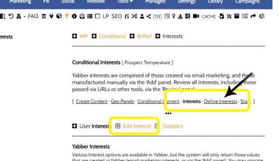
Link views and page views are clearly two very significant ways in which to resolve interest. The assignment of an interest to pages and links is performed via the 'Interests' panel. Selecting the 'Interests' panel returns various Interest options; the two primary options we're concerned with are 'Add Interest' and 'Define Interest'.
Pictured: The 'Define Interests' tab permits us to define interests for links and pages. The 'Add Interest' option is used to create an interest in Yabber.
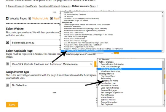
First, we'll select a page and assign an interest to that page.
Pictured: To assign a page interest, you simply select the applicable page (segmented by page group), select an interest type, and Save. As each page is viewed, that interest type will be assigned to the user matrix.
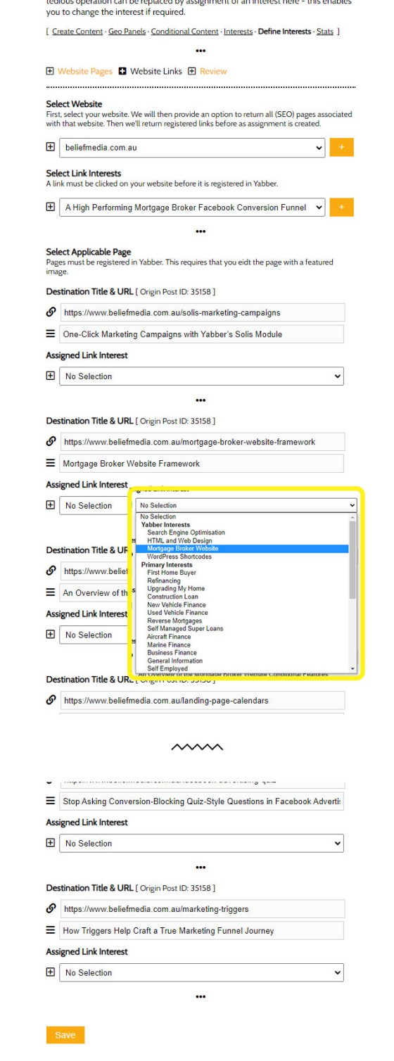
Assigning Interest types to links is a little different, since there are usually many links on a page, and they may all carry a unique interest variation.
Pictured: To assign a link interest, you simply select the applicable page (segmented by page group), select an internal links, assign an interest type, and Save. As each link is clicked, that interest type will be assigned to the user matrix (carrying an escalated score).
In the example shown above we've truncated the link results as there were a large number of link registered to the page. The assigned interest type will often vary based on the origin page. Bad credit, for example, might apply to First Home Buyers or Investors, so a trend of credit research in company with investor pages pains a reasonably clear understanding.
Front Page Conditional Content
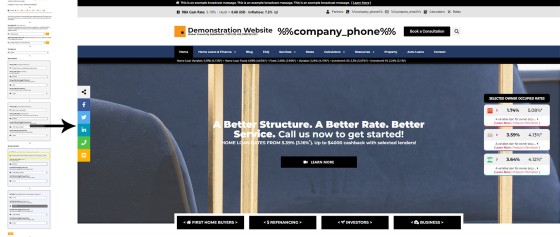
The front page conditional features are a little different to most other conditional modules. The front page includes defined blocks of content  that are designed to specifically serve a conversion objective. These conditional front-page blocks include the primary call-to-action text and button, subscription panel and lead magnet, primary video and video panel, and some intermediate text. By default, content is assigned to the 'Default' category, meaning that whenever a specific interest cannot be resolved, the default blocks of content will show. However, if we can resolve the borrowing objective of the user, we'll show alternate content that further strengthens our expertise and authoritativeness by showing content the user is actually interested in seeing.
Pictured: Showing how to change the front page Call-to-Action text and button. The message shown, like other assets on the front page, will vary based on the resolved interest of the user... or a specific instruction via the entry URL. A placeholder determines the 'lowest rate' shown, and this will also show the lowest rate based on the type of resolved borrowing.
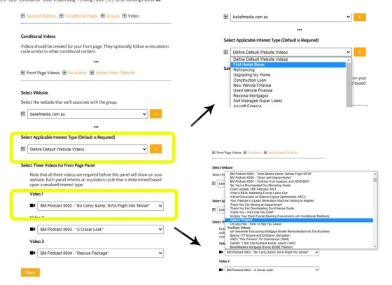
The same method repeats itself for most of your primary front page elements. An important consideration is the primary video shown on your website, or the block of three videos (optionally) shown towards the bottom of your page. We know that video will objectively increases conversions, and relevance will invariably improve upon the results.
Pictured: Assignment of video to a page is via a select menu. The front page includes two primary video blocks: a featured video, and a panel of three videos towards the bottom of the page. The videos shown will render based on resolved interest of your website user.
Another module provides for you to swap out your front page for another based on resolved borrowing, industry type, or various other methods. We've seen this applied extensively when a broker is targeting the medico industry.
Any conditional block may be shown on the front page in addition to those we've included by default, and they are discussed below.
Escalating Front Page Form
The front page form adopts an interesting method because it will not only escalate based on the resolved borrowing, but it will also escalate vertically once a user subscribes (meaning the same form isn't shown again ). This system is introduced in a little more details shortly.
Conditional Pages and Blocks
The Content shown on your website when a conditional understanding is resolved is based on content created in Yabber. The 'Content' and 'Blocks' systems are independent but there's a little overlap in terms of functionality. The 'Content' module is a little old and will be deprecated entirely in the future, meaning that the Blocks module is the primary mechanism for creating conditional content of most types.
The creation of conditional content is done so via a standard WYIWYG Word-style editor. You may crate any content of any type, and you may also include standard shortcodes (such as those for links or videos). A standard panel is shown below, although it's normal to edit these pages in full screen.
Pictured: The creation of conditional content is done so via a standard WYIWYG Word-style editor. You may crate any content of any type, and you may also include standard shortcodes (such as those for links or videos). A standard panel is shown below, although it's normal to edit these pages in full screen.
Note that we assign each content block to a single category, and we also apply tags. The Conditional modules work on a number of levels, so you may use content from categories in various ways, but it's the tags that are interests (the 'tags' are labeled as 'Associated Interests' towards the bottom of the image. You will notice we have checked 'mortgage_broker_website', which is the interest type we assigned to a link a little earlier). In assigning a block to an interest we're telling our website that if a borrowing objective is resolved, and we have content assigned to that borrowing types, show 'this content' instead.
How do we assign conditional blocks to our website?
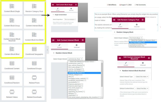
In order for conditional blocks to show, we need to have the blocks positioned in an appropriate manner on our website. in most cases, we achieve this by dragging an Elementor block onto our page... and that's it. The type of content should be selected (in many cases we'll force specific content to show - it doesn't have to be resolved). The primary block that will resolve interest is called "Content Interest Block Resolved", and this block will always try and resolve the borrowing objective of the user (and optionally show default content if not shown).
Pictured: Elementor Blocks are dragged and dropped into any position on your website. Content is then updated from Yabber when required. This negates the need to log into your website and navigate what is often a complex design in order to effect immediate content changes. The various Content Widgets made available in Elementor are now listed under their own standalone menu.
These conditional blocks are usually strategically placed in your funnel in locations where we know the user has escalated, and when we know the user is researching a specific topic.
Geographic blocks are shown on the basis of the geography of the user (they're conditional in that the location of a user is resolved).
Conditional Forms and Panels
Forms were introduced in brief earlier, and they obviously plan an important conditional role because they're the important conduit between a user and any subscription or content experience. We recently introduced a basic Facebook/Organic conversion funnel, and that article may introduce a little more relevance.
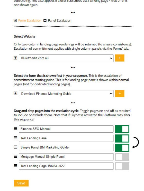
When a user downloads a lead magnet or subscribes to an offer of some type, we don't want them to show them the same form again, so we apply escalation and optionally show them a different offer in place of the original form (wherever that first form was shown). This is part of escalation of commitment method that has a big impact on repeat engagement (you won't get repeat engagement if nothing changes). The escalation of forms is defined in the Conditional module; you simply select the first form, and then define those forms that will follow .
Pictured: Subscription panels and forms take on a similar escalation method. You select your website and the first form to show, and then drag-and-drop (and activate or deactivate) those forms that will follow. This is an essential component when the same offer on 'general' pages is also provided on a landing page.
As mentioned earlier, forms may initially be shown on the basis of resolved interest, and once subscribed, a new form will take its place.
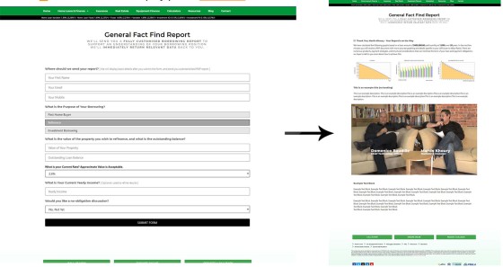
A conditional aspect applied to forms is the conditional redirect, and the conditional methodology we're about to describe applies to any form of virtually any types - such as Fact Find forms or Venus Reports.
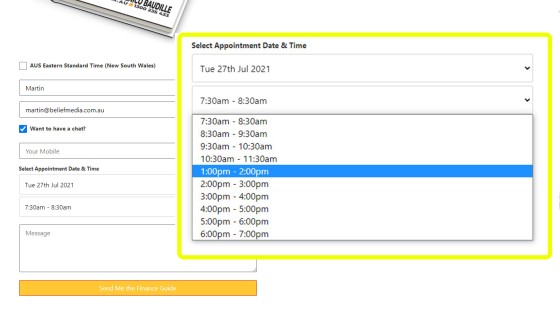
Pictured: First and foremost, it should be noted that the calendar option integrated into every single subscription form is shown on every single page (every single page is a type of landing page). Selecting the checkbox shows the calendar options. Selecting a date returns available times, as sourced from Microsoft Outlook. An option exists for 'Earliest Convenience', which becomes a phone-only  subscription.
Pictured: The Conditional Redirection ensure that the second page escalates the user appropriately based on the type of form interaction. The second page shouldn't be a 'thank you' page - this is a wasted opportunity. The second page, or the page shown after any subscription, is a gift to a business that values its marketing. We know that each page view or keystroke objectively decreases conversions, and this means we're obligated to minimise the effort required to submit a single form, and we're required to show relevant content. What we've just described is a mechanism that allows us to achieve in two pages what takes others 5 or more pages... and we're on the second page, so we still have the attention of our user. The landing page a user is redirected can be a single defined page, or a split group (we don't call split-testing A/B Testing as we allow for unlimited pages to be tested against each other). Summary: A Conditional Redirection is enabled to way of an integrated calendar, and redirections are applied based on the type of interaction.
It's not just the conditional redirection that applies. Submission of this form is what we call a declaration, in that a user is feeding us with fairly definitive understanding of their borrowing objective. In the same way, viewing a landing page achieves a higher interest score because a landing page is usually created for a specific purpose.
Fact Find, Venus, and other Forms
Unlike the ridiculous 60-second quizzes you're familiar with, your website fact find is designed to qualify you, and it does this by sending a PDF report to the user upon completion. The PDF report includes some basic information, LVR/LMI information resolved from the questions, and it includes a large number of graphs.
Fact Find Funnel: Because the fact find is a genuinely engaging experience that results in actual results to the page, and sends a PDF via email, it is sometimes appropriate to use the form on the initial landing page, although the advert needs to provide clear value and speak to the relevance of the experience, and we should still send a download offer for further value. Remember, your fact find includes an optional calendar contact option ("Would You Like to Make a Booking"), so we're not forcing a conditional second page for the sole purpose of contact (most of your competitors will show a form, they won't show any results, and then force contact details for the purpose of contact).
A video is usually included as part of the conditional (fact find) second page, with a tailored video shown for each of our subscriber types - subscriber, phone, or calendar. The video will be specific and entirely relevant to the forked funnel journey your user is experiencing. In the case of subscribers, or those that didn't initiate a contact of any kind, we'll show the calendar again - this time opened - and we'll invite them for a complimentary discussion. A very specific video introducing the value of the conversation massively improves conversions. If the subscriber funnel doesn't show the fact find on page 2, it will certainly show it on page 3.
Pictured: The Fact Find is a standard conditional form that asks various questions, with each 'next' question asked on the basis of each response (salary-related answers are always optional and may be removed). The reason a user is more willing to engage with the experience is because they'll receive a PDF report, and unlike the shonky experiences in the market, we'll returns information back to the user (based on rates that are available via your listed accreditations) immediately after submitting the form (it's 'kind of' a second page, except results are returned on-screen as an Ajax response). The Fact Find itself includes an Outlook-integrated calendar booking form. The inclusion of this form will only show if no booking is made, but it's an essential inclusion whenever the fact find is shown as it completely negates the need to send the user to yet another page. The concept of Triggers are introduced shortly in brief. Since each PDF report is dynamically created for an individual user, the links in each report may be tracked to the user level, and optional triggers may be applied for links clicked in the report. Various conditional-based automation will apply when a user subscribes to any form, or any style of fact find. The user (and optionally, the broker) will be sent a text message, with the message once again tailored based on the type of contact. The user may be added to CRM systems, they'll be subscribed to an appropriate email list and autoresponder sequence. There's around 35 points of automation that may be applied, with some of the features reserved for when your marketing matures (for example, the user is added to a Facebook lookalike list).
Fact find, Venus, and some other reports make declarations on specific borrowing attributes, such as borrowing objective, loan amount and credit history, and we can leverage this known information to return more relevant content to our user.
Other Conditional Modules
It isn't reasonable nor feasible to introduce all conditional aspects of your website. In general terms, every interaction a user has of any type will increment their interest score. Every interaction of any type is important. A short summary is shown below:
- Text Tooltips. Text tooltips are probably something that you've never seen associated with a conditional website system. Why? Because most marketing evaluates the interaction as irrelevant (and they don't have the tech to support it). Like everything, the interaction must be measured. Simply hovering over one of our tooltips will return basic glossary-style data on the front end, but on the back end it evaluates the interaction, makes an attempt to resolve purpose, and then it even applies (optional) triggers. Hover over this text . When that tooltip was created
 it was assigned an interest type (albeit in carries a very low internal score). The linked article introduces additional information, and introduces the optional triggers.
- Modal Links. Yabber provides what is unquestionably the most feature-rich and only finance-specific modal system in the industry. To demonstrate a simple modal, click on this basic link . In clicking on that link you have incremented your Yabber interest score, and the system would have evaluated for optional triggers. When creating a modal
 , an option towards the bottom is shown for assigning any Yabber interest you've created.
- Finance Calculator Modals. Yabber's finance calculator archive and functionality is significant. Calculators may be returned inline or, more applicable to our conditional architecture, as in a popup modal Clicking on that link returns a modal, and the interest type assigned to the click is usually based on the page the link resides. When you create your calculator modal text (shown above the calculator on all individual calculator pages), you will be asked to define an optional interest type
 . This interest type is applied to modal clicks.
- Geographic GHB Content. Geographic, or First Home Buyer content, is part of the Conditional Content module, and it shows a block on the basis of the resolved state of your user. The conditional content is simply assigned to each state
 .
.
- Geographic Placeholders. Following on from the FHB content, general geographic placeholders are available in all content, such as pages, posts, and post titles (the linked article no longer provides a resolved location, and the code now requires an API key). While not entirely accurate we've identified your state as Ohio, country as United States, and city as Dublin. Your postcode of is usually invalid but still may be appropriate at times. Your returned geographic coordinates (40.099, and -83.114) are ideal for locating nearby brokers or franchise offices, serving higher-value local testimonials, or rendering local contact information to a page.
- Downloads. Yabber includes a version-controlled document manager. All downloads from any source, such as your website, credit guide, email campaigns, or social, will download from a single version-controlled source. When you create a download record it is assigned to a category
 (the category is essentially your primary interest group), and any download included on your website will apply an incremental count with an assigned value slightly higher than links. The interest type is applied for any download location, such as inline download links, related download panels, download boxes, or your download archives.
- Lender Modals. The broker website includes two styles of lender modals, which we call Lender Modals and Bank Modals. Their differences aren't important in order to understanding the conditional aspect. Lender Modals of all types work in a similar manner to standard modals, with the exception that an interest is (usually) assigned to a lender. For example,
[link lender="cba"]your-text[/link]returns the following link . Clicking on any lender modal or any type feeds the conditional module with an understanding of interactions and in this case we're able to resolved the type of lenders a user might be researching (supplemented by identified pathways through the Lender Archive). - BM PDF Viewer. PDF Documents may be rendered to your website in various ways, but the only method of tracking PDF interactions and applying an incremental interest count, is via the BM PDF Viewer (modal). The PDF Viewer is launched with the link shortcode, so
[link pdf="yabber-doc-id"]yabber-document-id[/link]returns the following link (click it to launch the modal and feed Yabber with more interest-based information). - Video Modals. Yabber provides a large number of ways to render videos onto your website. We include two primary modal links: a full screen modal link, and a secondary modal link , with the latter method required for interest tracking and triggers (shortcode used to render the link was
[link video="zf1MytwD8dg"]anchor-text[/link]). Wistia videos include their own native architecture for measuring engagement, and all this data is recorded in Yabber in real-time.
The list goes on. Each of the mentioned modules apply a conditional understanding, while some will also alter their shape based on a resolved understanding of the website user.
A pending module that shows real-estate listings is forthcoming (designed to support property partners), and this entire module was built based on applying conditional funnel pressure. This means that default listings shown will be resolved by an understanding of the user.
Marketing Triggers
A marketing trigger is an action that takes place somewhere as a result of an user action taking somewhere else. Many might be familiar with the lower-level triggers that take place in email marketing software; the clicking of an email link, for example, might subscribe a user to a different list (a pedestrian but highly effective feature). Another email trigger might be the sending of another email on the basis of clicking on a link, or even opening an email.
Triggers: The Trigger system is a huge topic and generally outside the scope of this article. What's important to understand is that the declared actions of your users provide a heavily weighted means of establishing interest and escalation, so we're able to respond to that understanding by way of website content, but we can also use the known interaction to respond to our client (or back to our business) directly.
We've developed trigger methodology in a way that is reserved for companies with deep pockets and endless budgets... but it's all provided by default in a product that is priced lower than just about everything on the market.
What you may not be familiar with, and maybe didn't know was even possible, is the ability to action SMS messages or emails, or action other types of triggers, on the basis of a user simply visiting a specific webpage (after a defined time period), or by clicking on an internal website link. This level of integration into your website - and integration into your marketing funnel experience - is imperative because we're shaping a relevant experience based on known behaviour.
Triggers should not be confused with broad automation features. Automation via BeNet is a set schedule that applies based on a identified pattered behaviours, while triggers are the course-correcting actions we take after a user declares 'something' by way of a known action or interaction.
Triggers can alter email subscriptions and autoresponders, send specific admin emails, send SMS messages, create tasks, and they'll automatically alter BeNet's understanding. The trigger itself is actioned on the basis of around 100 types of actions, ranging from page views, link clicks,and downloads, through to an inbound telephone call. A more thorough - but now entirely outdated list of triggers systems - is introduced in our article on how marketing triggers may be used.
As a general rule, every system we build now integrates a trigger system of some sort.
Funnel Architecture
Your website plays a vistal role in your funnel journey, but it's just one asset that applies pressure on the journey a user takes. One must consider email, SMS, social, and other channels before a holistic experience may be applied. Website funnel assets of any type can change shape based on interactions outside of your website funnel.
In order to develop a better understanding of how Progressive Disclosure, Choice Architecture, Escalation of Commitment, and other principles are applied in funnel design, it's important to read the following two articles:
- Progressive Disclosure, Relevant Disclosure, Choice Architecture, and Your Conditional Marketing Funnel. Progressive Disclosure is a psychological principle that states a user is less likely to be overwhelmed by information or a system if only a subset of choices is made available to them. Focused around the notion that approachability and ease of use must take precedence over overchoice in order to improve upon user engagement, progressive disclosure is a discursive psychological principle applied by drip-feeding relevant and selected information into the life of a user in order to improve their understanding of your product or services (i.e. "less is more").
- Hick’s Law and The Paradox of Choice. Hick's law, or the Hick–Hyman law, describes the time it takes for a person to make a decision as a result of the possible choices. By increasing the number of choices a person may make we will increase the decision time logarithmically. Created by British and American psychologists William Edmund Hick and Ray Hyman, the published paper marked a shift from behavioural psychology to cognitive psychology. The principle is very similar to the The Paradox of Choice, a principle that states eliminating consumer choices can greatly reduce anxiety for shoppers. This article introduces these concepts, and how the psychology has helped shape Belief's core marketing ideology.
In order to understand our mortgage broker website in general, the following article should be referenced. You cannot have a great funnel without a great website.
- Mortgage Broker Website Framework. Your website framework is more than just a website. Comprehensive statistics are maintained, triggers may be applied to page views and links, and there are literally hundreds of features, shortcode, and Elementor blocks, on the periphery that amplify the effectiveness of your organic and promoted funnels
There are other relevant article shown below, but those listed tend to provide a satisfactory overview of funnel theory, and how that theory is applied by Yabber.
The following articles may be referenced for a more granular look at some of the conditional concepts.
Relevance Architecture
The focus of this article was website conditional content, so we've tried to avoid diving too deep into the follow-up or social funnels, but we're obligate the share some information on how holistic principles are applied to assets outside your website or active funnel.
Part of the metric we resolve from your website is 'trending' topics, or borrowing types that might be more popular than others. This trend is normally guided by news media, Government announcements, and general consumer herd behaviours (such as an RBA Tuesday). When we identify herd behaviour, Yabber has the capacity to optionally swap out the banner and profile picture you use on Facebook or YouTube. The change won't have a profound impact on your marketing, but it will start to shift focus towards the type of products most people are searching, thus injecting appropriate relevance into their minds, and assigning necessary expertise and authoritativeness to your operation. This type of 'experimental' tool repeats itself on the periphery for most of our bigger-ticket modules.
Manged clients have access to a system that automatically submits a footer banner or header message onto appropriate pages when trending behaviours are initially identified (and before the certainty is resolved).
We Get Frustrated With Mediocrity
We need to make a few points clear. The mediocre end of the marketing industry pushes ineffective solutions that do nothing but introduce a technical debt into your operation, and we find it professionally offensive. To that end, we'll make a few points clear:
- You should never ever buy leads -it's an utterly debilitating business solution. Don't buy into the messaging that buying leads will "scale your business", or that they leads are nurtured in any way - it's patently false. There are two types of brokers: those that own the building they work in, and those that rent... and those that buy leads usually fall into the latter category. As somebody that buys leads you're not scaling your own business - you're scaling the business that sells you the leads. In fact, one could argue that those that buy leads are slaves to a leadgen company, essentially relegating themselves into the 'processing' category. You can easily introduce a system that supports your operation in a manner that outperforms every lead generation group in a seriously significant way.
- Don't use Lead Pages, Click Funnels, High Level (in particular), or any other similar system. These platforms completely fractionalise your operation and introduce a dead-end solution to your business. It's not a scalable option. The crooks that peddle in this buffoonery will resell software with a hefty margin when it's not designed or intended for the finance industry. The notion that you introduce a third-party system to support any campaign when your own website has the capacity to support that functionality in exactly the same way is absurd. Further, third-party services completely negate the ability to have a marketing funnel in place because they're detached from your primary marketing assets.
- Facebook Advertising is Easy. If you're going to advertise on Facebook, appreciate that you don't need the support of a digital agency. While our own systems are fantastic, you're quite capable of using our free Funnels product to return better results (in fact, we guarantee it... as far as anybody can guarantee a free product). We've measured Funnels to be at least 3X more powerful than systems sold for 14k... and it's free. As a free product it'll return at least a 30X better ROI than any pay-per-lead service.
- Your Website and Funnels are Dynamic. You cannot and will not have an effective funnel if it isn't intrinsically connected to your website experience, and it isn't impossible to serve a real customer journey if your website isn't shaped by your marketing experience.
The list goes on and on. We like Alan Jones' "bacon and eggs theory"; the chicken attends, while the pig is committed. You're either the chicken or the bacon. Brokers that have their own systems are committed... while those that buy leads are 'attending' the industry.
Conclusion
We apply very unique methods to our marketing that are based on an ideology shaped from over 25 years of building broker businesses. The entire digital experience is one based on the principle of escalation of commitment, and it's not possible to apply this customer-focused journey unless we allow various conditional modules to function. At the very least, and if we choose not to implement conditional features, we need to evaluate the data returned via the Conditional and Interest modules in order to gain an appreciation of what parts of our marketing work better than others. The granular understating derived from website interactions and funnel pathways is what feeds us with the intelligence necessary to make informed decisions, and this information is essential if you're looking to introduce agility into your marketing operation.
Some modules discussed in this article were once used by only our managed Platinum clients, although we determined that it wasn't fair to withhold functionality that'd improve on broker results, so many modules - with more to come - will all make their way into the primary (default) website framework.
You won't find a framework packed with the functionality we've described for less than 30k (and probably way more). However, we don't apply a fee on the basis of advanced functionally and features because not all brokers will use it to its full potential. If you do choose to implement some of the features we've introduced, your digital presence will eclipse that of virtually all lenders and franchises, and give you a clear digital advantage... and we still cost less than the basic website an aggregator might provide.
One of the core messages we've tried to share with the industry is this: stop using lead-generation services, and instead take ownership of your marketing. It's for this reason that we introduced our complimentary Funnels product... but there are still brokers buying leads, despite our free product delivering better leads for a tiny fraction of the cost. We could quite easily sell leads without any consideration to the welfare of brokerages, or the ethical nature of participating in such programs, but we don't (or didn't -- we've created a product that comes with leads, but we won't provide it unless the business takes ownership of their marketing as part of the deal).
Compare our digital product against the alternatives and give us a call.
 from Google Maps (Screenshot taken August 2022). [ View Image ]


