We tend to talk a lot about how every page on your website is a potential organic entry point, therefore every page on your website is a type of landing page, and we've introduced the numerous and rather self-evident benefits of ensuring that you render a subscription offer on every single page as part of that conversion, and how it is important to include an optional (but highly recommended) integrated calendar option behind a checkbox. We repeat this over and over because it's the bread and butter of any framework that provides improved website-based conversions. If you're missing any of these important elements then you're missing out on business - simple as that.
It doesn't matter how successful you are at drawing visitors to your website, if you don't have the capacity to ingest them into your website or marketing funnel then they'll simply be lost into your flat-lining conversion analytics. Until you turn your mortgage broker website into a lead generating asset it simply won't generate leads. As part of this regular rant we'll often talk about how you should include a calendar subscription on every single page of your website, and how this simply makes the opportunity to book a discussion with you more accessible. The shortest path to any conversion is the one that your leads will take, and including subscription forms on every page is the easiest pathway you'll ever make available to them.
This article introduces one of the early features of our conditional ideology that allows you to show a message to a user based on whether they have or haven't made a calendar booking with you. In one sense, the message acts as a reminder for those that have made a booking (particularly since our email follow-up will escalate their website funnel experience as part of our marketing funnel), and in other cases - notably an expired meeting or no booking - we'll optionally show another message (or nothing at all).
The Integrated Experience
As soon as a user subscribes to a form in any way we record those details in a session and cookie, and the information is fed to our BeNet AI engine so we're able to retroactively determine past browsing habits, but also establish continued browsing patterns for that specific user - something we deem to be essential for a real marketing funnel. The basic data recorded within your website includes (among other things) the details associated with a booking, and it is this known booking data that enables us to shape a user website funnel experience.
Placeholders
Any number of placeholder can be replaced with known content about your user anywhere within your website content, but the problem is that we don't always have the content to replace the the placeholder text. However, the Elementor block will discriminately show content based on known calendar interactions, and based on the known booking data we've collected.
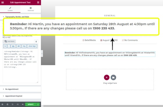
%%day%%, %%date%%, %%longdate%%, %%year%%, %%start%%, %%end%%, %%timestamp%%, %%iso_start%%, and %%iso_end%%. The placeholder can be used anywhere but will only return a value when a calendar booking was actually made.%%firstname%%, %%email%%, %%phone%%, %%mobile%%, %%day%%, %%date%%, %%longdate%%, %%year%%, %%start%%, %%end%%, %%cityname%%, %%region%%, %%country_name%%, %%latitude%%, %%longitude%%, and %%postcode%% (other data is recorded in a cookie but it's unlikely to be returned to a user's screen). It's the landing experience where the passage from one page to another makes appropriate placeholders entirely predictable... although you may use them on any page.Three optional blocks of text may be created based on three conditions: a pending appointment, an expired appointment, and no appointment. The text is created quickly in the Elementor drag-and-drop block. The most common placeholders used when a calendar booking is made, and when the name of the user is known, is as follows: %%firstname%%, %%day%%, %%date%%, %%start%%, and %%end%%. You might also choose to use %%email%% or %%mobile%%.
Pictured: The Calendar Appointment Elementor block. Text shown is that which is rendered when an appointment is made. The two panels shown under the 'appointment' panel should only be populated with text if you choose to return a message to your screen for these conditions.
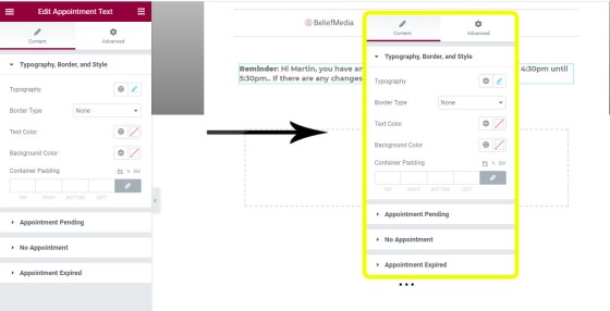
The text may be styled in any manner with simple and easy-to-use toolbar-style editing. You may alter the text color, font type and weight, border type and colour, background colour, line height, and so on.
Pictured: Calendar booking text style options. Virtually every aspect may be altered to your liking. A light border with light background colour is often used.
Pictured: An example of calendar reminder text with border styling applied. We've seen businesses apply the text across the width of their page, in sidebars, and above posts. In most cases the text will include a link to another resource that'll educated and develop the user within our funnel.
The calendar text may be placed anywhere on any page.
The Calendar Text Objective
In simple terms, the calendar text optionally returned to a page simply reminds a user of a pending appointment. We always refer a user back to our website as part of funnel escalation strategy (as part of our follow-up) so the reminder message will always be exposed to the funnel participant (remember, the most effective calendar option is a 'call now' option - an often overlooked calendar feature).
Consider just one of the possible funnel pathways created by way of the single message optional link:
Without a user being aware of what we're doing, the 'calendar message' is often the single feature that allows us to further qualify us as the broker of choice, and allows us to drive a website user deeper into a far more immersive funnel experience.
The point is this: the simple calendar text can be the conduit into a funnel that is far more likely to convert.
The Platinum Features
Certain features once reserved only for our Platinum clients will be migrated to our standard mortgage broker website over coming weeks. One such feature, and one that comes from recording details directly on your website, is that a user may alter their calendar appointment time after it's made, and the changes will simply push to your Outlook calendar. This kind of advanced website integration is only possible because of the fully-integrated manner in which our systems are built.
If you're engaging with professional marketing representation for any purpose (website and/or lead generation) they should never introduce third-party systems simply because they completely cripple your capacity to build an effective funnel. That said, the third-party systems are often commonplace, and they're seriously compromising on funnel conversion rates.
We have an interesting Platinum feature that renders conditional content of different types based on a set of known conditions. For example, we might filter on a user that has made a booking, downloaded two specific lead magnets, and visited a certain number of pages. The tool does have its place but is rarely used because it is designed to exclude certain funnel participants until they'd escalated to a certain point in our journey (it obviously requires large amounts of traffic to be effective). In almost all cases we tend to push as much information as possible into the funnel without discriminating on micro-engagement.
Conclusion
It might be becoming clear why our conditional experience is one that that provides a far more powerful website funnel strategy, and how our marketing programs guarantee to return more than competing products. The market will often gravitate towards worst-practice solutions because of the noise those charlatans peddling the bottom-of-the-barrel solutions tend to make, and this noise has slowly established a new low standard that is quite unique to the finance industry. As the competing noise becomes overwhelming it has slowly started to completely dilute the purpose and function of a real marketing funnel leaving brokers with horrible solutions that relies entirely on paid promotion. Your website is a core and vital component of your marketing funnel, and is intrinsically connected to your Facebook marketing efforts.
The migrating to a low standard is actually a great thing for those that use our tools because the inferior solutions peddled by others tend to seriously elevate your broker experience. Certainly, if any marketer has introduced you to third-party solutions (Click Funnels, High Level, Lead Pages etc.) as part of a Facebook or other campaign without first integrating your website (the core of your funnel experience) then they've objectively failed you, and they're costing you business, leads, and conversions.
The calendar text is just one conditional feature but it does illustrate how having the integrated experience elevates your digital presence. At the moment the simple calendar text widget is one of a few conditional drag-and-drop content blocks but we expect to have at least a few migrated by very early September (probably by the end of the first week).
Our very powerful mortgage broker website is still priced lower than the typical ten-page site you'll get from most sources. The fully-integrated and conditional website includes resource search features, live bank product data, and other tools that shape an amazing customer experience.


