The calendar form is often used in the transactional flow within a sales funnel experience. That is, at some point in the early contact experience we'll present a user with an option to book in an appointment for an early discussion. In this article we'll introduce the single and super-simple option that we see ignored consistently, and it's costing you conversions and business.
A short recap on a few concepts is required before we introduce what is truly a calendar-based funnel-blocking feature.
Facebook marketing, Google marketing, and virtually all other types of advertising is often referred to as Interruption Marketing because we're interrupting a user with a message we hope captures their attention. However, the adverts delivered to a user are predicated upon a contextual understanding of that client (targeting is just a starting point, and delivering via contextual means is the finish line). What this means is that when a user visits a few mortgage broker websites they'll likely start to see various broker adverts in their Facebook and other feeds. So, in essence, the understanding gained by a user visiting your website improves the visibility of adverts delivered to your competitors. If you're not using advertising yourself, the understanding that these social giants gain from your interaction will actually be used to support others that use their services - quite a bizarre concept.
The point is this: those clients that come to you, respond to you, download a lead magnet, or engage with any other marketing asset, are also engaging with others in your industry. In fact, we'll see the ubiquitous nature of cross-pollination via our own internal analytics, and that's just from our own client-base. This known consumer behaviour places pressure on our marketing funnel (as opposed to the transactional nature of the sales funnel, of course) - we're in competition with others, and it is the broker that provides the most powerful, persuasive, and immersive experience that'll win the race against others. Your marketing funnel is the deep-dive educational experience that is designed to educate, engage, inform, and qualify you as the broker of choice (never the other way around). Do your job and you'll win more business every single time.
The purpose of a marketing funnel, or even a basic advertising experience, is to qualify you as a broker - it is not designed to qualify the client. It's for this reason we had to introduce an article that detailed how ineffective quiz-style questions are to the sales experience - qualifying a client is somewhat presumptuous, premature, and inappropriate. Treat a cold lead or potential client as if they're qualifying you and you'll get better results. Remove the quiz questions and your advertising programs and marketing funnel will be more effective. Simple as that.
First, our integrated use of calendars is the only such application in the finance space. We fully integrate calendars in your page for a number of reasons, and without going into detail, we'll list some of them here:
- We place 'hidden' calendar booking forms neatly tucked away on every page of your website. Every page of your site is an organic entry point, therefore every single page need to provide a conversion opportunity.
- We highly object to calendar forms on any entry first landing page... but also encourage it. Confused? Read our article titled "Why You Should *Never* Have a Calendar On an Entry Landing Page (But Why You Must Include It)". In summary, we hide a fully-integrated calendar behind a checkbox. Some clients want to talk to you now and aren't interested in your quiz, offer, or anything else. They want to book with you now (in other words, you've interrupted them at the right time).
- Various automated actions apply when using our subscription forms (including a calendar). This includes an optional Conditional Redirections. We need to make the Second Page great again.
- If a user makes a booking that information is recorded in session, a cookie, and on Yabber
 . We can use that information in different ways, such as showing the booking time on various pages (as a reminder) or serving them alternate content focused on escalated features rather than pre-booking or 'salesy' content.
Of course, each form that includes a subscription form includes an optional 'Escalation Cycle' designed to show a user with new assets once in your organic or website funnel. This escalation applies to forms and landing panels (but not landing pages) in the same way.
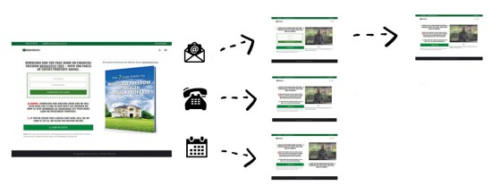
Pictured: Calendar should be on every page of your website; you shouldn't be making it difficult, or you shouldn't be introducing another page-view, to facilitate a primary purpose of your website. It's the calendar and phone fields that play a part in facilitating the conditional redirect - one of the most powerful features you will ever introduce to your website forms.
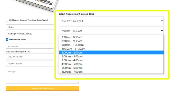
When we talk about calendar integration it's important to understand what "integration" actually means. Basically, the form is part of your website - it is not a third-party plugin (in fact, for compliance reasons it is driven by a Microsoft application registered to your business). The form can be used anywhere in any location and designed or fashioned to your liking, and the dates are populated based on your Outlook availability. When a booking is made the schedule sends directly to your Outlook calendar (other automation applies, such as CRM contact or task creation, SMS messages, and so on), and that data is made available on your website - not somebody else's.
Pictured: If a user would like to make an appointment we ask for a date and time, with the time populated based on the selected data. We don't require another page-view, we don't require they enter their personal details again, and we don't ask any unnecessary details (they'll provide information in the contact text field if they choose to do so). We include these simply-to-use forms everywhere - you should never make it difficult for a client to contact you, and you should never ask for a page-view or keystroke above that which is absolutely required to complete the task.
Pictured above is a subscription (calendar) form as we use it on our website. You'll note that we use the calendar option behind a checkbox - another feature made available via true integration. While it may be left open at all times we don't like to scare away any potential leads based on a perceived requirement to contact us. Various interaction options apply: a user may simply enter a name and email, they may provide an optional phone number, or they may use the calendar form.
It's a field in our date and time selection panel that we'll now address (and we'll show you what you're missing).
The Most Important Calendar Field
Knowing that "if you're not first you're last", and understanding that your cold lead will talk to other brokers, any paid lead (or any lead from any channel, really) should be spoken to before they talk to anybody else, so it stands to reason we make an option available in a calendar that makes your imminent availability known.
While we very clearly provide the most powerful calendar integration in the industry, we also appreciate that automatic calendar creation it often used as a Gimmick. Like all technology, calendars have their place, but we're obligated to provide a lower barrier to entry for those that require it.
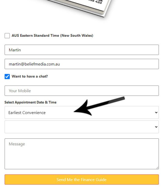
Pictured: The earliest convenience field. Appropriate form automation takes place, such as a client SMS and business SMS, the user is subscribed to an autoresponder campaign, and the lead record is created in Yabber, planner, or a CRM. Note how the fully integrated calendar is tucked neatly behind a simple checkbox. The unobtrusive nature of the option makes it suitable for landing page forms (since we'd never normally who a calendar on any landing entry page).
That one calendar form we're now seeing selected more than any other, and the one field that we're seeing convert far higher than actual calendar bookings, is simply the 'Earliest Convenience' field (that text can, of course, be modified to your liking). Instead of selecting a date and time, the user simply makes it known that they'd like to talk to you the first chance you get... and it's this simple feature that is converting more clients than the scheduled calendar-based leads. Calendar leads are often exposed to opportunities before your scheduled discussion... and an earlier phone call mitigates this potential disruption.
A calendar option should be present for all occasions where a user wishes to make a booking, but the Earliest Convenience option must be present for everybody else.
Conclusion
Calendars are a fantastic tool that certainly have their place, but it should be understood that delaying contact with a client leaves them open to influence and interference from other brokers.... and this interference will and absolutely does happen.
Our website and landing calendar integration is extremely easy to use, but it's also the only example where we make the calendar options easy to navigate with that always-important 'Call Now' option. Used in company with our form-based conditional redirect feature, the calendar panel has the potential to have a transformative impact on your marketing programs.


