Until recently, our high-performing mortgage broker website included a linear one-row slider of banks to showcase your accredited panel. It wasn't until a brilliant broker in Western Sydney asked for a large image showing all accredited banks that we started to consider how the evolved feature might be used as a conversion element, and what impact it might have on the page (keeping in mind that the large bank image is almost an industry standard). We've now tested the feature we're about to introduce on just two websites but we've already seen positive results, and the data returned quickly proved the alteration to be an immediate inclusion on all websites we deploy. This article introduces a new methodology we're now using to return bank icons to the front page of your website (or any other page).
When the first request for the bank image was made to us, our first thought was to build a module within Yabber  than would manufacture a styled image automatically, and that's exactly what we did. We created a quick panel where all accredited bank images would be added to a canvas, and that image could then be used on a website. However, when we introduced the feature we were clearly sleep-deprived or Covid-depressed because the notion that we'd use a static image for a dynamic element is somewhat ludicrous. We'd already built the dynamic bank archive pages that show accredited banks, so the inclusion of those logos into a page simply made more sense.
Each image in the bank grid is an active link to a bank archive that shows all parent products associated with a bank. This approach adds SEO value, opens up more front-page funnel pathways, and provides easier access to high-value resources (in this case, live and always up-to-date bank product data). We always rant on about how a broker website should look like a broker website (it's why we recommend you include bank data everywhere), and the grid of bank images in place of the former carousal-style slider serves this end nicely.
Pictured: The former and now-retired bank carousal slider. The slider is still available as an option but given that we've determined the bank grid returns better results we'd recommend the latter feature be used (it took just one day for the data to prove its point).
Video Introduction
The video below provides a brief introduction to the feature:
The Bank Image Grid Result
The new bank grid images render on your front page as they do on the bank product archive page.
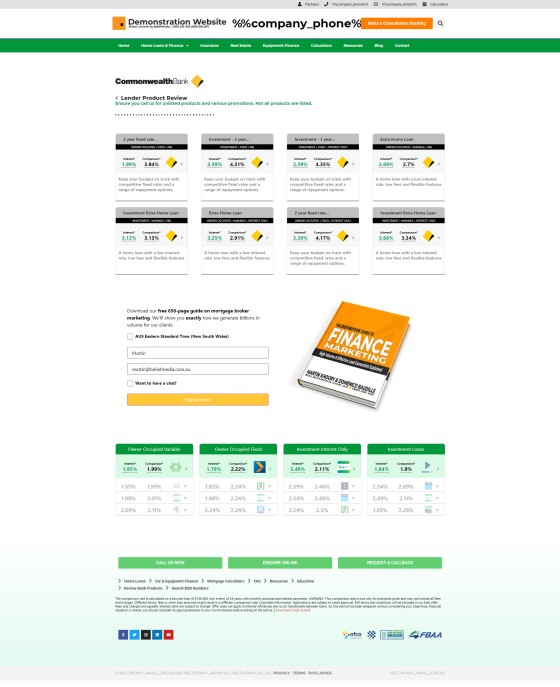
Pictured: The bank logo grid. The grid isn't one that should be used on just the entry page - it may be used anywhere. The returned images can either be a collection of all your accredited banks, or just a small selection of banks. Each bank logo links to an archive page showing all parent bank products. The screenshot is an actual client website; note that about 40% of his page is occupied by actionable bank product information. Every linked page obviously provides further funnel pathways, and each page includes the mandatory 'every page' subscription panel.
As stated, each of the bank icons links to a bank product page showing parent products (as pictured below).
Pictured: Bank product pages are made available for every bank you're accredited. Each of the panels links to a page with full product information that shows the rates and conditions applied to the tiered product. The bank archive pages are discussed in an article titled "Providing a Website Archive of all Bank Home Loan Products". Note the inclusion of the Simple Panel (subscription form); this every-page inclusion is discussed in an article titled "Defining Website Form Locations – Explode Your Conversions". The lower panel of selected bank products (in green) are standard bank product widgets.
Each of the products in the archive links to a product page showing all product variations and rates.
The Elementor Bank Grid Block
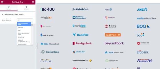
We make a drag-and-drop block available in our Elementor plugin that permits you to drag the bank logos as a grid into any page of your choosing. The responsive grid initially wraps in four columns before folding down into two columns, and then a single column on mobiles.
Leaving the bank select option blank returns all accredited banks. To show specific banks you should specifically select them. Accredited banks are defined in Yabber.
Font Page Website Content
The bank logos are just one element on your website, and they're normally located towards the bottom of the page near the footer. Other page elements may all be defined in Yabber, and unlike the bank grid, the other elements attract a conditional cycle, meaning that your website starts to change shape based on the determined interest of your visitor.
You may read about the front entry page chameleon effects applied on our broker website in an article titled "Managing Front Page Website Content Within Yabber".
Conclusion
The new bank grid works very nicely. What makes it different to the pedestrian experience (i.e. the one-row slider we previously used, and the feature used on all your competitor websites) is that the logos actually perform a function in that they link to bank product archive pages, and they facilitate the website funnel pathways that should be the core of any website experience.
The bank image grid module serves the function any website asset is supposed to support: website funnels and conversions. It's a simple feature, but it's feature-rich and worthy of mention.


