Because this is a guide on marketing, and how your marketing impacts upon your brand, it’s probably important to assign some meaning to our logo… even if it doesn’t look like it means anything at all. A discussion on logos and branding is one of those discussions that will take place for our full Growth program, or for new-to-industry unbranded brokers.
Our logo is built upon the underlying principles of our business.
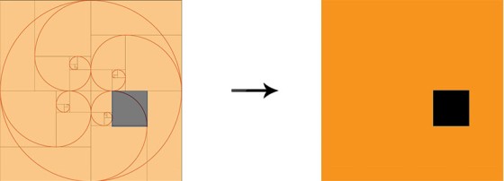
The Golden ratio is a magical number 1.618 that makes all things proportioned to it aesthetically pleasing (or so it is believed). In mathematics, two quantities are in the golden ratio if their ratio is the same as the ratio of their sum to the larger of the two quantities.
Then there is also the Fibonacci sequence where each term is defined as the sum of the two previous terms: 0, 1, 1, 2, 3, 5, 8, 13, 21 and so on. The interesting thing is that we have two seemingly unrelated equations producing the same number and same result.
The idea with the Golden Ration as we apply it online is to avoid a cognitive dissonance in web design or marketing communication. Our brain doesn’t like to be distracted or confused. Have you ever had to turn the radio down in your car because you were struggling with direction? While our brains are capable of switching between one task and another, if we’re presented with a problem that requires solving, we tend to focus on that task over any other. The golden ratio introduces a familiar organic element to digital design and is more likely to result in a harmonious experience.
Pictured: The golden ratio when drawn.
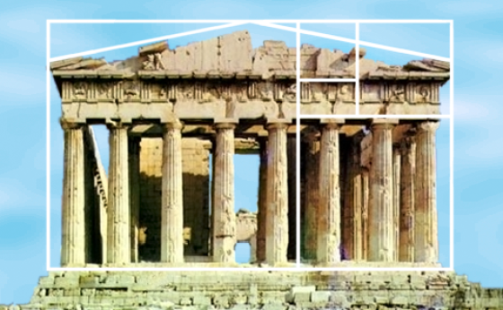
If it looks familiar to you, it’s because it’s a pattern that repeats itself in nature… and translates to a pleasant experience in traditional design and architecture because it avoids a cognitive dissonance.
The Fibonacci sequence and golden ratio are said to improve or maximise energy flow. This can be seen in the path falcons fly when approaching their prey, or by the way plants grow. If you divide the female bees by the male bees in any given hive, you will get 1.618. Sunflowers, which have opposing spirals of seeds, have a 1.618 ratio between the diameters of each rotation. In fact, the golden ratio describes predictable patterns on everything from atoms to the expansion of the universe.
Leonardo Da Vinci used the ‘Divine Proportion’ sequence extensively in his artwork and designs, and he made regular mention of the artistic and mathematic proportion (the ‘Divine Proportion’ is how the sequence was describe in Luca Pacioli’s 1509 book  , "De Divina Proportione" – a book that Da Vinci illustrated). The Mona Lisa, Vitruvian Man, The Last Supper, and numerous other Da Vinci artworks is based upon this somewhat spiritual proportion.
As students of Da Vinci’s work we’ve found over and over that marketing isn’t possibly without an artistic and architectural application. The pattern repeats itself over and over in results from marketing efforts the same way the artistic element and ratio is used to predict monetary policy and stock markets.
Pictured: Pantheon in Greece.
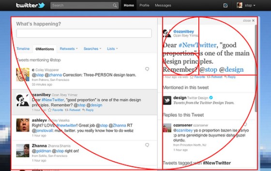
Have you seen this pattern in online designs? Even if you don’t think you recognise it, we assure you that you have.
Pictured: Twitter, Source: Wikipedia Commons. From Twitter’s Creative Director, @Stop: “To anyone curious about #NewTwitter proportions, know that we didn’t leave those ratios to chance … This, of course, only applies to the narrowest version of the UI. If your browser window is wider, your details pane will expand to provide greater utility, throwing off these proportions. But the narrowest width shows where we started, ratio-wise.”
Our logo is the Fibonacci sequence. Even if you cannot see it.
The choice of colour in a logo is important because it may alter or influence moods or emotions and appeal to an individual in a particular state. According to studies conducted at The University of Winnipeg, “62-90% of a person’s initial assessment of a product is based on colour alone”… which is why so many broker websites tend to be green.
Orange, created from red (energy) and yellow (wellbeing), is a social colour that might provide motivation and empowerment, and it’s intended to inspire an extroverted behaviour. It’s a colour that tends to encourage communication and optimism. In fact, among athletes it’s often a favourite colour because it is closely aligned with success.
Our small square is obviously a visual indication of our connection to Fibonacci, but it’s black because of the connection to its relevance in feng shui which suggests the colour is associated with the water element and invokes power, mystery, and calm. In marketing and branding psychology, black is associated with boldness, formality, mystery, strength, luxuriousness, and seriousness. The square itself – as a standalone geometric shape – is associated with discipline, strength, courage, security, reliability, trust, and trustworthiness. While the relationship is intended, our square is also a subtle nod to our three-dimensional and weighted marketing funnel approach.
Black is the darkest colour, the result of the absence or complete absorption of visible light; this is applicable because our leading technology and methodology simply excludes our competition from comparison.
So, in essence, while we’re very data-driven in our philosophy, our logo is firmly rooted in the mathematical and psychological principles that drive us on a daily basis.


